text and SelectionArea
Purpose
Text the reader can select and copy, alone or across several texts.
Signature
pub fn text(content: impl Into<String>) -> Text
pub struct SelectionArea<Msg = crate::callback::Callback> { .. }

impl SelectionArea {
    pub fn around(child: impl Widget<Msg> + 'static) -> Self;
}
Example
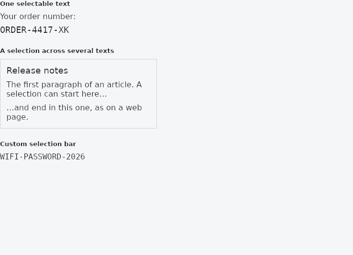
From frus-examples/widgets/src/features/text/widgets/selectable_text.rs:
//! `Text::selectable` and `SelectionArea` — text the reader can select and copy: one
//! text on its own, or a selection that runs across several.
//!
//! Text is not selectable by default: a label on a button should take the tap, not
//! start a selection. Make selectable what a reader may want to copy — an order
//! number, an address, an error message, an article.

use frus::{Align, Color, Column, Container, FontFamily, SelectionArea, Text, ToolbarItem, Widget};

use crate::common::shared::{section, sections};

pub fn example() -> Box<dyn Widget> {
    sections(vec![
        // One selectable text: drag across it, double-click a word, or press Ctrl+A
        // once it has focus, then Ctrl+C. On a touch screen, long-press.
        Box::new(section(
            "One selectable text",
            Column::new()
                .cross_axis_alignment(Align::Start)
                .spacing(6.0)
                .child(Text::new("Your order number:"))
                .child(
                    Text::new("ORDER-4417-XK")
                        .family(FontFamily::Monospace)
                        .size(18.0)
                        .selectable(),
                ),
        )),
        // `SelectionArea` wraps a subtree, and the selection runs from one text into the
        // next, in reading order — select from the title into the second paragraph.
        Box::new(section(
            "A selection across several texts",
            Container::new()
                .width(320.0)
                .padding(12.0)
                .border(1.0, Color::hex("#CBD5E1"))
                .child(SelectionArea::around(
                    Column::new()
                        .cross_axis_alignment(Align::Start)
                        .spacing(8.0)
                        .child(Text::new("Release notes").size(18.0))
                        .child(Text::new(
                            "The first paragraph of an article. A selection can start here…",
                        ))
                        .child(Text::new("…and end in this one, as on a web page.")),
                )),
        )),
        // The bar over a selection can be changed: here it offers Copy only, since a
        // one-line code has nothing worth "Select all".
        Box::new(section(
            "Custom selection bar",
            SelectionArea::around(Text::new("WIFI-PASSWORD-2026").family(FontFamily::Monospace))
                .selection_toolbar(|_, items: Vec<ToolbarItem>| {
                    items
                        .into_iter()
                        .filter(|item| item.label() == "Copy")
                        .collect()
                }),
        )),
    ])
}
Properties
| Type | Method | Argument | Effect |
|---|---|---|---|
SelectionArea | .selection_toolbar() | build: impl Fn(&ToolbarContext, Vec<ToolbarItem<Msg>>) -> Vec<ToolbarItem<Msg>> + 'static | Changes what the bar over the area's selection offers, as TextField::selection_toolbar does for a field. build is given the context and the default list — Copy, and Select all unless everything is selected — and answers with the list to show; an empty one shows no bar. |
SelectionArea | .selection_color() | color: Color | The highlight under the selected words in this area. Unset, the theme's TextSelectionTheme::selection_color. |
SelectionArea | .handle_color() | color: Color | The handles under a touch selection in this area. Unset, the theme's TextSelectionTheme::handle_color. |
Behaviour
text
Shorthand: a text widget. text("Hello") = Text::new("Hello").
SelectionArea
A subtree in which every Text can be selected, and one drag selects across them: a paragraph broken into three texts selects as a paragraph, and copying gives those three lines.
use frus_widgets::{column, SelectionArea, Text};

let terms: SelectionArea<()> = SelectionArea::around(column![
    Text::new("Terms of service").heading(),
    Text::new("You may copy any of this."),
    Text::new("Drag from one line to another."),
]);
How it looks and what its bar offers are the application's: the highlight and the handles take TextSelectionTheme, which selection_color and handle_color set for one area, and selection_toolbar changes the list on the bar.
A text that is itself selectable keeps its own selection, and what takes a press — a button, a field, a link — keeps that: a press begins a selection only over words nothing else has a claim on.
The area does not draw anything and does not change the layout: it is a wrapper that is its child, and says so to the texts inside it.
See also
- Text theme: the app's type scale, from display_large to label_small, and headings.
- FontFamily: sans-serif, serif, monospace, or a font registered by name.
- Kbd: a keyboard key cap, for showing shortcuts.
- The guide: Text, colour and the theme
- API reference:
text - API reference:
SelectionArea
Source: crates/frus-widgets/src/dsl.rs, crates/frus-widgets/src/region.rs @ e6fba33f5b42