Kbd
Purpose
A keyboard key cap, for showing shortcuts.
Signature
pub struct Kbd { .. }

impl Kbd {
    pub fn new(label: impl Into<String>) -> Self;
}
Example
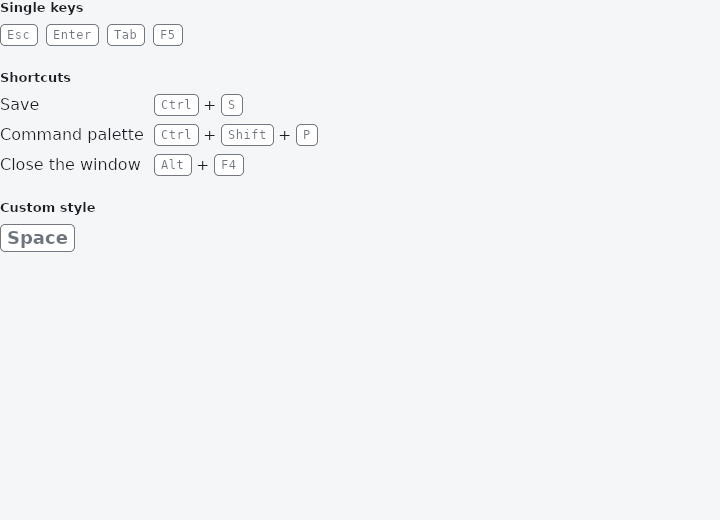
From frus-examples/widgets/src/features/text/widgets/kbd.rs:
//! `Kbd` — a keyboard key cap, for showing shortcuts in menus, tooltips and help pages.

use frus::{Align, Column, FontWeight, Kbd, MainAxisSize, Row, SizedBox, Text, TextStyle, Widget};

use crate::common::shared::{section, sections};

pub fn example() -> Box<dyn Widget> {
    sections(vec![
        Box::new(section(
            "Single keys",
            Row::new()
                .main_axis_size(MainAxisSize::Min)
                .spacing(8.0)
                .child(Kbd::new("Esc"))
                .child(Kbd::new("Enter"))
                .child(Kbd::new("Tab"))
                .child(Kbd::new("F5")),
        )),
        // A combination is keys and "+" signs in a row; centring them across the row
        // keeps the signs level with the caps.
        Box::new(section(
            "Shortcuts",
            Column::new()
                .spacing(8.0)
                .cross_axis_alignment(Align::Start)
                .child(shortcut("Save", &["Ctrl", "S"]))
                .child(shortcut("Command palette", &["Ctrl", "Shift", "P"]))
                .child(shortcut("Close the window", &["Alt", "F4"])),
        )),
        // The cap's text style can be changed — bigger and bold here, for a help screen.
        Box::new(section(
            "Custom style",
            Kbd::new("Space").text_style(TextStyle::new(18.0).weight(FontWeight::Bold)),
        )),
    ])
}

/// "Label   Ctrl + S": a description and its keys.
fn shortcut(label: &str, keys: &[&str]) -> Row {
    let row = Row::new()
        .main_axis_size(MainAxisSize::Min)
        .spacing(4.0)
        .child(SizedBox::new(Text::new(label)).width(150.0));
    keys.iter().enumerate().fold(row, |row, (i, key)| {
        let row = if i > 0 {
            row.child(Text::new("+"))
        } else {
            row
        };
        row.child(Kbd::new(*key))
    })
}
Properties
| Method | Argument | Effect |
|---|---|---|
.text_style() | style: TextStyle | The label's type, over the theme's and the framework's. |
Behaviour
A key cap showing a label, such as "Ctrl" or "Enter".
See also
- FontFamily: sans-serif, serif, monospace, or a font registered by name.
- Selectable text & SelectionArea: text the reader can select and copy, alone or across several texts.
- The guide: Text, colour and the theme
- API reference:
Kbd
Source: crates/frus-widgets/src/kbd.rs @ e6fba33f5b42