Themed and ThemeBuilder
Purpose
A different theme, or part of one, for one part of the screen.
Signature
pub struct Themed<Msg = crate::callback::Callback> { .. }

impl Themed {
    pub fn new(theme: Theme, child: impl Widget<Msg> + 'static) -> Self;
    pub fn tweak(change: impl Fn(&mut Theme) + 'static, child: impl Widget<Msg> + 'static) -> Self;
}
pub struct ThemeBuilder<Msg = crate::callback::Callback> { .. }

impl ThemeBuilder {
    pub fn new<W: Widget<Msg> + 'static>(build: impl FnOnce(&Theme) -> W + 'static) -> Self;
    pub fn boxed(build: impl FnOnce(&Theme) -> Box<dyn Widget<Msg>> + 'static) -> Self;
}
Example
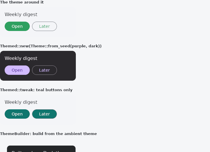
From frus-examples/widgets/src/features/state/widgets/themed.rs:
//! `Themed` and `ThemeBuilder` — a different theme for one part of the screen.
//!
//! `Themed::new` replaces the theme for a subtree (a dark promo card on a light page).
//! `Themed::tweak` changes **part** of the inherited one (this section's buttons are
//! teal), keeping everything else. `ThemeBuilder` builds a subtree from whatever theme
//! is in force where it sits.

use frus::{
    component, Align, Button, Card, Color, Colors, Column, Container, Text, Theme, ThemeBuilder,
    Themed, Variant, Widget, Wrap,
};

use crate::common::shared::{section, sections};

/// A few widgets that only read the theme: shown under each theme below.
fn sample() -> Box<dyn Widget> {
    Box::new(component(|cx| {
        let scheme = &cx.theme().scheme;
        Box::new(
            Container::new()
                .width(260.0)
                .padding(16.0)
                .radius(12.0)
                .color(scheme.surface_container)
                .child(
                    Column::new()
                        .spacing(10.0)
                        .cross_axis_alignment(Align::Start)
                        .child(Text::new("Weekly digest").color(scheme.on_surface))
                        .child(
                            Wrap::new()
                                .gap(8.0)
                                .run_gap(8.0)
                                .child(Button::new("Open").on_press(|| {}))
                                .child(
                                    Button::new("Later")
                                        .variant(Variant::Outlined)
                                        .on_press(|| {}),
                                ),
                        ),
                ),
        )
    }))
}

pub fn example() -> Box<dyn Widget> {
    sections(vec![
        Box::new(section("The theme around it", sample())),
        // A whole theme, made from one seed colour, dark whatever the app is.
        Box::new(section(
            "Themed::new(Theme::from_seed(purple, dark))",
            Themed::new(Theme::from_seed(Color::hex("#7C3AED"), true), sample()),
        )),
        // Only the buttons change; the surface and text stay the inherited ones.
        Box::new(section(
            "Themed::tweak: teal buttons only",
            Themed::tweak(
                |theme| {
                    theme.widgets.button.color = Some(Color::hex("#0F766E"));
                    theme.widgets.button.label_color = Some(Colors::WHITE);
                },
                sample(),
            ),
        )),
        // Built late, from the theme in force *here* — inside the dark `Themed`, the
        // builder sees the dark theme.
        Box::new(section(
            "ThemeBuilder: build from the ambient theme",
            Themed::new(
                Theme::from_seed(Color::hex("#0EA5E9"), true),
                ThemeBuilder::new(|theme| {
                    Card::new().padding(16.0).child(
                        Text::new(format!("Built under a {:?} theme", theme.brightness()))
                            .color(theme.scheme.on_surface),
                    )
                }),
            ),
        )),
    ])
}
Properties
No builder methods: everything is set through the constructor.
Behaviour
Themed
Applies a theme to its child and everything under it.
ThemeBuilder
Builds its child from the ambient theme (theme → widget).
Transparent otherwise: it has no box, no paint and no identity of its own, so the child sits exactly where the builder does.
See also
- keyed & Keyed: a stable identity, so a widget's state follows it when siblings move.
- Theme: reading the theme's colours and type, and switching light and dark.
- MediaQuery & MediaScope: the screen's size, insets, text scale, brightness and size class.
- Responsive, LayoutBuilder & OrientationBuilder: one interface, several layouts, by window or by box.
- Locale & Localizations: the interface's language, and the words the framework says in it.
- The guide: Starting a frus application
- API reference:
Themed - API reference:
ThemeBuilder
Source: crates/frus-widgets/src/themed.rs, crates/frus-widgets/src/themebuilder.rs @ e6fba33f5b42