Theme
Purpose
Reading the theme's colours and type, and switching light and dark.
Signature
pub struct Theme { .. }

impl Theme {
    pub fn from_scheme(scheme: ColorScheme, focus: Color, selection: Color) -> Self;
    pub fn dark() -> Self;
    pub fn light() -> Self;
    pub fn from_seed(seed: Color, dark: bool) -> Self;
}
Example
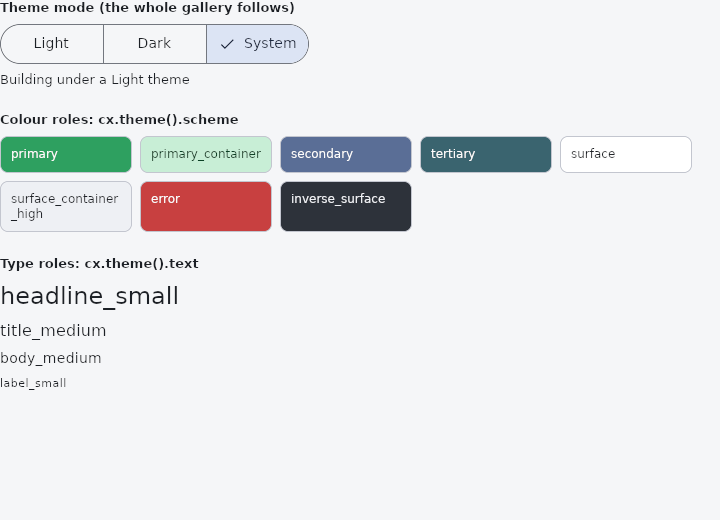
From frus-examples/widgets/src/features/state/widgets/theme.rs:
//! `Theme` — reading the colours and type every widget is dressed in (`cx.theme()`), and
//! switching the whole application between light and dark (`host::app()`).
//!
//! Read colours from the theme rather than writing them down: then dark mode, a brand
//! colour or a high-contrast theme reaches your widgets too.

use frus::{
    component, host, Align, Callback, Color, Column, Container, Row, SegmentedButton, Text, Theme,
    ThemeMode, Widget, Wrap,
};

use crate::common::shared::{section, sections};

const MODES: [(ThemeMode, &str); 3] = [
    (ThemeMode::Light, "Light"),
    (ThemeMode::Dark, "Dark"),
    (ThemeMode::System, "System"),
];

pub fn example() -> Box<dyn Widget> {
    Box::new(component(|cx| {
        let theme = cx.theme();
        let scheme = &theme.scheme;

        // The application's settings live in `host::app()`: the theme, the dark theme and
        // which of the two is on show. Changing one rebuilds the whole window.
        let app = host::app();
        let current = MODES
            .iter()
            .position(|(mode, _)| *mode == app.theme_mode())
            .unwrap_or(2);
        let modes = MODES.iter().fold(
            SegmentedButton::new(current, |index| {
                Callback::new(move || {
                    let app = host::app();
                    // An application with a single theme has nothing to switch to: give
                    // it a dark one the first time it is asked for.
                    if app.dark_theme().is_none() {
                        app.set_dark_theme(Some(Theme::dark()));
                    }
                    app.set_theme_mode(MODES[index].0);
                })
            }),
            |picker, (_, name)| picker.segment(*name),
        );

        let swatch = |name: &str, background: Color, foreground: Color| {
            Container::new()
                .width(132.0)
                .padding(10.0)
                .radius(8.0)
                .color(background)
                .border(1.0, scheme.outline_variant)
                .child(Text::new(name).size(12.0).color(foreground))
        };
        let colours = Wrap::new()
            .gap(8.0)
            .run_gap(8.0)
            .child(swatch("primary", scheme.primary, scheme.on_primary))
            .child(swatch(
                "primary_container",
                scheme.primary_container,
                scheme.on_primary_container,
            ))
            .child(swatch("secondary", scheme.secondary, scheme.on_secondary))
            .child(swatch("tertiary", scheme.tertiary, scheme.on_tertiary))
            .child(swatch("surface", scheme.surface, scheme.on_surface))
            .child(swatch(
                "surface_container_high",
                scheme.surface_container_high,
                scheme.on_surface,
            ))
            .child(swatch("error", scheme.error, scheme.on_error))
            .child(swatch(
                "inverse_surface",
                scheme.inverse_surface,
                scheme.on_inverse_surface,
            ));

        // The type scale: a named style for each role, rather than sizes picked by hand.
        let text = &theme.text;
        let type_scale = Column::new()
            .spacing(6.0)
            .cross_axis_alignment(Align::Start)
            .child(Text::styled("headline_small", text.headline_small))
            .child(Text::styled("title_medium", text.title_medium))
            .child(Text::styled("body_medium", text.body_medium))
            .child(Text::styled("label_small", text.label_small));

        sections(vec![
            Box::new(section(
                "Theme mode (the whole gallery follows)",
                Column::new()
                    .spacing(8.0)
                    .cross_axis_alignment(Align::Start)
                    .child(modes)
                    .child(
                        Text::new(format!("Building under a {:?} theme", theme.brightness()))
                            .size(13.0),
                    ),
            )),
            Box::new(section("Colour roles: cx.theme().scheme", colours)),
            Box::new(section(
                "Type roles: cx.theme().text",
                Row::new().child(type_scale),
            )),
        ])
    }))
}
Properties
| Method | Argument | Effect |
|---|---|---|
.with_platform() | platform: frus_core::TargetPlatform | The same theme, following platform's conventions (Theme::platform). |
.with_cupertino_override_theme() | data: crate::CupertinoThemeData | The same theme, its Apple-style widgets taking what data sets instead of what this theme would give them (Theme::cupertino_override_theme). |
.with_visual_density() | density: crate::VisualDensity | The same theme, its controls at density whatever the platform. |
.rtl() | — | The same theme in right-to-left (Arabic, Hebrew…). |
Behaviour
A set of style tokens.
The ColorScheme (theme.scheme) is the source of truth for the colors; the "flat" fields (background, surface, primary, …) are convenience views of the most used roles, derived from the scheme — the widgets' historical API stays intact. focus/selection are interaction accents specific to frus (outside the M3 roles).
See also
- host::spawn & host::after: slow work on another thread, and something to do after a delay.
- keyed & Keyed: a stable identity, so a widget's state follows it when siblings move.
- Themed & ThemeBuilder: a different theme, or part of one, for one part of the screen.
- MediaQuery & MediaScope: the screen's size, insets, text scale, brightness and size class.
- Responsive, LayoutBuilder & OrientationBuilder: one interface, several layouts, by window or by box.
- The guide: Starting a frus application
- API reference:
Theme
Source: crates/frus-widgets/src/theme.rs @ e6fba33f5b42