ShaderMask
Purpose
Lays a gradient over a child's pixels: gradient text, fades, spotlights.
Signature
pub struct ShaderMask<Msg = crate::callback::Callback> { .. }

impl ShaderMask {
    pub fn new(mask: FractionalMask) -> Self;
    pub fn linear(from: (f32, f32), to: (f32, f32), from_color: Color, to_color: Color) -> Self;
    pub fn radial(center: (f32, f32), radius: f32, from_color: Color, to_color: Color) -> Self;
    pub fn fade_out_bottom() -> Self;
}
Example
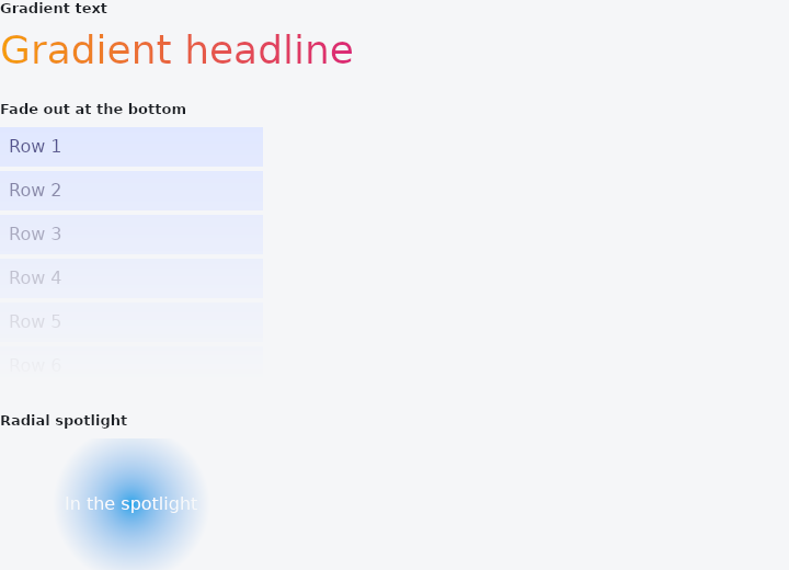
From frus-examples/widgets/src/features/painting/widgets/shader_mask.rs:
//! `ShaderMask` — lays a gradient over a child's own pixels: a headline painted in a
//! gradient, a list that fades out at its edge, a spotlight.
//!
//! By default the mask's alpha multiplies the child (a fade). With `BlendMode::SrcIn`
//! the mask's colours replace the child's wherever the child is drawn — a gradient
//! fill for text or icons.

use frus::{Align, Alignment, BlendMode, Color, Column, Container, ShaderMask, Text, Widget};

use crate::common::shared::{section, sections};

pub fn example() -> Box<dyn Widget> {
    sections(vec![
        // `linear(from, to, from_colour, to_colour)`, points as fractions of the box.
        Box::new(section(
            "Gradient text",
            ShaderMask::linear(
                (0.0, 0.0),
                (1.0, 0.0),
                Color::hex("#F59E0B"),
                Color::hex("#DB2777"),
            )
            .blend(BlendMode::SrcIn)
            .child(Text::new("Gradient headline").size(36.0)),
        )),
        // The default blend multiplies alpha in: opaque at the top, gone at the bottom —
        // the edge of a list that continues past view.
        Box::new(section(
            "Fade out at the bottom",
            ShaderMask::fade_out_bottom().child(
                (1..=6).fold(
                    Column::new()
                        .spacing(4.0)
                        .cross_axis_alignment(Align::Start),
                    |column, i| {
                        column.child(
                            Container::new()
                                .width(240.0)
                                .padding(8.0)
                                .color(Color::hex("#E0E7FF"))
                                .child(Text::new(format!("Row {i}")).color(Color::hex("#312E81"))),
                        )
                    },
                ),
            ),
        )),
        // A radial mask: visible in the middle, fading towards the edges — a spotlight
        // or a vignette. The default blend multiplies colour as well as alpha, so a pure
        // fade is drawn in white, from opaque to transparent.
        Box::new(section(
            "Radial spotlight",
            ShaderMask::radial(
                (0.5, 0.5),
                0.6,
                Color::rgba(1.0, 1.0, 1.0, 1.0),
                Color::rgba(1.0, 1.0, 1.0, 0.0),
            )
            .child(
                Container::new()
                    .width(240.0)
                    .height(120.0)
                    .color(Color::hex("#0EA5E9"))
                    .alignment(Alignment::CENTER)
                    .child(Text::new("In the spotlight").color(Color::hex("#FFFFFF"))),
            ),
        )),
    ])
}
Properties
| Method | Argument | Effect |
|---|---|---|
.blend() | blend: BlendMode | How the fade meets the child. The default multiplies it in. |
.child() | child: impl Widget<Msg> + 'static | Sets the masked child. |
.enabled() | enabled: bool | Turns the mask off: the child is painted as if this widget were not there. |
Behaviour
Blends a two-stop fade over its child: a list that fades out at its bottom edge, a headline filled with a gradient, a photograph dissolving into its page.
The fade is written in fractions of the child's box — (0, 0) its top-left corner, (1, 1) its bottom-right — and follows it through every resize with nothing to recompute. The default blend, BlendMode::Modulate, multiplies, so the fade's alpha becomes the child's transparency: that is what makes a mask a mask, and it is why the colours in the examples below are white with only their alpha varying. Any other blend mode turns it into a tint, a highlight, or a silhouette instead.
ShaderMask::fade_out_bottom().child(list)
ShaderMask::linear((0.0, 0.0), (1.0, 0.0), theme.primary, theme.tertiary)
    .blend(BlendMode::SrcIn)
    .child(Text::new("gradient headline"))
See also
- Opacity: paints a child partly transparent, as one layer.
- CustomPaint: a canvas you draw yourself, with paths, rectangles and the theme's colours.
- ColorFiltered: changes the colours of everything a child paints.
- ImageFiltered: blurs a child, or grows and shrinks its shapes.
- BackdropFilter: blurs what is painted underneath: frosted glass.
- The guide: Text, colour and the theme
- API reference:
ShaderMask
Source: crates/frus-widgets/src/filters.rs @ e6fba33f5b42