TabPageSelector
Purpose
Dots that say which of several pages you are on.
Signature
pub struct TabPageSelector<Msg = crate::callback::Callback> { .. }

impl TabPageSelector {
    pub fn new(count: usize, selected: usize) -> Self;
}
Example
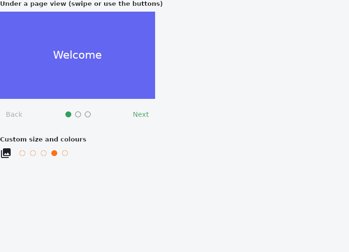
From frus-examples/widgets/src/features/navigation/widgets/pageselector.rs:
//! `TabPageSelector` — the row of dots that says which of several pages you are on:
//! under an onboarding walkthrough, a gallery or a carousel.

use frus::{
    Align, Button, Center, Color, Column, Container, Icon, Icons, PageView, Row, TabPageSelector,
    Text, Variant, Widget,
};

use crate::common::shared::{section, sections};

const SLIDES: [(&str, &str); 3] = [
    ("Welcome", "#6366F1"),
    ("Sync everywhere", "#0EA5E9"),
    ("You're all set", "#22C55E"),
];

pub fn example() -> Box<dyn Widget> {
    Box::new(frus::component(|cx| {
        let page = cx.use_state(|| 0usize);

        // The page view reports the page as the finger moves; the dots follow it, and the
        // buttons move the view by changing the page it is given.
        let follow = page.clone();
        let pages = PageView::new(SLIDES.len(), |i| {
            let (title, color) = SLIDES[i];
            Container::new().color(Color::hex(color)).child(Center::new(
                Text::new(title).size(22.0).color(frus::Colors::WHITE),
            ))
        })
        .height(180.0)
        .page(page.get())
        .on_page_changed(move |i: usize| follow.set(i));

        let back = page.clone();
        let next = page.clone();
        let walkthrough = Container::new().width(320.0).child(
            Column::new()
                .spacing(12.0)
                .cross_axis_alignment(Align::Stretch)
                .child(pages)
                .child(
                    Row::new()
                        .main_axis_alignment(frus::Justify::SpaceBetween)
                        .child(
                            Button::new("Back")
                                .variant(Variant::Text)
                                .enabled(page.get() > 0)
                                .on_press(move || back.update(|p| *p = p.saturating_sub(1))),
                        )
                        .child(TabPageSelector::new(SLIDES.len(), page.get()))
                        .child(
                            Button::new("Next")
                                .variant(Variant::Text)
                                .enabled(page.get() + 1 < SLIDES.len())
                                .on_press(move || next.update(|p| *p += 1)),
                        ),
                ),
        );

        sections(vec![
            Box::new(section(
                "Under a page view (swipe or use the buttons)",
                walkthrough,
            )),
            // Size, gap and colours are the theme's by default.
            Box::new(section(
                "Custom size and colours",
                Row::new()
                    .spacing(16.0)
                    .main_axis_size(frus::MainAxisSize::Min)
                    .child(Icon::new(Icons::PHOTO_LIBRARY))
                    .child(
                        TabPageSelector::new(5, 3)
                            .size(12.0)
                            .gap(10.0)
                            .color(Color::hex("#F97316"))
                            .border_color(Color::hex("#FDBA74")),
                    ),
            )),
        ])
    }))
}
Properties
| Method | Argument | Effect |
|---|---|---|
.size() | size: f32 | — |
.gap() | gap: f32 | The gap between two dots. |
.color() | color: Color | What the dot you are on is filled with. Unset, the accent. |
.border_color() | color: Color | The ring every dot is drawn with. |
Behaviour
The row of dots that says which page of several you are on.
It pairs with PageView as much as with a TabBar: an onboarding walkthrough, a gallery, a carousel — anything with a handful of pages and no room for a bar. It is a read-out, not a control: it says where you are and does not take a press, because a four-pixel target is not one.
The dot for the page you are on is filled and the rest are rings, and the fill crosses rather than jumping — driven by the same fractional index the tab bar's indicator slides along, so a selector under a page view and a bar over it agree on where the crossing has got to.
use frus_widgets::TabPageSelector;

let dots = TabPageSelector::<()>::new(4, 1);
See also
- Steps: the numbered step indicator of a wizard or multi-step form.
- Pagination: a page picker: previous, page numbers, next.
- The guide: Screens, navigation and dialogs
- API reference:
TabPageSelector
Source: crates/frus-widgets/src/pageselector.rs @ e6fba33f5b42