TabBar
Purpose
Tabs and the panel of the selected one: primary, secondary, icons, scrolling, swiping.
Signature
pub struct TabBar<Msg = crate::callback::Callback> { .. }

impl TabBar {
    pub fn new<R1: crate::callback::IntoMsg<Msg>>(
        selected: usize,
        on_select: impl Fn(usize) -> R1 + 'static,
    ) -> Self;
}
Example
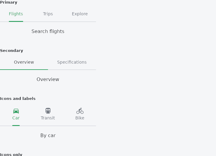
From frus-examples/widgets/src/features/navigation/widgets/tabs.rs:
//! `TabBar` — a row of tabs and the panel of the selected one. Primary for the top
//! level of a screen, secondary for a division inside it; icons, scrolling and swiping
//! between panels are all options.

use frus::{
    Center, Container, Icons, State, StateContext, StatefulWidget, TabBarVariant, Text, Widget,
};

use crate::common::shared::{section, sections};

pub fn example() -> Box<dyn Widget> {
    Box::new(TabsDemo.into_widget())
}

struct TabsDemo;

/// One selected index per tab bar in the demo. The bar is **controlled**: it shows the
/// index it is given and reports a press; the state decides.
#[derive(Default)]
struct TabsDemoState {
    selected: [usize; 5],
}

impl StatefulWidget for TabsDemo {
    type State = TabsDemoState;

    fn create_state(&self) -> TabsDemoState {
        TabsDemoState::default()
    }
}

const TOPICS: [&str; 8] = [
    "World", "Business", "Science", "Health", "Sports", "Travel", "Culture", "Food",
];

impl State for TabsDemoState {
    type Widget = TabsDemo;

    fn build(&self, cx: &StateContext<Self>) -> Box<dyn Widget> {
        // A handler for bar `n`: the index it reports goes into slot `n`.
        let select = |n: usize| cx.handler(move |s: &mut Self, i: usize| s.selected[n] = i);
        let tabs = |n: usize| frus::TabBar::new(self.selected[n], select(n));

        // Only the selected tab's content is built; the bar is as tall as that panel.
        let primary = tabs(0)
            .tab("Flights", panel("Search flights"))
            .tab("Trips", panel("Your upcoming trips"))
            .tab("Explore", panel("Ideas for the weekend"));

        // The secondary variant: the indicator spans the whole tab and is square.
        let secondary = tabs(1)
            .variant(TabBarVariant::Secondary)
            .tab("Overview", panel("Overview"))
            .tab("Specifications", panel("Specifications"));

        // An icon over each label makes the row taller; `icon_only_tab` keeps the normal
        // height and uses the label only for screen readers.
        let with_icons = tabs(2)
            .icon_tab(Icons::DIRECTIONS_CAR, "Car", panel("By car"))
            .icon_tab(Icons::DIRECTIONS_TRANSIT, "Transit", panel("By transit"))
            .icon_tab(Icons::DIRECTIONS_BIKE, "Bike", panel("By bike"));
        let icon_only = tabs(3)
            .icon_only_tab(Icons::GRID_VIEW, "Grid", panel("Grid view"))
            .icon_only_tab(Icons::VIEW_LIST, "List", panel("List view"));

        // Many tabs on a narrow screen: each takes the room its label needs and the bar
        // scrolls sideways.
        let scrollable = TOPICS.iter().fold(tabs(4).scrollable(true), |bar, topic| {
            bar.tab(*topic, panel(&format!("Latest in {topic}")))
        });

        // Swipeable: a drag across the panel changes tab. A swipeable set fills the
        // height it is given, so inside a scrolling page it needs a bounded box.
        let swipeable = Container::new().width(320.0).height(180.0).child(
            frus::TabBar::new(self.selected[0], select(0))
                .swipeable(true)
                .tab("Flights", panel("Swipe sideways…"))
                .tab("Trips", panel("…to change tab"))
                .tab("Explore", panel("…like this")),
        );

        sections(vec![
            Box::new(section("Primary", narrow(primary))),
            Box::new(section("Secondary", narrow(secondary))),
            Box::new(section("Icons and labels", narrow(with_icons))),
            Box::new(section("Icons only", narrow(icon_only))),
            Box::new(section("Scrollable", narrow(scrollable))),
            Box::new(section(
                "Swipeable (shares the first bar's state)",
                swipeable,
            )),
        ])
    }
}

/// The content of one tab.
fn panel(text: &str) -> Container {
    Container::new()
        .height(64.0)
        .child(Center::new(Text::new(text)))
}

/// Tab bars fill their width; the demo gives them a phone's.
fn narrow(bar: frus::TabBar) -> Container {
    Container::new().width(320.0).child(bar)
}
Properties
| Method | Argument | Effect |
|---|---|---|
.tab() | label: impl Into<String>, content: impl Widget<Msg> + 'static | Adds a tab, a label plus content. The content is realised only when it belongs to the selected tab. |
.tab_widget() | child: impl Widget<Msg> + 'static, label: impl Into<String>, content: impl Widget<Msg> + 'static | Adds a tab the caller draws — a label with an unread count beside it, a coloured dot, two lines, rich text — plus the word it is called by and its content. |
.item() | tab: TabItem<Msg>, content: impl Widget<Msg> + 'static | Adds a tab however it was built, plus its content — the door to TabItem::width, which no shorthand carries. |
.icon_tab() | icon: IconData, label: impl Into<String>, content: impl Widget<Msg> + 'static | Adds a tab with an icon over its label. |
.icon_only_tab() | icon: IconData, label: impl Into<String>, content: impl Widget<Msg> + 'static | Adds a tab showing only an icon, in a row of the ordinary height. |
.swipeable() | swipeable: bool | Whether a drag across the panel changes tab. |
.scrollable() | scrollable: bool | Lets the bar scroll rather than sharing its width between the tabs. |
.alignment() | alignment: TabAlignment | Where the tabs sit when they do not fill the bar. |
.enabled() | enabled: bool | Whether the bar can be switched. Disabled every tab is inert - no press, no ink, out of the tab order - and the panel stays, because which tab is showing is still the answer even when it cannot be changed. |
.variant() | variant: TabBarVariant | Chooses between the two bars. See TabBarVariant. |
.indicator_color() | color: Color | The indicator's colour. Defaults to the theme's accent. |
.indicator_weight() | weight: f32 | The indicator's thickness — and, on a primary bar, the radius of its top corners. 0.0 removes it. |
.label_color() | color: Color | The selected label's colour. |
.unselected_label_color() | color: Color | The colour of every label but the selected one. |
.label_style() | style: TextStyle | The labels' type. Defaults to the theme's title_small step. |
.divider_color() | color: Color | The hairline's colour. |
.divider_height() | height: f32 | The hairline's thickness. 0.0 removes it — a bar sitting directly on a coloured surface usually wants that. |
.label_padding() | padding: f32 | The room on either side of a label. |
.tab_height() | height: f32 | The tabs' height, the indicator excluded. |
Behaviour
A tabbed view: the bar, and the selected tab's panel under it.
See also
- AppBar: the bar at the top of a screen: leading button, title, actions and a bottom.
- Scaffold: the shell of a screen: app bar, body, navigation, drawer, FAB and footer slots.
- BottomBar: the main destinations along the bottom of a phone screen.
- BottomNavigationBar: the classic bottom bar: fixed, or shifting with the selected item's colour.
- NavigationRail: the main destinations down the side of a tablet or desktop window.
- The guide: Screens, navigation and dialogs
- API reference:
TabBar
Source: crates/frus-widgets/src/tabs.rs @ e6fba33f5b42