Steps
Purpose
The numbered step indicator of a wizard or multi-step form.
Signature
pub struct Steps<Msg = crate::callback::Callback> { .. }

impl Steps {
    pub fn new(labels: impl IntoIterator<Item = impl Into<String>>) -> Self;
}
Example
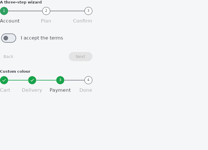
From frus-examples/widgets/src/features/navigation/widgets/steps.rs:
//! `Steps` — the numbered indicator of a multi-step form or wizard: done steps show a
//! tick, the current one its number in the accent. The navigation (Back, Next) and the
//! validation of each step stay in your state.

use frus::{
    Align, Button, Column, Container, Justify, Row, State, StateContext, StatefulWidget, Steps,
    Switch, Text, Variant, Widget,
};

use crate::common::shared::{section, sections};

pub const STEPS: [&str; 3] = ["Account", "Plan", "Confirm"];

pub fn example() -> Box<dyn Widget> {
    Box::new(WizardDemo.into_widget())
}

pub struct WizardDemo;

#[derive(Default)]
pub struct WizardState {
    pub current: usize,
    /// Step 1's only question; the wizard cannot move on until it is answered.
    pub terms_accepted: bool,
    /// Step 2's choice.
    pub premium: bool,
    pub finished: bool,
}

impl WizardState {
    /// Whether step `i` is complete — what the indicator ticks, and what Next checks.
    pub fn is_done(&self, i: usize) -> bool {
        match i {
            0 => self.terms_accepted,
            1 => self.current > 1,
            _ => self.finished,
        }
    }

    /// Only the first step has a question that must be answered before moving on.
    fn can_advance(&self) -> bool {
        self.current != 0 || self.terms_accepted
    }

    pub fn next(&mut self) {
        if !self.can_advance() {
            return;
        }
        if self.current + 1 < STEPS.len() {
            self.current += 1;
        } else {
            self.finished = true;
        }
    }

    fn back(&mut self) {
        self.current = self.current.saturating_sub(1);
        self.finished = false;
    }

    /// A tap on a marker jumps back to a step already reached, never ahead of it.
    pub fn jump(&mut self, i: usize) {
        if i < self.current {
            self.current = i;
            self.finished = false;
        }
    }
}

impl StatefulWidget for WizardDemo {
    type State = WizardState;

    fn create_state(&self) -> WizardState {
        WizardState::default()
    }
}

impl State for WizardState {
    type Widget = WizardDemo;

    fn build(&self, cx: &StateContext<Self>) -> Box<dyn Widget> {
        // `completed` says which steps get a tick; without it, every step before the
        // current one counts as done.
        let indicator = Steps::new(STEPS)
            .current(self.current)
            .completed((0..STEPS.len()).map(|i| self.is_done(i)))
            .on_tap(cx.handler(|s: &mut Self, i: usize| s.jump(i)));

        let page: Box<dyn Widget> = match self.current {
            0 => Box::new(
                Row::new()
                    .spacing(12.0)
                    .main_axis_size(frus::MainAxisSize::Min)
                    .child(
                        Switch::new(self.terms_accepted)
                            .on_toggle(cx.handler(|s: &mut Self, on: bool| s.terms_accepted = on)),
                    )
                    .child(Text::new("I accept the terms")),
            ),
            1 => Box::new(
                Row::new()
                    .spacing(12.0)
                    .main_axis_size(frus::MainAxisSize::Min)
                    .child(
                        Switch::new(self.premium)
                            .on_toggle(cx.handler(|s: &mut Self, on: bool| s.premium = on)),
                    )
                    .child(Text::new("Premium plan")),
            ),
            _ => Box::new(Text::new(if self.finished {
                "All done — welcome aboard!".to_string()
            } else {
                format!("Plan: {}", if self.premium { "Premium" } else { "Free" })
            })),
        };

        let last = self.current + 1 == STEPS.len();
        let wizard = Container::new().width(320.0).child(
            Column::new()
                .spacing(20.0)
                .cross_axis_alignment(Align::Stretch)
                .child(indicator)
                .child(Container::new().height(48.0).child(page))
                .child(
                    Row::new()
                        .main_axis_alignment(Justify::SpaceBetween)
                        .child(
                            Button::new("Back")
                                .variant(Variant::Text)
                                .enabled(self.current > 0)
                                .on_press(cx.callback(Self::back)),
                        )
                        .child(
                            Button::new(if last { "Finish" } else { "Next" })
                                .enabled(self.can_advance() && !self.finished)
                                .on_press(cx.callback(Self::next)),
                        ),
                ),
        );

        sections(vec![
            Box::new(section("A three-step wizard", wizard)),
            // The indicator alone, in another colour, two steps in.
            Box::new(section(
                "Custom colour",
                Container::new().width(320.0).child(
                    Steps::new(["Cart", "Delivery", "Payment", "Done"])
                        .current(2)
                        .color(frus::Color::hex("#16A34A")),
                ),
            )),
        ])
    }
}
Properties
| Method | Argument | Effect |
|---|---|---|
.label_text_style() | style: TextStyle | — |
.index_text_style() | style: TextStyle | The figures inside the markers, over the theme's and the framework's. |
.completed() | flags: impl IntoIterator<Item = bool> | Explicitly marks the done steps (a tick) with one flag per step — typically each step's validity, rather than position alone. Without this call, a step counts as "done" if it precedes the current one (i < current). |
.current() | index: usize | Sets the current step (the earlier ones are "done", the later ones "upcoming"). Clamped to the last index. |
.color() | color: Color | Overrides the accent color (done and current markers + the connectors crossed). |
.on_tap() | on_tap: impl Fn(usize) -> Msg | Makes the markers clickable: clicking step i's marker emits on_tap(i) (to jump there — typically a step already visited). Lays a row of transparent clickable zones exactly over the markers (a SpaceBetween distribution of marker-sized boxes), without changing the rendering. |
Behaviour
The step indicator of a multi-step form.
use frus_widgets::Steps;
// Three steps, the second in progress (so the first counts as "done").
let steps: Steps<()> = Steps::new(["Account", "Profile", "Review"]).current(1);
See also
- NavigationBar: a simple screen header: a centred title and a back button.
- CollapsingHeader: a tall header that shrinks to a toolbar as the page under it scrolls.
- Pagination: a page picker: previous, page numbers, next.
- TabPageSelector: dots that say which of several pages you are on.
- The guide: Screens, navigation and dialogs
- API reference:
Steps
Source: crates/frus-widgets/src/steps.rs @ e6fba33f5b42