Scaffold
Purpose
The shell of a screen: app bar, body, navigation, drawer, FAB and footer slots.
Signature
pub struct Scaffold<Msg = crate::callback::Callback> { .. }

impl Scaffold {
    pub fn new() -> Self;
}
Example
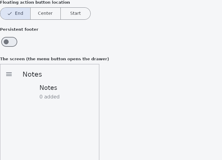
From frus-examples/widgets/src/features/navigation/widgets/scaffold.rs:
//! `Scaffold` — the shell of a screen. You fill its slots (app bar, body, navigation,
//! drawer, floating action button, persistent footer) and it lays them out, keeping
//! clear of the system bars and the keyboard.

use frus::{
    Align, AppBar, Button, Center, Color, Column, Container, FabLocation, FloatingActionButton,
    Icons, ListTile, MediaQuery, Row, Scaffold, SegmentedButton, Size, State, StateContext,
    StatefulWidget, Switch, Text, Variant, Widget,
};

use crate::common::shared::{section, sections};

pub fn example() -> Box<dyn Widget> {
    Box::new(ScaffoldDemo.into_widget())
}

struct ScaffoldDemo;

#[derive(Default)]
struct ScaffoldDemoState {
    /// Index into `LOCATIONS`.
    fab_at: usize,
    drawer_open: bool,
    footer: bool,
    tab: usize,
    count: u32,
}

const LOCATIONS: [(&str, FabLocation); 3] = [
    ("End", FabLocation::EndFloat),
    ("Center", FabLocation::CenterFloat),
    ("Start", FabLocation::StartFloat),
];

impl StatefulWidget for ScaffoldDemo {
    type State = ScaffoldDemoState;

    fn create_state(&self) -> ScaffoldDemoState {
        ScaffoldDemoState::default()
    }
}

impl State for ScaffoldDemoState {
    type Widget = ScaffoldDemo;

    fn build(&self, cx: &StateContext<Self>) -> Box<dyn Widget> {
        let theme = cx.theme();
        let toggle_drawer = cx.callback(|s: &mut Self| s.drawer_open = !s.drawer_open);

        // The screen is built under a description of a 320 × 480 surface with no system
        // bars: the scaffold and its slots read the screen (`MediaQuery::of`) when they
        // are made, so a shell shown in part of a page — a preview, a device frame — is
        // made inside `scope`. A real screen writes none of this.
        let screen = MediaQuery::new(Size::new(320.0, 480.0)).scope(|| {
            // No leading button: a scaffold with a drawer gives its app bar the button that
            // opens it.
            let app_bar = AppBar::new().title(Text::new("Notes")).build();

            let body = Center::new(
                Column::new()
                    .cross_axis_alignment(Align::Start)
                    .spacing(8.0)
                    .child(Text::new(["Notes", "Reminders"][self.tab]).size(20.0))
                    .child(Text::new(format!("{} added", self.count)).color(theme.muted)),
            );

            let drawer = Column::new()
                .cross_axis_alignment(Align::Start)
                .child(
                    Container::new()
                        .padding(16.0)
                        .child(Text::new("Folders").size(18.0)),
                )
                .child(
                    ListTile::new()
                        .title("Personal")
                        .on_tap(toggle_drawer.clone()),
                )
                .child(ListTile::new().title("Work").on_tap(toggle_drawer.clone()));

            let mut shell = Scaffold::new()
                // Without a background the scaffold is transparent.
                .background(theme.background)
                .app_bar(app_bar)
                .body(body)
                // Destinations make a bottom navigation bar.
                .nav(self.tab, cx.handler(|s: &mut Self, i: usize| s.tab = i))
                .destination(Icons::NOTE, "Notes")
                .destination(Icons::ALARM, "Reminders")
                .drawer(drawer, self.drawer_open, toggle_drawer)
                .fab(
                    FloatingActionButton::new(Icons::ADD)
                        .on_press(cx.callback(|s: &mut Self| s.count += 1)),
                )
                .fab_location(LOCATIONS[self.fab_at].1);
            if self.footer {
                // Always visible above the navigation: the screen's committing actions.
                shell = shell.persistent_footer(
                    Row::new()
                        .spacing(8.0)
                        .main_axis_size(frus::MainAxisSize::Min)
                        .child(Button::new("Discard").variant(Variant::Text))
                        .child(Button::new("Save")),
                );
            }
            shell.build()
        });

        let fab_picker = LOCATIONS.iter().fold(
            SegmentedButton::new(
                self.fab_at,
                cx.handler(|s: &mut Self, i: usize| s.fab_at = i),
            ),
            |picker, (name, _)| picker.segment(*name),
        );

        sections(vec![
            Box::new(section("Floating action button location", fab_picker)),
            Box::new(section(
                "Persistent footer",
                Switch::new(self.footer)
                    .on_toggle(cx.handler(|s: &mut Self, on: bool| s.footer = on)),
            )),
            Box::new(section(
                "The screen (the menu button opens the drawer)",
                Container::new()
                    // The 1 px border sits inside the box, so the box is the screen plus 2 px.
                    .width(322.0)
                    .height(482.0)
                    .border(1.0, Color::hex("#A1A1AA"))
                    .clip()
                    .child(screen),
            )),
        ])
    }
}
Properties
| Method | Argument | Effect |
|---|---|---|
.size() | width: f32, height: f32 | The surface's size, in logical pixels — an override. |
.insets() | insets: Insets | The permanent safe area (system bars, notch): the Scaffold keeps the slots clear of it. |
.window_insets() | insets: WindowInsets | The window insets, both kinds: the permanent padding and the transient area the keyboard covers. |
.resize_to_avoid_bottom_inset() | resize: bool | Whether the body is lifted clear of the soft keyboard (true by default). |
.extend_body() | extend: bool | Lets the body run under the bottom bar and the persistent footer rather than stopping above them. |
.extend_body_behind_app_bar() | extend: bool | Lets the body run under the app bar, its top aligned with the top of the screen rather than with the bottom of the bar. |
.background() | color: Color | Background color, spread edge to edge, including under the system bars. |
.app_bar() | widget: impl Widget<Msg> + 'static | The application bar, pinned at the top. |
.body() | widget: impl Widget<Msg> + 'static | — |
.nav() | selected: usize, on_select: impl Fn(usize) -> R1 + 'static | Enables navigation: selected = the active destination, on_select(i) emitted on choice. Then add Scaffold::destinations. |
.nav_placement() | placement: NavPlacement | Where the destinations are drawn: a bottom bar (the default) or a rail. |
.nav_labels() | labels: RailLabels | When the destinations say what they are, whichever of the two widgets ends up carrying them. See RailLabels. |
.rail() | configure: impl FnOnce(NavigationRail<Msg>) -> NavigationRail<Msg> + 'static | What to do to the rail once the shell has built it from the destinations — .rail(|rail| rail.extended(true).group_alignment(0.0)). |
.destination() | icon: impl Into<crate::navrail::DestinationIcon>, label: impl Into<String> | Adds a navigation destination (mark + label). |
.destinations() | destinations: impl IntoIterator<Item = NavigationDestination> | Adds a whole list of destinations declared elsewhere — the same list a rail, a drawer or a NavScaffold would take, so an application describes its navigation once. |
.tooltip() | message: impl Into<String> | What a pointer resting on the last destination is told. See NavigationRail::tooltip. |
.badge() | count: u32 | A notification count on the last destination. |
.badge_dot() | — | Adds a dot to the last destination (milestone 707). |
.selected_icon() | icon: impl Into<crate::navrail::DestinationIcon> | The glyph the last destination shows while it is selected, where that differs from its resting one. See NavigationRail::selected_icon. |
.disabled() | — | Marks the last destination inaccessible. See NavigationRail::disabled. |
.indicator_color() | color: Color | The last destination's own indicator colour, over the theme's. See NavigationRail::indicator_color. |
.drawer() | panel: impl Widget<Msg> + 'static, open: bool, toggle: Msg | A modal side drawer on the leading edge (left): panel = the content, open = expanded, toggle = the toggle message (the button, and a click on the scrim). |
.end_drawer() | panel: impl Widget<Msg> + 'static, open: bool, toggle: Msg | A modal side drawer (right edge): panel = the content, open = expanded, toggle = the toggle message (the button, and a click on the scrim). |
.fab() | widget: impl Widget<Msg> + 'static | A floating action button, anchored bottom-right, above the bottom bar. |
.bottom_app_bar() | bar: BottomAppBar<Msg> | A bottom app bar in place of the navigation one: the actions belonging to the screen you are on, rather than a choice of screen. |
.bottom_navigation_bar() | bar: impl Widget<Msg> + 'static | A bottom navigation bar — a BottomNavigationBar, or any bar of that height — along the bottom edge, told about the room the system's bars take there so that its colour runs behind them (milestone 731). |
.fab_location() | location: FabLocation | Where the FAB sits: which end of the row, and whether it floats clear of the bottom bar or docks astride its top edge. FabLocation::EndFloat by default. |
.fab_size() | size: f32 | The height the FAB is taken to have when it is docked, since that placement puts its centre on the bar's edge and so has to know how tall it is. 56 px — the conventional diameter — unless said otherwise. |
.persistent_footer() | widget: impl Widget<Msg> + 'static | A strip pinned between the body and the bottom bar, always visible: the screen's committing actions (Save, Cancel), which must not be scrolled away. |
.persistent_footer_alignment() | alignment: Justify | How the persistent footer is aligned in its row (Justify::End by default, the conventional place for a confirming action). |
.bottom_sheet() | panel: impl Widget<Msg> + 'static, open: bool, toggle: Msg | A modal sheet sliding up from the bottom. |
.primary() | primary: bool | Whether the shell sits at the top of the screen, so that its app bar is the thing that absorbs the status bar. true by default. |
.persistent_footer_divider() | divider: bool | The line along the top of the persistent footer. |
.persistent_footer_color() | color: Color | The background behind the persistent footer. Unset, it is the shell's own — the footer is part of the screen, not a bar laid on it. |
.drawer_scrim_color() | color: Color | The scrim behind an open drawer, alpha included: the transparency of a scrim is its colour, so Color::TRANSPARENT darkens nothing and an opaque value hides the screen behind it. |
.drawer_barrier_dismissible() | dismissible: bool | Whether a click on the scrim closes the drawer. |
Behaviour
The screen shell. A fluent builder finished by Scaffold::build.
See also
- AppBar: the bar at the top of a screen: leading button, title, actions and a bottom.
- TabBar: tabs and the panel of the selected one: primary, secondary, icons, scrolling, swiping.
- BottomBar: the main destinations along the bottom of a phone screen.
- BottomNavigationBar: the classic bottom bar: fixed, or shifting with the selected item's colour.
- The guide: Screens, navigation and dialogs
- API reference:
Scaffold
Source: crates/frus-widgets/src/scaffold.rs @ e6fba33f5b42