NavigationDrawer
Purpose
A side panel's list of destinations, with a header, badges and a footer.
Signature
pub struct NavigationDrawer<Msg = crate::callback::Callback> { .. }

impl NavigationDrawer {
    pub fn new<R1: crate::callback::IntoMsg<Msg>>(
        selected: usize,
        on_select: impl Fn(usize) -> R1 + 'static,
    ) -> Self;
}
Example
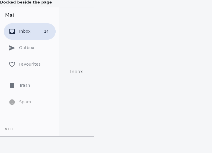
From frus-examples/widgets/src/features/navigation/widgets/navdrawer.rs:
//! `NavigationDrawer` — the content of a side panel for an app with many destinations:
//! a header, every destination with its full label (and a badge), dividers, a footer.
//! Put it in a `Drawer` (modal or docked) or let `NavScaffold` dock it on wide screens.

use frus::{
    Center, Color, Container, Divider, Drawer, Expanded, Icons, NavigationDrawer, Row, State,
    StateContext, StatefulWidget, Text, Widget,
};

use crate::common::shared::{section, sections};

pub fn example() -> Box<dyn Widget> {
    Box::new(MailboxDemo.into_widget())
}

struct MailboxDemo;

#[derive(Default)]
struct MailboxDemoState {
    selected: usize,
}

const BOXES: [&str; 5] = ["Inbox", "Outbox", "Favourites", "Trash", "Spam"];

impl StatefulWidget for MailboxDemo {
    type State = MailboxDemoState;

    fn create_state(&self) -> MailboxDemoState {
        MailboxDemoState::default()
    }
}

impl State for MailboxDemoState {
    type Widget = MailboxDemo;

    fn build(&self, cx: &StateContext<Self>) -> Box<dyn Widget> {
        // Destinations are counted in the order they are added; dividers and other
        // `child` widgets between them are not destinations and do not count.
        let drawer = NavigationDrawer::new(
            self.selected,
            cx.handler(|s: &mut Self, i: usize| s.selected = i),
        )
        .header(
            Container::new()
                .padding(16.0)
                .child(Text::new("Mail").size(18.0)),
        )
        .item(Icons::INBOX, "Inbox")
        .badge(24)
        .item(Icons::SEND, "Outbox")
        .item(Icons::FAVORITE_BORDER, "Favourites")
        .selected_icon(Icons::FAVORITE)
        .child(Divider::new())
        .item(Icons::DELETE, "Trash")
        .item(Icons::REPORT, "Spam")
        .disabled()
        .footer(
            Container::new()
                .padding(16.0)
                .child(Text::new("v1.0").size(12.0)),
        )
        .width(200.0);

        // Docked with a permanent `Drawer`, beside the page it navigates.
        let window = Container::new()
            .width(320.0)
            .height(440.0)
            .border(1.0, Color::hex("#A1A1AA"))
            .clip()
            .child(
                Drawer::new(true)
                    .permanent(true)
                    .width(200.0)
                    .panel(drawer)
                    .body(
                        Row::new()
                            .child(Expanded::new(Center::new(Text::new(BOXES[self.selected])))),
                    ),
            );

        sections(vec![Box::new(section("Docked beside the page", window))])
    }
}
Properties
| Method | Argument | Effect |
|---|---|---|
.item() | icon: impl Into<DestinationIcon>, label: impl Into<String> | Adds a destination: a glyph and a name. |
.child() | child: impl Widget<Msg> + 'static | — |
.child_boxed() | child: Box<dyn Widget<Msg>> | Self::child, for a widget already boxed. |
.destinations() | destinations: impl IntoIterator<Item = NavigationDestination> | Adds a whole list of destinations declared elsewhere — one navigation, handed to whichever chrome the width called for. |
.badge() | count: u32 | A notification count on the last destination. |
.badge_dot() | — | Adds a dot to the last destination (milestone 707). |
.tooltip() | message: impl Into<String> | — |
.selected_icon() | icon: impl Into<DestinationIcon> | — |
.disabled() | — | — |
.tile_color() | color: Color | — |
.destination_indicator_color() | color: Color | The last destination's own indicator colour, over the drawer's. |
.destination_indicator_shape() | shape: ShapeBorder | The last destination's own indicator shape, over the drawer's. |
.destination_overlay_color() | overlay: WidgetStateProperty<Color> | The last destination's own highlight per state, over the framework's state layer. |
.header() | header: impl Widget<Msg> + 'static | — |
.header_boxed() | header: Box<dyn Widget<Msg>> | Self::header, for a widget already boxed. |
.footer() | footer: impl Widget<Msg> + 'static | — |
.footer_boxed() | footer: Box<dyn Widget<Msg>> | Self::footer, for a widget already boxed. |
.width() | width: f32 | How wide the panel asks to be. Unset, it takes the width it is offered — which is what a Drawer gives it, so a panel's width stays the panel's business and this is for one standing on its own. |
.background_color() | color: Color | The panel's surface. |
.elevation() | elevation: f32 | How far off the page the panel sits. |
.shadow_color() | color: Color | The shadow's colour. |
.indicator_color() | color: Color | The pill behind the selected destination. Unset, the scheme's secondary_container. |
.indicator_shape() | shape: ShapeBorder | That pill's shape. |
.indicator_size() | width: f32, height: f32 | That pill's box, (width, height). The width is a ceiling: a pill never grows past the room its tile has. |
.tile_height() | height: f32 | A tile's height. Unset, 56. |
.tile_padding() | padding: Insets | The room either side of a tile. |
.icon_size() | size: f32 | The destinations' glyphs. Unset, 24. |
.label_text_style() | style: TextStyle | The destinations' labels. Unset, labelLarge. |
.badge_text_style() | style: TextStyle | The count a destination carries. Unset, labelSmall. |
Behaviour
A panel of destinations: the navigation's widest form.
See also
- NavScaffold: navigation that becomes a bar, a rail or an extended rail with the size class.
- Drawer & drawer headers: a side panel that slides over the page or sits docked beside it.
- BottomAppBar: a bar of actions along the bottom, notched for a docked action button.
- NavigationBar: a simple screen header: a centred title and a back button.
- CollapsingHeader: a tall header that shrinks to a toolbar as the page under it scrolls.
- The guide: Screens, navigation and dialogs
- API reference:
NavigationDrawer
Source: crates/frus-widgets/src/navdrawer.rs @ e6fba33f5b42