NavigationBar
Purpose
A simple screen header: a centred title and a back button.
Signature
pub struct NavigationBar<Msg = crate::callback::Callback> { .. }

impl NavigationBar {
    pub fn new(title: impl Into<String>) -> Self;
}
Example
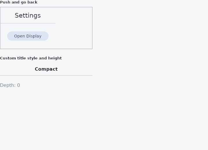
From frus-examples/widgets/src/features/navigation/widgets/navbar.rs:
//! `NavigationBar` — a simple screen header: a centred title and, on a screen that can
//! be left, a back button. It slides with its screen during `Navigator` transitions.

use frus::{
    Align, Button, Color, Column, Container, FontWeight, NavigationBar, Text, TextStyle, Variant,
    Widget,
};

use crate::common::shared::{section, sections};

const SCREENS: [&str; 3] = ["Settings", "Display", "Font size"];

pub fn example() -> Box<dyn Widget> {
    Box::new(frus::component(|cx| {
        // How deep the reader has gone: the bar of the top screen shows a back button.
        let depth = cx.use_state(|| 0usize);

        let title = SCREENS[depth.get()];
        let bar = if depth.get() == 0 {
            // A root screen: the title alone.
            NavigationBar::new(title)
        } else {
            let back = depth.clone();
            NavigationBar::new(title).on_back(move || back.update(|d| *d -= 1))
        };

        let deeper = depth.clone();
        let next = SCREENS.get(depth.get() + 1).copied();
        let body = match next {
            Some(name) => Button::new(format!("Open {name}"))
                .variant(Variant::Tonal)
                .on_press(move || deeper.update(|d| *d += 1)),
            None => Button::new("Deepest screen").enabled(false),
        };

        sections(vec![
            Box::new(section(
                "Push and go back",
                Container::new()
                    .width(320.0)
                    .border(1.0, Color::hex("#A1A1AA"))
                    .child(
                        Column::new()
                            .cross_axis_alignment(Align::Start)
                            .child(bar)
                            .child(Container::new().padding(24.0).child(body)),
                    ),
            )),
            // The title's type and the bar's height are overridable.
            Box::new(section(
                "Custom title style and height",
                Container::new().width(320.0).child(
                    NavigationBar::new("Compact")
                        .height(44.0)
                        .title_style(TextStyle::new(16.0).weight(FontWeight::SemiBold)),
                ),
            )),
            Box::new(Text::new(format!("Depth: {}", depth.get())).color(cx.theme().muted)),
        ])
    }))
}
Properties
| Method | Argument | Effect |
|---|---|---|
.title_style() | style: TextStyle | Overrides the title style (size/weight/italic/color). |
.height() | height: f32 | Overrides the bar height (the theme's, else 56 px). |
.on_back() | message: impl Into<Msg> | Adds a back button that emits message. |
Behaviour
A navigation bar: a title + an optional back button.
See also
- NavigationDrawer: a side panel's list of destinations, with a header, badges and a footer.
- BottomAppBar: a bar of actions along the bottom, notched for a docked action button.
- CollapsingHeader: a tall header that shrinks to a toolbar as the page under it scrolls.
- Steps: the numbered step indicator of a wizard or multi-step form.
- Pagination: a page picker: previous, page numbers, next.
- The guide: Screens, navigation and dialogs
- API reference:
NavigationBar
Source: crates/frus-widgets/src/navbar.rs @ e6fba33f5b42