BottomNavigationBar
Purpose
The classic bottom bar: fixed, or shifting with the selected item's colour.
Signature
pub struct BottomNavigationBar<Msg = Callback> { .. }

impl BottomNavigationBar {
    pub fn new<R: crate::callback::IntoMsg<Callback>>(
        current_index: usize,
        on_tap: impl Fn(usize) -> R + 'static,
    ) -> Self;
}
Example
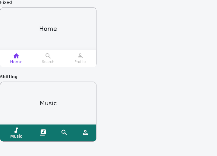
From frus-examples/widgets/src/features/navigation/widgets/bottomnavbar.rs:
//! `BottomNavigationBar` — the classic bar of three to five destinations along the bottom
//! of a phone screen. A fixed bar keeps every item the same width; a shifting one widens
//! the selected item, shows only its label and takes its colour.

use frus::{
    Align, BottomNavigationBar, BottomNavigationBarItem, BottomNavigationBarType, Center, Color,
    Column, Container, Expanded, Icons, State, StateContext, StatefulWidget, Text, Widget,
};

use crate::common::shared::{section, sections};

pub fn example() -> Box<dyn Widget> {
    Box::new(BottomNavigationBarDemo.into_widget())
}

/// The selected item of each bar is the demo's state: the bar shows what it is told and
/// reports the item tapped.
struct BottomNavigationBarDemo;

#[derive(Default)]
struct BottomNavigationBarDemoState {
    fixed: usize,
    shifting: usize,
}

impl StatefulWidget for BottomNavigationBarDemo {
    type State = BottomNavigationBarDemoState;

    fn create_state(&self) -> BottomNavigationBarDemoState {
        BottomNavigationBarDemoState::default()
    }
}

const FIXED: [&str; 3] = ["Home", "Search", "Profile"];
const SHIFTING: [&str; 4] = ["Music", "Library", "Search", "Profile"];

impl State for BottomNavigationBarDemoState {
    type Widget = BottomNavigationBarDemo;

    fn build(&self, cx: &StateContext<Self>) -> Box<dyn Widget> {
        // Three items: a fixed bar. Every label shows; the selected item takes the
        // selected colour, and an item may have an icon of its own for when it is selected.
        let fixed =
            BottomNavigationBar::new(self.fixed, cx.handler(|s: &mut Self, i: usize| s.fixed = i))
                .item(BottomNavigationBarItem::new(Icons::HOME, "Home"))
                .item(BottomNavigationBarItem::new(Icons::SEARCH, "Search"))
                .item(
                    BottomNavigationBarItem::new(Icons::PERSON_OUTLINE, "Profile")
                        .active_icon(Icons::PERSON)
                        .tooltip("Your profile"),
                )
                .selected_item_color(Color::hex("#7C3AED"));

        // Four items: a shifting bar. Tap one and its colour spreads from it across the bar.
        let shifting = BottomNavigationBar::new(
            self.shifting,
            cx.handler(|s: &mut Self, i: usize| s.shifting = i),
        )
        .kind(BottomNavigationBarType::Shifting)
        .items([
            BottomNavigationBarItem::new(Icons::MUSIC_NOTE, "Music")
                .background_color(Color::hex("#0F766E")),
            BottomNavigationBarItem::new(Icons::LIBRARY_MUSIC, "Library")
                .background_color(Color::hex("#B45309")),
            BottomNavigationBarItem::new(Icons::SEARCH, "Search")
                .background_color(Color::hex("#1D4ED8")),
            BottomNavigationBarItem::new(Icons::PERSON_OUTLINE, "Profile")
                .background_color(Color::hex("#BE123C")),
        ]);

        sections(vec![
            Box::new(section("Fixed", phone(FIXED[self.fixed], fixed))),
            Box::new(section(
                "Shifting",
                phone(SHIFTING[self.shifting], shifting),
            )),
        ])
    }
}

/// A small phone-shaped frame: the page above, the bar along the bottom.
fn phone(page: &str, bar: BottomNavigationBar) -> Container {
    Container::new()
        .width(320.0)
        .height(200.0)
        .border(1.0, Color::hex("#A1A1AA"))
        .radius(12.0)
        .clip()
        .child(
            Column::new()
                .cross_axis_alignment(Align::Stretch)
                .child(Expanded::new(Center::new(Text::new(page).size(20.0))))
                .child(bar),
        )
}
Properties
| Method | Argument | Effect |
|---|---|---|
.item() | item: BottomNavigationBarItem | Adds a destination. |
.items() | items: impl IntoIterator<Item = BottomNavigationBarItem> | Adds several destinations. |
.kind() | kind: BottomNavigationBarType | Which kind of bar. Unset, fixed for three items or fewer and shifting for more. |
.elevation() | elevation: f32 | How far the bar sits off the page. 8 unless told. |
.background_color() | color: Color | The bar's colour, for a fixed bar. A shifting bar takes its selected item's. |
.icon_size() | size: f32 | The icons' size. 24 unless told. |
.selected_item_color() | color: Color | The selected item's colour, icon and label. |
.unselected_item_color() | color: Color | The other items' colour. |
.selected_font_size() | size: f32 | The selected label's size. 14 unless told; a selected label style's own size wins. |
.unselected_font_size() | size: f32 | The other labels' size. 12 unless told; an unselected label style's own size wins. |
.selected_label_style() | style: TextStyle | The selected label's type. |
.unselected_label_style() | style: TextStyle | The other labels' type. |
.show_selected_labels() | show: bool | Whether the selected item's label shows. It does unless told. |
.show_unselected_labels() | show: bool | Whether the other items' labels show. On a fixed bar and not a shifting one, unless told. |
.landscape_layout() | layout: BottomNavigationBarLandscapeLayout | How the bar lays out in landscape. Spread unless told. |
.use_legacy_color_scheme() | legacy: bool | Whether the icons and labels take one colour between them (true, the default and the long-standing look), or the labels' styles and the shifting bar's selected colour each have their say (false). |
Behaviour
A bar of three to five destinations along the bottom of the screen, the selected one marked by colour — and, on a shifting bar, by its width, its label and the bar's own colour.
use frus_widgets::{BottomNavigationBar, BottomNavigationBarItem, Icons};

let bar: BottomNavigationBar = BottomNavigationBar::new(0, |index| {
    let _ = index; // show that destination
})
.item(BottomNavigationBarItem::new(Icons::HOME, "Home"))
.item(BottomNavigationBarItem::new(Icons::SEARCH, "Search"))
.item(BottomNavigationBarItem::new(Icons::PERSON, "Profile"));
See also
- TabBar: tabs and the panel of the selected one: primary, secondary, icons, scrolling, swiping.
- BottomBar: the main destinations along the bottom of a phone screen.
- NavigationRail: the main destinations down the side of a tablet or desktop window.
- NavScaffold: navigation that becomes a bar, a rail or an extended rail with the size class.
- Drawer & drawer headers: a side panel that slides over the page or sits docked beside it.
- The guide: Screens, navigation and dialogs
- API reference:
BottomNavigationBar
Source: crates/frus-widgets/src/bottomnavbar.rs @ e6fba33f5b42