BottomAppBar
Purpose
A bar of actions along the bottom, notched for a docked action button.
Signature
pub struct BottomAppBar<Msg = crate::callback::Callback> { .. }

impl BottomAppBar {
    pub fn new() -> Self;
}
Example
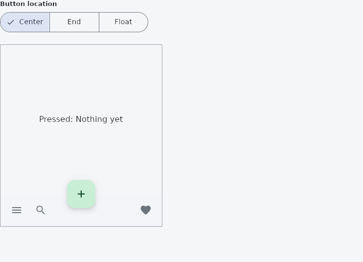
From frus-examples/widgets/src/features/navigation/widgets/bottomappbar.rs:
//! `BottomAppBar` — a bar of actions along the bottom of a screen, for the screen you
//! are on (not for moving between screens). The scaffold cuts a notch in it for a
//! docked floating action button.

use frus::{
    bar_spacer, BottomAppBar, Center, Color, Container, FabLocation, FloatingActionButton,
    IconButton, Icons, Insets, Row, Scaffold, SegmentedButton, State, StateContext, StatefulWidget,
    Text, Widget,
};

use crate::common::shared::{section, sections};

pub fn example() -> Box<dyn Widget> {
    Box::new(BottomAppBarDemo.into_widget())
}

struct BottomAppBarDemo;

#[derive(Default)]
struct BottomAppBarDemoState {
    /// Index into `LOCATIONS`.
    fab_at: usize,
    last: &'static str,
}

/// Short labels, so the three segments fit a phone: "Center" and "End" sit docked in
/// the bar's notch, "Float" floats above the bar at the end.
const LOCATIONS: [(&str, FabLocation); 3] = [
    ("Center", FabLocation::CenterDocked),
    ("End", FabLocation::EndDocked),
    ("Float", FabLocation::EndFloat),
];

impl StatefulWidget for BottomAppBarDemo {
    type State = BottomAppBarDemoState;

    fn create_state(&self) -> BottomAppBarDemoState {
        BottomAppBarDemoState {
            fab_at: 0,
            last: "Nothing yet",
        }
    }
}

impl State for BottomAppBarDemoState {
    type Widget = BottomAppBarDemo;

    fn build(&self, cx: &StateContext<Self>) -> Box<dyn Widget> {
        let pressed = |what: &'static str| cx.callback(move |s: &mut Self| s.last = what);

        // The bar holds any row; `bar_spacer()` pushes what follows to the far end.
        let bar = BottomAppBar::new().child(
            Row::new()
                .child(
                    IconButton::new(Icons::MENU)
                        .label("Menu")
                        .on_press(pressed("Menu")),
                )
                .child(
                    IconButton::new(Icons::SEARCH)
                        .label("Search")
                        .on_press(pressed("Search")),
                )
                .child(bar_spacer())
                .child(
                    IconButton::new(Icons::FAVORITE)
                        .label("Favourite")
                        .on_press(pressed("Favourite")),
                ),
        );

        // The notch is the scaffold's decision: it knows where it puts the button.
        let shell = Scaffold::new()
            .size(320.0, 360.0)
            .insets(Insets::ZERO)
            .primary(false)
            .background(cx.theme().background)
            .body(Center::new(Text::new(format!("Pressed: {}", self.last))))
            .bottom_app_bar(bar)
            .fab(FloatingActionButton::new(Icons::ADD).on_press(pressed("Add")))
            .fab_location(LOCATIONS[self.fab_at].1)
            .build();

        let picker = LOCATIONS.iter().fold(
            SegmentedButton::new(
                self.fab_at,
                cx.handler(|s: &mut Self, i: usize| s.fab_at = i),
            ),
            |picker, (name, _)| picker.segment(*name),
        );

        sections(vec![
            Box::new(section("Button location", picker)),
            Box::new(
                Container::new()
                    .width(322.0)
                    .height(362.0)
                    .border(1.0, Color::hex("#A1A1AA"))
                    .clip()
                    .child(shell),
            ),
        ])
    }
}
Properties
| Method | Argument | Effect |
|---|---|---|
.child() | child: impl Widget<Msg> + 'static | What the bar carries — usually a row of buttons. |
.color() | color: Color | The bar's colour. The theme's surface by default. |
.height() | height: f32 | The bar's height (64 px by default). |
.padding() | padding: f32 | The padding around its content. |
.notch_margin() | margin: f32 | The gap left between the notch and the button it receives (4 px by default). |
Behaviour
A bottom bar of actions, optionally notched for a docked floating action button.
See also
- Drawer & drawer headers: a side panel that slides over the page or sits docked beside it.
- NavigationDrawer: a side panel's list of destinations, with a header, badges and a footer.
- NavigationBar: a simple screen header: a centred title and a back button.
- CollapsingHeader: a tall header that shrinks to a toolbar as the page under it scrolls.
- Steps: the numbered step indicator of a wizard or multi-step form.
- The guide: Screens, navigation and dialogs
- API reference:
BottomAppBar
Source: crates/frus-widgets/src/bottomappbar.rs @ e6fba33f5b42