Placeholder
Purpose
A crossed box standing in for a widget not written yet.
Signature
pub struct Placeholder { .. }

impl Placeholder {
    pub fn new() -> Self;
}
Example
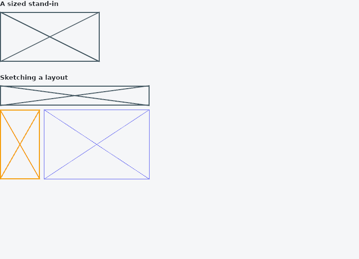
From frus-examples/widgets/src/features/layout/widgets/placeholder.rs:
//! `Placeholder` — a crossed box standing in for a widget you have not written yet, so
//! the shape of a layout is readable before any of it is built.

use frus::{Align, Color, Column, MainAxisSize, Placeholder, Row, Widget};

use crate::common::shared::{section, sections};

pub fn example() -> Box<dyn Widget> {
    sections(vec![
        // `fallback` gives it a size of its own (400 × 400 unless told otherwise).
        Box::new(section(
            "A sized stand-in",
            Placeholder::new().fallback(200.0, 100.0),
        )),
        // Sketching a screen: a header, a side bar and a content area, before any of
        // them exist. The colour and the stroke width can be changed, to tell the parts
        // apart.
        Box::new(section(
            "Sketching a layout",
            Column::new()
                .spacing(8.0)
                .cross_axis_alignment(Align::Start)
                .child(Placeholder::new().fallback(300.0, 40.0))
                .child(
                    Row::new()
                        .main_axis_size(MainAxisSize::Min)
                        .spacing(8.0)
                        .child(
                            Placeholder::new()
                                .color(Color::hex("#F59E0B"))
                                .fallback(80.0, 140.0),
                        )
                        .child(
                            Placeholder::new()
                                .color(Color::hex("#6366F1"))
                                .stroke(1.0)
                                .fallback(212.0, 140.0),
                        ),
                ),
        )),
    ])
}
Properties
| Method | Argument | Effect |
|---|---|---|
.color() | color: Color | The colour of the box and its diagonals. |
.stroke() | stroke: f32 | The stroke width. |
.fallback() | width: f32, height: f32 | The size to take when nothing constrains it. |
Behaviour
A crossed box standing in for a widget not written yet.
See also
- OverflowBar: a row of buttons that becomes a column when they stop fitting.
- TwoPane & responsive: a list and its detail side by side when wide, one at a time when narrow.
- The guide: Laying out a screen
- API reference:
Placeholder
Source: crates/frus-widgets/src/placeholder.rs @ e6fba33f5b42