OverflowBar
Purpose
A row of buttons that becomes a column when they stop fitting.
Signature
pub struct OverflowBar<Msg = crate::callback::Callback> { .. }

impl OverflowBar {
    pub fn new() -> Self;
}
Example
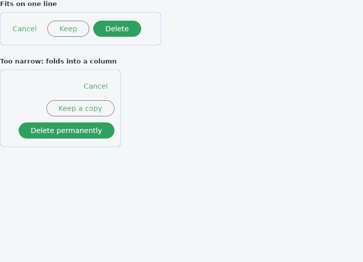
From frus-examples/widgets/src/features/layout/widgets/overflow_bar.rs:
//! `OverflowBar` — a row of buttons that becomes a column when they stop fitting.
//!
//! Unlike `Wrap`, it folds all of its children or none: never a second line with one
//! button stranded on it. It is the bar for dialog actions, which must survive a larger
//! system font size.

use frus::{Align, Button, Color, Container, Justify, OverflowBar, Variant, Widget};

use crate::common::shared::{section, sections};

pub fn example() -> Box<dyn Widget> {
    sections(vec![
        // Short labels with room enough: one line, pushed to the end as dialog actions
        // are.
        Box::new(section(
            "Fits on one line",
            framed(320.0, actions(["Cancel", "Keep", "Delete"])),
        )),
        // Longer labels in a narrower box: the buttons fold into a column, aligned at
        // the end, with `overflow_spacing` between them — never a squashed row.
        Box::new(section(
            "Too narrow: folds into a column",
            framed(
                240.0,
                actions(["Cancel", "Keep a copy", "Delete permanently"]),
            ),
        )),
    ])
}

fn actions([cancel, keep, delete]: [&str; 3]) -> OverflowBar {
    // A button with no `on_press` is disabled; these do nothing but stay enabled.
    OverflowBar::new()
        .spacing(8.0)
        .alignment(Justify::End)
        .overflow_spacing(4.0)
        .overflow_alignment(Align::End)
        .child(Button::new(cancel).variant(Variant::Text).on_press(|| ()))
        .child(Button::new(keep).variant(Variant::Outlined).on_press(|| ()))
        .child(Button::new(delete).on_press(|| ()))
}

fn framed(width: f32, bar: OverflowBar) -> Container {
    Container::new()
        .width(width)
        .padding(12.0)
        .radius(8.0)
        .border(1.0, Color::hex("#C7D2FE"))
        .child(bar)
}
Properties
| Method | Argument | Effect |
|---|---|---|
.child() | child: impl Widget<Msg> + 'static | Adds a child, after the ones already there. |
.child_boxed() | child: Box<dyn Widget<Msg>> | Adds an already boxed child — what a builder holding Vec<Box<dyn Widget>> has to hand. |
.spacing() | spacing: f32 | The space between the children on one line. |
.overflow_spacing() | spacing: f32 | The space between them once they have stacked. |
.alignment() | alignment: Justify | How the children are distributed along the line while they fit. |
.overflow_alignment() | alignment: Align | Which edge the column lines up on once they have stacked. |
.overflow_direction() | direction: VerticalDirection | Which way the column runs once they have stacked. |
Behaviour
A row of children that folds into a column when they do not fit on one line.
A flex row does not wrap and its children do not shrink, so a row of buttons that has run out of room keeps its natural width and is drawn straight past whatever is holding it — which is what a reader who has turned their system font size up gets, every time. A bar folds instead, and folds all of them rather than stranding the last one on a second line the way a Wrap would.
OverflowBar::new()
    .spacing(8.0)
    .alignment(Justify::End)
    .overflow_alignment(Align::End)
    .child(button("Cancel", Msg::Close))
    .child(button("Delete permanently", Msg::Delete))
The arrangement is chosen during layout, from the box actually offered and the natural width of the children measured under the theme in force — which is what lets the text scale reach it. That has a price, the same one LayoutBuilder pays: the subtree is composed more than once a frame, so the children are held by shared pointer, and a deferred overlay declared inside a bar does not open. Clicks, hover, focus and the accessibility tree all work; a tooltip on a button in a bar does not, and belongs around the bar instead.
No child is ever wider than the bar: one that would be is capped, and ellipsises or wraps inside its own box rather than escaping it.
See also
- LayoutBuilder & OrientationBuilder: builds from the room actually given, so a component adapts wherever it is placed.
- CustomMultiChildLayout: children measured and placed by a function you write.
- TwoPane & responsive: a list and its detail side by side when wide, one at a time when narrow.
- Placeholder: a crossed box standing in for a widget not written yet.
- The guide: Laying out a screen
- API reference:
OverflowBar
Source: crates/frus-widgets/src/overflowbar.rs @ e6fba33f5b42