Container
Purpose
One box that sizes, pads, colours, rounds, borders and shadows its child.
Signature
pub struct Container<Msg = crate::callback::Callback> { .. }

impl Container {
    pub fn new() -> Self;
}
Example
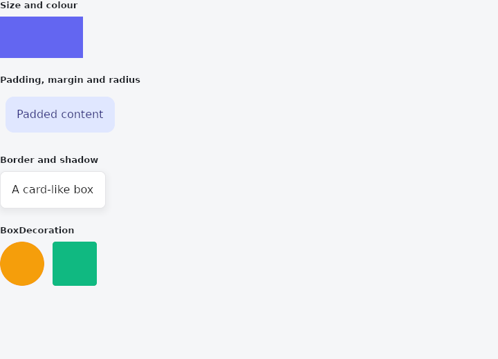
From frus-examples/widgets/src/features/layout/widgets/container.rs:
//! `Container` — one box that can size, pad, colour, round, border and shadow its child.

use frus::{BorderRadius, BoxDecoration, BoxShadow, Color, Colors, Container, Row, Text, Widget};

use crate::common::shared::{section, sections};

pub fn example() -> Box<dyn Widget> {
    sections(vec![
        // The simplest use: a fixed size and a colour.
        Box::new(section(
            "Size and colour",
            Container::new()
                .width(120.0)
                .height(60.0)
                .color(Color::hex("#6366F1")),
        )),
        // Padding is inside the box, margin outside it; `radius` rounds the corners.
        Box::new(section(
            "Padding, margin and radius",
            Container::new()
                .padding(16.0)
                .margin(8.0)
                .radius(12.0)
                .color(Color::hex("#E0E7FF"))
                .child(Text::new("Padded content").color(Color::hex("#312E81"))),
        )),
        // A border, and a shadow under it.
        Box::new(section(
            "Border and shadow",
            Container::new()
                .padding(16.0)
                .radius(8.0)
                .color(Colors::WHITE)
                .border(1.0, Color::hex("#E4E4E7"))
                .shadows([BoxShadow::new(
                    0.0,
                    4.0,
                    12.0,
                    Color::rgba(0.0, 0.0, 0.0, 0.15),
                )])
                .child(Text::new("A card-like box").color(Color::hex("#09090B"))),
        )),
        // `decoration` takes the whole description at once — what a theme or a design
        // system would hand you.
        Box::new(section(
            "BoxDecoration",
            Row::new()
                .spacing(12.0)
                .child(
                    Container::new().width(64.0).height(64.0).decoration(
                        BoxDecoration::filled(Color::hex("#F59E0B"))
                            .radius(BorderRadius::uniform(32.0)),
                    ),
                )
                .child(Container::new().width(64.0).height(64.0).decoration(
                    BoxDecoration::filled(Color::hex("#10B981")).radius(BorderRadius::uniform(4.0)),
                )),
        )),
    ])
}
Properties
| Method | Argument | Effect |
|---|---|---|
.min_width() | width: f32 | — |
.max_width() | width: f32 | At most width wide. |
.min_height() | height: f32 | At least height tall. |
.max_height() | height: f32 | At most height tall. |
.translated() | dx: f32, dy: f32 | — |
.scaled() | sx: f32, sy: f32 | Scaled by (sx, sy) when painted, about the transform_alignment. |
.rotated() | radians: f32 | Turned by radians when painted, about the transform_alignment. |
.transform_alignment() | pivot: frus_core::Alignment | The point a scale and a turn are about, within the box. Unset, its centre. |
.repaint_boundary() | — | Marks this container as a repaint boundary: its subtree is cached and reused for as long as its geometry and its descendants' interaction state stay stable. To be placed around static content that would otherwise be repainted on every frame of a neighbouring animation. |
.width() | width: f32 | Sets the width, in logical pixels. |
.height() | height: f32 | Sets the height, in logical pixels. |
.width_fraction() | fraction: f32 | Sets the width as a fraction of the space the parent offers — 1.0 fills it. |
.flex() | grow: f32 | Flex growth factor along the parent's main axis. |
.shrink() | shrink: f32 | How much of a row's deficit this box absorbs. |
.no_shrink() | — | This box never shrinks — the default said out loud, kept because a layout that depends on it reads better for saying so. See Self::shrink. |
.padding() | padding: f32 | Uniform inner padding, in logical pixels. |
.padding_each() | top: f32, right: f32, bottom: f32, left: f32 | Inner padding per side (top, right, bottom, left). |
.padding_insets() | padding: impl Into<InsetsGeometry> | Sets the padding from any insets: one number, physical Insets — whose left stays on the left in a right-to-left script — or InsetsDirectional, whose start is the right there. |
.margin_insets() | margin: impl Into<InsetsGeometry> | Sets the margin from any insets, as padding_insets does the padding. |
.margin() | margin: f32 | A uniform outer margin: space reserved around the box — outside the decoration, it pushes the siblings away without growing the background or the border. |
.margin_each() | top: f32, right: f32, bottom: f32, left: f32 | Outer margin per side (top, right, bottom, left). |
.radius() | radius: impl Into<BorderRadius> | The rounded corner radii: uniform via f32 (.radius(10.0)) or per corner via BorderRadius (.radius(BorderRadius::top(12.0))). |
.clip() | — | Clips the child to this box, corners included. |
.border() | width: f32, color: Color | The border: width (in px) and color, the same on all four sides. |
.box_border() | border: impl Into<BoxBorder> | The border, side by side — a Border or a BorderDirectional, each side its own width and colour (milestone 641). |
.shape() | shape: BoxShape | A rectangle or a circle (milestone 641). A circle is centred in the box, as wide as its shorter side, and its radius is not read. |
.shadows() | shadows: impl IntoIterator<Item = BoxShadow> | The shadows, painted in order behind the box (milestone 641). |
.color() | color: Color | The background color at rest. |
.hover_color() | color: Color | The background color on hover. |
.pressed_color() | color: Color | The background color when pressed. |
.gradient() | end: Color, dir: [f32; 2] | A linear background gradient (color → end), with dir in [0,1]² space ([0.0, 1.0] = top→bottom, for instance). |
.image() | image: DecorationImage | A picture over the background, under the border, clipped to the corners or the circle — fitted, aligned, repeated or sliced as the DecorationImage says. |
.background_blend_mode() | mode: frus_core::BlendMode | Blends the background — the colour or the gradient — with what is under the box by mode rather than painting it over: a multiply that darkens the picture behind, a colour that tints it, a difference that inverts it. |
.shadow() | dx: f32, dy: f32, blur: f32, color: Color | A drop shadow: the (dx, dy) offset, the blur radius and the color. Each call adds one, over those already there. |
.on_click() | message: impl Into<Msg> | The message emitted when the container is clicked. |
.on_long_press() | message: impl Into<Msg> | The message emitted by a long press (a press held without movement). A long press supersedes the click. |
.child() | child: impl Widget<Msg> + 'static | Sets the container's child. |
.opacity() | opacity: f32 | Applies a group opacity [0,1] to the whole subtree, as one block: the rendering goes through a composited layer, so overlaps are not double-blended. 1.0 = no effect at all. |
.animated_opacity() | opacity: f32, duration: f32, curve: Curve | Like Container::opacity, but the opacity animates toward opacity on every change, with duration (in seconds) and curve. The fade applies to the whole group. |
.animated_color() | color: Color, duration: f32, curve: Curve | A background whose color animates toward color on every change, with duration (in seconds) and curve. The runtime interpolates from the current color; on mount it adopts color with no transition. Note: one box shares a single (duration, curve) across its animations (opacity, color). |
.animated_size() | width: f32, height: f32, duration: f32, curve: Curve | A box whose size animates toward width×height on every change, with duration and curve. The interpolated size is injected at layout time (the children reposition accordingly). On mount it adopts the target with no transition. |
.animated_radius() | radius: impl Into<BorderRadius>, duration: f32, curve: Curve | A box whose corner radius animates toward radius on every change, with duration and curve — the corners morph smoothly. Uniform via f32, or per corner via BorderRadius. On mount it adopts the target with no transition. |
.animated_padding() | padding: f32, duration: f32, curve: Curve | A box whose (uniform) inner padding animates toward padding on every change, with duration and curve. The interpolated padding is injected at layout time (the content repositions). On mount it adopts the target with no transition. |
.animated_alignment() | alignment: impl Into<AlignmentGeometry>, duration: f32, curve: Curve | A box whose anchor animates toward alignment on every change, with duration and curve: the child slides through the free space instead of jumping across it. On mount it adopts the anchor with no transition. |
.alignment() | alignment: impl Into<AlignmentGeometry> | Anchors the child within the box: centred, in a corner, against an edge… Accepts a physical anchor (Alignment) or a directional one (AlignmentDirectional, resolved for RTL at render time) — both through Into. By default, with no anchor, the child stretches to fill the container (the flex behaviour); setting an anchor leaves the child at its natural size and positions it. |
.foreground() | decoration: BoxDecoration | — |
.decoration() | decoration: BoxDecoration | Sets the box's fill, gradient, picture, blend mode, border, shadows and shape from a BoxDecoration at once. What the decoration leaves unset changes nothing; the radius and the shape are always adopted. |
Behaviour
A decorated rectangular box.
See also
- Padding: empty space around a child, on every side or each side on its own.
- Center & Aligned: places one child somewhere inside the room it is given.
- Row & Column: children in a line, across or down, with alignment on both axes and spacing.
- The guide: Laying out a screen
- API reference:
Container
Source: crates/frus-widgets/src/container.rs @ e6fba33f5b42