Semantics
Purpose
What a screen reader is told about a widget, said from outside it.
Signature
pub struct Semantics<Msg = crate::callback::Callback> { .. }

impl Semantics {
    pub fn new(props: SemanticsProperties, child: impl Widget<Msg> + 'static) -> Self;
    pub fn heading(child: impl Widget<Msg> + 'static) -> Self;
    pub fn merge(child: impl Widget<Msg> + 'static) -> Self;
}
Example
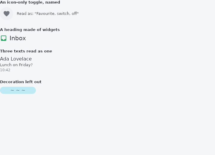
From frus-examples/widgets/src/features/interaction/widgets/semantics.rs:
//! `Semantics`, `ExcludeSemantics` — what a screen reader is told about a widget, said
//! from outside it.
//!
//! Built-in widgets describe themselves (a button says it is a button, with its label).
//! These wrappers are for what only you know: an icon-only control's name, a row that is
//! really one thing, a heading made of a widget, a decoration that should stay silent.
//! Nothing changes on screen — turn on a screen reader (Narrator, TalkBack) to hear it.

use frus::{
    component, Align, Alignment, Column, Container, ExcludeSemantics, Icon, Icons, Role, Row,
    Semantics, SemanticsProperties, Text, Widget,
};

use crate::common::shared::{section, sections};

pub fn example() -> Box<dyn Widget> {
    Box::new(component(|cx| {
        let liked = cx.use_state(|| false);
        let on = liked.get();
        let scheme = &cx.theme().scheme;

        // A home-made toggle drawn with a bare icon: without help a reader finds nothing
        // to announce. Give it a role, a name, its state, and say it can be activated.
        let flip = liked.clone();
        let heart = Semantics::new(
            SemanticsProperties::new(Role::Switch),
            Container::new()
                .padding(10.0)
                .radius(24.0)
                .color(scheme.surface_container_high)
                .on_click(move || flip.update(|on| *on = !*on))
                .child(Icon::new(Icons::FAVORITE).color(if on {
                    scheme.error
                } else {
                    scheme.outline
                })),
        )
        .label("Favourite")
        .toggled(on)
        .clickable(true);

        // A heading made of several widgets: announced once, as a landmark.
        let heading = Semantics::heading(
            Row::new()
                .spacing(8.0)
                .cross_axis_alignment(Align::Center)
                .child(Icon::new(Icons::INBOX).color(scheme.primary))
                .child(Text::new("Inbox").size(20.0)),
        );

        // A row of separate texts that is really one statement: merged, it is read as
        // one item rather than three.
        let merged = Semantics::merge(
            Column::new()
                .spacing(2.0)
                .cross_axis_alignment(Align::Start)
                .child(Text::new("Ada Lovelace"))
                .child(Text::new("Lunch on Friday?").size(13.0))
                .child(
                    Text::new("10:42")
                        .size(12.0)
                        .color(scheme.on_surface_variant),
                ),
        );

        // A purely decorative picture: nothing to say, so say nothing.
        let decoration = ExcludeSemantics::new(
            Container::new()
                .width(120.0)
                .height(24.0)
                .radius(12.0)
                .color(scheme.tertiary_container)
                .alignment(Alignment::CENTER)
                .child(Text::new("~ ~ ~").color(scheme.on_tertiary_container)),
        );

        sections(vec![
            Box::new(section(
                "An icon-only toggle, named",
                Row::new()
                    .spacing(12.0)
                    .cross_axis_alignment(Align::Center)
                    .child(heart)
                    .child(
                        Text::new(format!(
                            "Read as: \"Favourite, switch, {}\"",
                            if on { "on" } else { "off" }
                        ))
                        .size(13.0),
                    ),
            )),
            Box::new(section("A heading made of widgets", heading)),
            Box::new(section("Three texts read as one", merged)),
            Box::new(section("Decoration left out", decoration)),
        ])
    }))
}
Properties
| Method | Argument | Effect |
|---|---|---|
.merging() | merging: bool | Whether this speaks for the subtree (dropping its annotations and carrying over what they said) or merely beside it. Off by default; see the type's docs for why that is the safe default rather than the faithful one. |
.label() | label: impl Into<String> | Sets the accessible name — what a screen reader reads out. |
.value() | value: impl Into<String> | Sets the textual value: a field's contents, a slider's position. |
.role() | role: Role | Sets the announced role. |
.toggled() | on: bool | Marks it checked or unchecked. |
.clickable() | clickable: bool | Announces it as actionable — the reader offers "activate". |
.disabled() | disabled: bool | Announces it as disabled. |
Behaviour
// A widget title announced as a landmark rather than as one more run of prose.
Semantics::heading(my_title_widget)

// A row of two controls that reads as one thing.
Semantics::merge(Flex::row().child(Checkbox::new(on)).child(Text::new("Notifications")))
It adds a node; merging replaces them
By default this adds an annotation and leaves the child's alone: safe, and what a caller naming an otherwise anonymous box wants. Semantics::merging is the other answer — the subtree's annotations are dropped and this one speaks for all of them, carrying over what they said through SemanticsProperties::over.
The default is the additive one because the destructive one cannot be undone by the caller. Wrapping a whole screen to name it, under a merging default, would collapse every control on it into a single node; the reverse mistake leaves one node too many, which is noise rather than loss.
What the flat tree costs
This framework's accessibility tree is flat: every annotated widget is a child of the window.
See also
- Visibility & Offstage: hide a child, keeping its box, its input, or nothing at all.
- Disabled state: one enabled flag on every control: greyed out, inert, value kept.
- Permission: asking for the camera, the microphone, the location and notifications.
- The guide: Taking input
- API reference:
Semantics
Source: crates/frus-widgets/src/semantics.rs @ e6fba33f5b42