InkWell
Purpose
Makes any content pressable, with an ink ripple, hover and focus feedback.
Signature
pub struct InkWell<Msg = crate::callback::Callback> { .. }

impl InkWell {
    pub fn new() -> Self;
}
Example
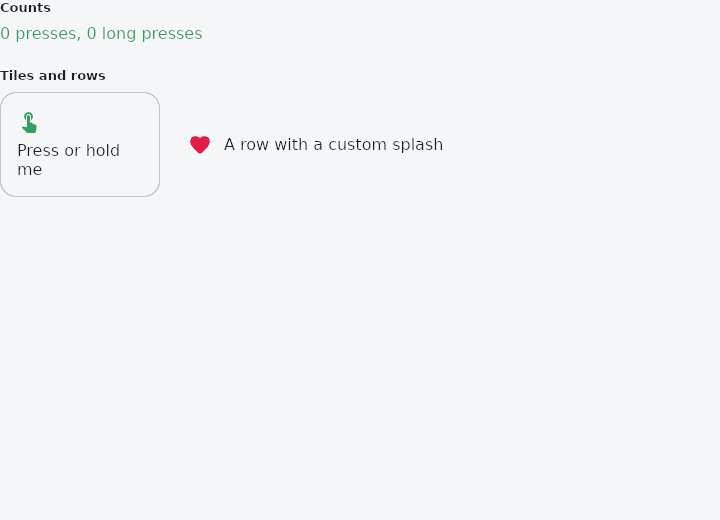
From frus-examples/widgets/src/features/interaction/widgets/ink_well.rs:
//! `InkWell` — makes any content pressable, with the ink ripple that spreads from the
//! point of contact, a hover tint and a focus highlight.
//!
//! Use it for custom tiles and rows that should feel like buttons. It answers a click and
//! a long press; for more gestures, put a `GestureDetector` around it.

use frus::{
    component, Align, Color, Column, Container, Icon, Icons, InkWell, Row, Text, Widget, Wrap,
};

use crate::common::shared::{section, sections};

pub fn example() -> Box<dyn Widget> {
    Box::new(component(|cx| {
        let presses = cx.use_state(|| 0_u32);
        let holds = cx.use_state(|| 0_u32);
        let scheme = &cx.theme().scheme;

        // A tile: the ink is clipped to `radius`, which should match the content's corners.
        let (press, hold) = (presses.clone(), holds.clone());
        let tile = InkWell::new()
            .radius(16.0)
            .on_click(move || press.update(|n| *n += 1))
            .on_long_press(move || hold.update(|n| *n += 1))
            .child(
                Container::new()
                    .width(160.0)
                    .padding(16.0)
                    .radius(16.0)
                    .border(1.0, scheme.outline_variant)
                    .child(
                        Column::new()
                            .spacing(8.0)
                            .cross_axis_alignment(Align::Start)
                            .child(Icon::new(Icons::TOUCH_APP).color(scheme.primary))
                            .child(Text::new("Press or hold me")),
                    ),
            );

        // The splash colour is yours to choose; the theme's is used otherwise.
        let press_row = presses.clone();
        let row = InkWell::new()
            .radius(8.0)
            .color(Color::rgba(0.9, 0.2, 0.4, 0.25))
            .on_click(move || press_row.update(|n| *n += 1))
            .child(
                Container::new().padding(12.0).child(
                    Row::new()
                        .spacing(12.0)
                        .cross_axis_alignment(Align::Center)
                        .child(Icon::new(Icons::FAVORITE).color(Color::hex("#E11D48")))
                        .child(Text::new("A row with a custom splash")),
                ),
            );

        sections(vec![
            Box::new(section(
                "Counts",
                Text::new(format!(
                    "{} presses, {} long presses",
                    presses.get(),
                    holds.get()
                ))
                .color(scheme.primary),
            )),
            Box::new(section(
                "Tiles and rows",
                Wrap::new().gap(16.0).run_gap(16.0).child(tile).child(row),
            )),
        ])
    }))
}
Properties
| Method | Argument | Effect |
|---|---|---|
.color() | color: Color | Overrides the splash colour, alpha included — the caller decides how present the ink is, not just what hue it takes. |
.radius() | radius: impl Into<BorderRadius> | The rounding the ink is clipped to (uniform via f32, per corner via BorderRadius). It should match whatever draws the surface underneath. |
.on_click() | msg: impl Into<Msg> | The message a tap emits. |
.on_long_press() | msg: impl Into<Msg> | The message a long press emits. |
.child() | child: impl Widget<Msg> + 'static | Sets the child. |
Behaviour
A pass-through in layout, like crate::ClipRRect: it takes the size its parent gives it and its child fills it. What it adds is the ink, and the tap that starts it.
InkWell::new()
    .radius(12.0)                          // the ink is clipped to this rounding
    .on_click(Msg::Open(id))
    .child(row)

InkWell::new().color(theme.scheme.primary.fade(0.16)).child(tile)   // its own colour
The splash sits over this widget and under its child, so a row of text tapped this way keeps its text on top of the ink, the way a material surface does.
See also
- GestureDetector: taps, double taps, long presses, right clicks and drags on any widget.
- MouseRegion: the mouse entering, moving over and leaving a widget, and the cursor there.
- Listener: the pointer's raw down, move, up and hover events.
- Draggable & DragTarget: pick a thing up and drop it on something else, with a payload.
- The guide: Taking input
- API reference:
InkWell
Source: crates/frus-widgets/src/ink.rs @ e6fba33f5b42