Disabled state
Purpose
One enabled flag on every control: greyed out, inert, value kept.
Signature
This demo shows a pattern rather than one type. The names it uses are in the example below, and each one is in the API reference.
Example
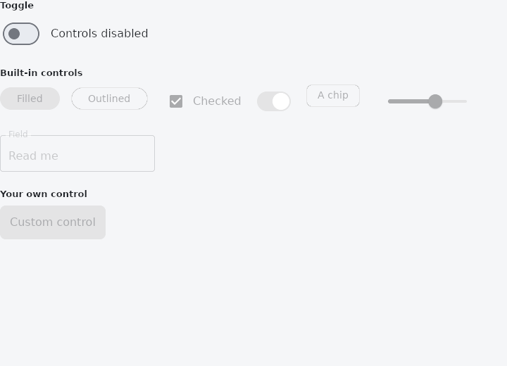
From frus-examples/widgets/src/features/interaction/widgets/disabled.rs:
//! The disabled state — one contract every control shares: `enabled(false)` greys it out
//! **and** makes it inert (no press, no ink, out of the Tab order, announced as disabled),
//! while it keeps showing its value.
//!
//! For a control of your own, `disabled_container(theme)` and `disabled_content(theme)`
//! give the same two colours the built-in ones use.

use frus::{
    component, disabled_container, disabled_content, Align, Button, Checkbox, Chip, Column,
    Container, Row, Slider, Switch, Text, TextField, Variant, Widget, Wrap,
};

use crate::common::shared::{section, sections};

pub fn example() -> Box<dyn Widget> {
    Box::new(component(|cx| {
        let enabled = cx.use_state(|| false);
        let checked = cx.use_state(|| true);
        let switched = cx.use_state(|| true);
        let level = cx.use_state(|| 0.6_f32);
        let on = enabled.get();
        let theme = cx.theme();
        let scheme = &theme.scheme;

        let flip = enabled.clone();
        let master = Row::new()
            .spacing(12.0)
            .cross_axis_alignment(Align::Center)
            .child(Switch::new(on).on_toggle(move |value| flip.set(value)))
            .child(Text::new(if on {
                "Controls enabled"
            } else {
                "Controls disabled"
            }));

        // The same `enabled` flag on every kind of control. A disabled control still
        // shows its value: the checkbox stays ticked, the slider stays where it was.
        let (tick, flick, slide) = (checked.clone(), switched.clone(), level.clone());
        let controls = Wrap::new()
            .gap(16.0)
            .run_gap(16.0)
            .child(Button::new("Filled").enabled(on).on_press(|| {}))
            .child(
                Button::new("Outlined")
                    .variant(Variant::Outlined)
                    .enabled(on)
                    .on_press(|| {}),
            )
            .child(
                Checkbox::new(checked.get())
                    .label("Checked")
                    .enabled(on)
                    .on_toggle(move |value| tick.set(value)),
            )
            .child(
                Switch::new(switched.get())
                    .enabled(on)
                    .on_toggle(move |value| flick.set(value)),
            )
            .child(Chip::new("A chip").enabled(on))
            .child(
                Slider::new(level.get())
                    .width(160.0)
                    .enabled(on)
                    .on_change(move |value| slide.set(value)),
            )
            .child(TextField::new("Read me").label("Field").enabled(on));

        // A home-made control in the same two colours: the fill and the content.
        let custom = Container::new()
            .padding(14.0)
            .radius(8.0)
            .color(if on {
                scheme.primary
            } else {
                disabled_container(theme)
            })
            .child(Text::new("Custom control").color(if on {
                scheme.on_primary
            } else {
                disabled_content(theme)
            }));

        sections(vec![
            Box::new(section("Toggle", master)),
            Box::new(section("Built-in controls", controls)),
            Box::new(section(
                "Your own control",
                Column::new()
                    .cross_axis_alignment(Align::Start)
                    .child(custom),
            )),
        ])
    }))
}
Properties
See the example.
Behaviour
The example shows it at work; the API reference has every method.
See also
- IgnorePointer & AbsorbPointer: switch off the pointer for a subtree: let taps through, or stop them.
- Visibility & Offstage: hide a child, keeping its box, its input, or nothing at all.
- Semantics: what a screen reader is told about a widget, said from outside it.
- Permission: asking for the camera, the microphone, the location and notifications.
- The guide: Taking input
Source: frus-examples/widgets/src/features/interaction/widgets/disabled.rs @ e6fba33f5b42