Stepper
Purpose
A whole number with − and + buttons on either side.
Signature
pub struct Stepper<Msg = crate::callback::Callback> { .. }

impl Stepper {
    pub fn new<R1: crate::callback::IntoMsg<Msg>>(
        value: i32,
        on_change: impl Fn(i32) -> R1 + 'static,
    ) -> Self;
}
Example
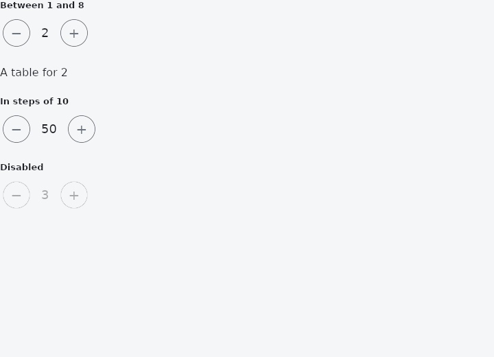
From frus-examples/widgets/src/features/inputs/widgets/stepper.rs:
//! `Stepper` — a whole number with − and + buttons on either side: a quantity in a
//! cart, a number of guests. (The numbered step indicator of a wizard is `Steps`.)

use frus::{State, StateContext, StatefulWidget, Stepper, Text, Widget};

use crate::common::shared::{section, sections};

pub fn example() -> Box<dyn Widget> {
    Box::new(StepperDemo.into_widget())
}

struct StepperDemo;

struct StepperDemoState {
    guests: i32,
    volume: i32,
}

impl StatefulWidget for StepperDemo {
    type State = StepperDemoState;

    fn create_state(&self) -> StepperDemoState {
        StepperDemoState {
            guests: 2,
            volume: 50,
        }
    }
}

impl State for StepperDemoState {
    type Widget = StepperDemo;

    fn build(&self, cx: &StateContext<Self>) -> Box<dyn Widget> {
        sections(vec![
            // `range` stops the buttons at the bounds.
            Box::new(section(
                "Between 1 and 8",
                Stepper::new(
                    self.guests,
                    cx.handler(|s: &mut StepperDemoState, v: i32| s.guests = v),
                )
                .range(1, 8),
            )),
            Box::new(Text::new(format!("A table for {}", self.guests))),
            // `step` changes how much one press moves the value.
            Box::new(section(
                "In steps of 10",
                Stepper::new(
                    self.volume,
                    cx.handler(|s: &mut StepperDemoState, v: i32| s.volume = v),
                )
                .range(0, 100)
                .step(10),
            )),
            Box::new(section(
                "Disabled",
                Stepper::new(3, cx.handler(|_: &mut StepperDemoState, _: i32| {})).enabled(false),
            )),
        ])
    }
}
Properties
| Method | Argument | Effect |
|---|---|---|
.range() | min: i32, max: i32 | Clamps the value to [min, max]. |
.enabled() | enabled: bool | Whether the value can be changed. Disabled, both buttons are inert and the value greys with them - and it is still readable, because read-only is not invisible. |
.step() | step: i32 | Sets the increment step, at least 1. |
Behaviour
An incremental numeric picker.
See also
- RangeSlider: two thumbs on one track, for picking an interval.
- Rating: a score given by tapping stars.
- DatePicker: a month calendar: one day, allowed days only, or a range.
- TimePicker & TimeRange: a time of day from an hour grid and a minute grid; or a start and an end.
- DateTimePicker: a calendar above a time picker, for one moment.
- The guide: Taking input
- API reference:
Stepper
Source: crates/frus-widgets/src/stepper.rs @ e6fba33f5b42