CheckboxListTile and RadioListTile and SwitchListTile
Purpose
List rows whose whole width works one control, for settings screens.
Signature
pub struct CheckboxListTile<Msg = crate::callback::Callback> { .. }

impl CheckboxListTile {
    pub fn new(value: bool, on_changed: Msg) -> Self;
    pub fn maybe(value: Option<bool>, on_changed: Msg) -> Self;
}
pub struct RadioListTile<Msg = crate::callback::Callback> { .. }

impl RadioListTile {
    pub fn new(selected: bool, on_changed: Msg) -> Self;
}
pub struct SwitchListTile<Msg = crate::callback::Callback> { .. }

impl SwitchListTile {
    pub fn new(value: bool, on_changed: Msg) -> Self;
}
Example
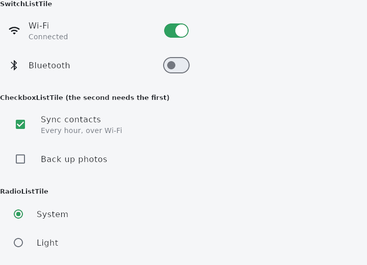
From frus-examples/widgets/src/features/inputs/widgets/control_tiles.rs:
//! `CheckboxListTile`, `RadioListTile` and `SwitchListTile` — list rows whose **whole
//! width** works one control. For settings screens: a tap anywhere on the row toggles,
//! not only on the 20-pixel box.

use frus::{
    Align, CheckboxListTile, Color, Column, ConstrainedBox, ControlAffinity, Icon, Icons,
    RadioListTile, State, StateContext, StatefulWidget, SwitchListTile, Widget,
};

use crate::common::shared::{section, sections};

pub fn example() -> Box<dyn Widget> {
    Box::new(TilesDemo.into_widget())
}

const THEMES: [&str; 3] = ["System", "Light", "Dark"];

struct TilesDemo;

struct TilesDemoState {
    wifi: bool,
    bluetooth: bool,
    sync: bool,
    backup: bool,
    theme: usize,
}

impl StatefulWidget for TilesDemo {
    type State = TilesDemoState;

    fn create_state(&self) -> TilesDemoState {
        TilesDemoState {
            wifi: true,
            bluetooth: false,
            sync: true,
            backup: false,
            theme: 0,
        }
    }
}

impl State for TilesDemoState {
    type Widget = TilesDemo;

    fn build(&self, cx: &StateContext<Self>) -> Box<dyn Widget> {
        // The rows take the message to send, not the new value: flip the field in it.
        let switches = Column::new()
            .cross_axis_alignment(Align::Stretch)
            .child(
                SwitchListTile::new(
                    self.wifi,
                    cx.callback(|s: &mut TilesDemoState| s.wifi = !s.wifi),
                )
                .title("Wi-Fi")
                .subtitle(if self.wifi { "Connected" } else { "Off" })
                .secondary(Icon::new(Icons::WIFI)),
            )
            .child(
                SwitchListTile::new(
                    self.bluetooth,
                    cx.callback(|s: &mut TilesDemoState| s.bluetooth = !s.bluetooth),
                )
                .title("Bluetooth")
                .secondary(Icon::new(Icons::BLUETOOTH))
                .active_color(Color::hex("#2563EB")),
            );

        // The control goes at the end by default; `Leading` puts it in front, where a
        // checkbox in a list usually sits.
        let checkboxes = Column::new()
            .cross_axis_alignment(Align::Stretch)
            .child(
                CheckboxListTile::new(
                    self.sync,
                    cx.callback(|s: &mut TilesDemoState| s.sync = !s.sync),
                )
                .title("Sync contacts")
                .subtitle("Every hour, over Wi-Fi")
                .control_affinity(ControlAffinity::Leading),
            )
            .child(
                CheckboxListTile::new(
                    self.backup,
                    cx.callback(|s: &mut TilesDemoState| s.backup = !s.backup),
                )
                .title("Back up photos")
                .control_affinity(ControlAffinity::Leading)
                .enabled(self.sync),
            );

        // Radio rows: each is "selected or not"; the state keeps which one is.
        let radios = THEMES.iter().enumerate().fold(
            Column::new().cross_axis_alignment(Align::Stretch),
            |column, (i, name)| {
                column.child(
                    RadioListTile::new(
                        self.theme == i,
                        cx.callback(move |s: &mut TilesDemoState| s.theme = i),
                    )
                    .title(*name)
                    .control_affinity(ControlAffinity::Leading),
                )
            },
        );

        // A list row stretches to the width it is given; `ConstrainedBox` bounds it.
        sections(vec![
            Box::new(section(
                "SwitchListTile",
                ConstrainedBox::new(switches).max_width(400.0),
            )),
            Box::new(section(
                "CheckboxListTile (the second needs the first)",
                ConstrainedBox::new(checkboxes).max_width(400.0),
            )),
            Box::new(section(
                "RadioListTile",
                ConstrainedBox::new(radios).max_width(400.0),
            )),
        ])
    }
}
Properties
| Type | Method | Argument | Effect |
|---|---|---|---|
CheckboxListTile | .title() | — | The row's first line. |
CheckboxListTile | .subtitle() | — | Its second. |
CheckboxListTile | .secondary() | — | The widget in the other slot — an icon, usually. The control takes the side control_affinity names and this takes the side left over. |
CheckboxListTile | .control_affinity() | — | — |
CheckboxListTile | .dense() | — | The tighter row. |
CheckboxListTile | .three_line() | — | A row tall enough for a two-line subtitle. |
CheckboxListTile | .selected() | — | Whether this is the row the reader is on, which is a different question from whether the control is on. |
CheckboxListTile | .enabled() | — | Whether the row and its control can be worked at all. Disabled, neither answers: a row that still reported a tap while its control refused one would be two controls disagreeing. |
CheckboxListTile | .tile_color() | — | The row's surface. |
CheckboxListTile | .selected_tile_color() | — | And its surface while it is the row the reader is on. |
CheckboxListTile | .shape() | — | What shape the row is. |
CheckboxListTile | .content_padding() | — | The room kept inside it. |
CheckboxListTile | .title_style() | — | The title's type. |
CheckboxListTile | .subtitle_style() | — | The subtitle's. |
CheckboxListTile | .active_color() | color: Color | The colour of a ticked box, over the theme's and primary. |
CheckboxListTile | .check_color() | color: Color | The colour of the tick itself. |
CheckboxListTile | .checkbox_radius() | radius: f32 | The box's corner. |
RadioListTile | .title() | — | The row's first line. |
RadioListTile | .subtitle() | — | Its second. |
RadioListTile | .secondary() | — | The widget in the other slot — an icon, usually. The control takes the side control_affinity names and this takes the side left over. |
RadioListTile | .control_affinity() | — | — |
RadioListTile | .dense() | — | The tighter row. |
RadioListTile | .three_line() | — | A row tall enough for a two-line subtitle. |
RadioListTile | .selected() | — | Whether this is the row the reader is on, which is a different question from whether the control is on. |
RadioListTile | .enabled() | — | Whether the row and its control can be worked at all. Disabled, neither answers: a row that still reported a tap while its control refused one would be two controls disagreeing. |
RadioListTile | .tile_color() | — | The row's surface. |
RadioListTile | .selected_tile_color() | — | And its surface while it is the row the reader is on. |
RadioListTile | .shape() | — | What shape the row is. |
RadioListTile | .content_padding() | — | The room kept inside it. |
RadioListTile | .title_style() | — | The title's type. |
RadioListTile | .subtitle_style() | — | The subtitle's. |
RadioListTile | .active_color() | color: Color | The ring and the dot while it is the chosen one, over the theme's and primary. |
SwitchListTile | .title() | — | The row's first line. |
SwitchListTile | .subtitle() | — | Its second. |
SwitchListTile | .secondary() | — | The widget in the other slot — an icon, usually. The control takes the side control_affinity names and this takes the side left over. |
SwitchListTile | .control_affinity() | — | — |
SwitchListTile | .dense() | — | The tighter row. |
SwitchListTile | .three_line() | — | A row tall enough for a two-line subtitle. |
SwitchListTile | .selected() | — | Whether this is the row the reader is on, which is a different question from whether the control is on. |
SwitchListTile | .enabled() | — | Whether the row and its control can be worked at all. Disabled, neither answers: a row that still reported a tap while its control refused one would be two controls disagreeing. |
SwitchListTile | .tile_color() | — | The row's surface. |
SwitchListTile | .selected_tile_color() | — | And its surface while it is the row the reader is on. |
SwitchListTile | .shape() | — | What shape the row is. |
SwitchListTile | .content_padding() | — | The room kept inside it. |
SwitchListTile | .title_style() | — | The title's type. |
SwitchListTile | .subtitle_style() | — | The subtitle's. |
SwitchListTile | .active_color() | color: Color | The thumb while it is on, over the theme's. |
SwitchListTile | .active_track_color() | color: Color | The track while it is on. |
Behaviour
CheckboxListTile
A row whose whole width ticks a box.
CheckboxListTile::new(true, Msg::Notify)
    .title("Notify me")
    .subtitle("About replies to my posts");
RadioListTile
A row whose whole width chooses one option.
It carries selected rather than a value and a group value: this framework's Radio reports being pressed and says nothing about what the answer becomes, so the application already holds the choice.
SwitchListTile
A row whose whole width flips a switch. The commonest shape a settings screen has.
See also
- RadioGroup & Radio: one choice out of a few, all visible at once.
- Switch: an on/off toggle that takes effect at once.
- Slider: a value picked by dragging along a track, continuous or in steps.
- RangeSlider: two thumbs on one track, for picking an interval.
- Rating: a score given by tapping stars.
- The guide: Taking input
- API reference:
CheckboxListTile - API reference:
RadioListTile - API reference:
SwitchListTile
Source: crates/frus-widgets/src/controltile.rs, crates/frus-widgets/src/controltile.rs, crates/frus-widgets/src/controltile.rs @ e6fba33f5b42