Checkbox
Purpose
A yes/no choice with an optional label, and a three-state version.
Signature
pub struct Checkbox<Msg = crate::callback::Callback> { .. }

impl Checkbox {
    pub fn new(checked: bool) -> Self;
    pub fn maybe(value: Option<bool>) -> Self;
}
Example
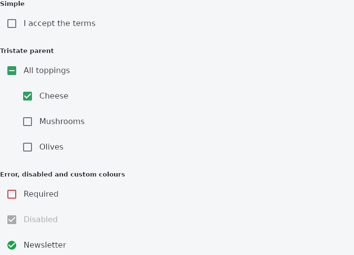
From frus-examples/widgets/src/features/inputs/widgets/checkbox.rs:
//! `Checkbox` — a yes/no choice, with an optional label beside it. `Checkbox::maybe` is
//! the three-state version: on, off, or partly on (a "select all" over a list).

use frus::{
    Align, Checkbox, Color, Column, Insets, Padding, State, StateContext, StatefulWidget, Widget,
};

use crate::common::shared::{section, sections};

pub fn example() -> Box<dyn Widget> {
    Box::new(CheckboxDemo.into_widget())
}

pub const TOPPINGS: [&str; 3] = ["Cheese", "Mushrooms", "Olives"];

pub struct CheckboxDemo;

pub struct CheckboxDemoState {
    terms: bool,
    toppings: [bool; 3],
    newsletter: bool,
}

impl CheckboxDemoState {
    /// The parent's value follows its children: all, none, or some (`None`).
    pub fn all_toppings(&self) -> Option<bool> {
        match self.toppings.iter().filter(|on| **on).count() {
            0 => Some(false),
            n if n == self.toppings.len() => Some(true),
            _ => None,
        }
    }

    /// Ticking the parent ticks every child; anything else clears them.
    pub fn set_all(&mut self, value: Option<bool>) {
        self.toppings = [value == Some(true); 3];
    }
}

impl StatefulWidget for CheckboxDemo {
    type State = CheckboxDemoState;

    fn create_state(&self) -> CheckboxDemoState {
        CheckboxDemoState {
            terms: false,
            toppings: [true, false, false],
            newsletter: true,
        }
    }
}

impl State for CheckboxDemoState {
    type Widget = CheckboxDemo;

    fn build(&self, cx: &StateContext<Self>) -> Box<dyn Widget> {
        // `on_toggle` reports the new value; the label is part of the tap target.
        let terms = Checkbox::new(self.terms)
            .label("I accept the terms")
            .on_toggle(cx.handler(|s: &mut CheckboxDemoState, on: bool| s.terms = on));

        // A parent in three states over its children.
        let toppings = TOPPINGS.iter().enumerate().fold(
            Column::new()
                .spacing(4.0)
                .cross_axis_alignment(Align::Start)
                .child(
                    Checkbox::maybe(self.all_toppings())
                        .label("All toppings")
                        .on_change(
                            cx.handler(|s: &mut CheckboxDemoState, v: Option<bool>| s.set_all(v)),
                        ),
                ),
            |column, (i, name)| {
                // Indented under the parent, so the hierarchy reads at a glance.
                column.child(Padding::new(
                    Insets::new(0.0, 0.0, 0.0, 32.0),
                    Checkbox::new(self.toppings[i]).label(*name).on_toggle(
                        cx.handler(move |s: &mut CheckboxDemoState, on: bool| s.toppings[i] = on),
                    ),
                ))
            },
        );

        sections(vec![
            Box::new(section("Simple", terms)),
            Box::new(section("Tristate parent", toppings)),
            // `error(true)` paints it in the error colour: the terms must be accepted.
            Box::new(section(
                "Error, disabled and custom colours",
                Column::new()
                    .spacing(4.0)
                    .cross_axis_alignment(Align::Start)
                    .child(
                        Checkbox::new(self.terms)
                            .label("Required")
                            .error(!self.terms)
                            .on_toggle(
                                cx.handler(|s: &mut CheckboxDemoState, on: bool| s.terms = on),
                            ),
                    )
                    .child(Checkbox::new(true).label("Disabled").enabled(false))
                    .child(
                        Checkbox::new(self.newsletter)
                            .label("Newsletter")
                            .fill_color(Color::hex("#16A34A"))
                            .check_color(Color::hex("#FFFFFF"))
                            .radius(10.0)
                            .on_toggle(
                                cx.handler(|s: &mut CheckboxDemoState, on: bool| s.newsletter = on),
                            ),
                    ),
            )),
        ])
    }
}
Properties
| Method | Argument | Effect |
|---|---|---|
.fill_color() | color: Color | The box's fill when it is ticked; the theme's, then primary. |
.check_color() | color: Color | The tick drawn on that fill; the theme's, then on_primary. |
.border_color() | color: Color | The outline when the box is not ticked and at rest. |
.active_border_color() | color: Color | The outline under a pointer, a finger or focus. |
.overlay_color() | overlay: WidgetStateProperty<Color> | — |
.splash_radius() | radius: f32 | That halo's radius. Unset, the theme's, then 20. |
.visual_density() | density: crate::VisualDensity | — |
.radius() | radius: f32 | The box's corner radius. Unset, the theme's, then 2. |
.label_color() | color: Color | The label's colour; the theme's on_surface otherwise. |
.error() | error: bool | — |
.semantic_label() | label: impl Into<String> | What a screen reader calls it when it has no label to read. |
.label() | label: impl Into<String> | Adds a label after it. |
.enabled() | enabled: bool | Whether the box can be ticked. Disabled it is inert — no message, out of the tab order, announced as unavailable — and it still shows whether it is ticked, because read-only is not invisible. |
.on_toggle() | on_toggle: impl Fn(bool) -> R + 'static | A closure producing a message from the new state, checked or not. |
.on_change() | on_change: impl Fn(Option<bool>) -> R + 'static | A closure producing a message from the new state, including the partly-on one. What Checkbox::maybe wants; it wins over on_toggle when both are given. |
.tap_target() | target: TapTarget | How much room it reserves for a finger (TapTarget). Unset, the theme's answer, which is Padded — 48 pixels either way, whatever this control paints in the middle of it. |
Behaviour
A checkbox, with an optional label.
Ticking it fills the box and draws the tick over a fifth of a second.
It follows the box's room.
See also
- SearchBar: the raised pill an application searches from.
- SearchAnchor: a search bar that opens a search view with suggestions.
- RadioGroup & Radio: one choice out of a few, all visible at once.
- Switch: an on/off toggle that takes effect at once.
- CheckboxListTile, RadioListTile & SwitchListTile: list rows whose whole width works one control, for settings screens.
- The guide: Taking input
- API reference:
Checkbox
Source: crates/frus-widgets/src/checkbox.rs @ e6fba33f5b42