Autocomplete
Purpose
A text field that suggests completions in a floating list.
Signature
pub struct Autocomplete<Msg = crate::callback::Callback> { .. }

impl Autocomplete {
    pub fn new<R1: crate::callback::IntoMsg<Msg>, R2: crate::callback::IntoMsg<Msg>>(
        value: impl Into<String>,
        on_input: impl Fn(String) -> R1 + 'static,
        on_pick: impl Fn(String) -> R2 + 'static,
    ) -> Self;
}
Example
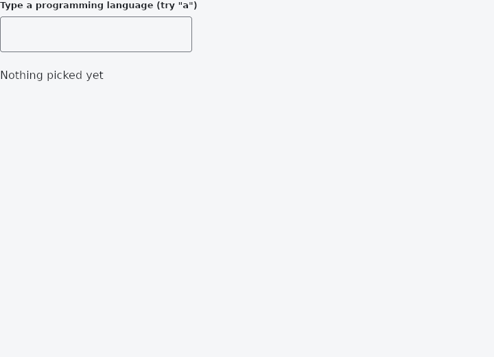
From frus-examples/widgets/src/features/inputs/widgets/autocomplete.rs:
//! `Autocomplete` — a text field that suggests completions in a floating list. The
//! application filters the suggestions; the widget shows them and reports the pick.

use frus::{Autocomplete, State, StateContext, StatefulWidget, Text, Widget};

use crate::common::shared::{section, sections};

pub fn example() -> Box<dyn Widget> {
    Box::new(AutocompleteDemo.into_widget())
}

pub const LANGUAGES: [&str; 10] = [
    "C",
    "C++",
    "Go",
    "Haskell",
    "Java",
    "JavaScript",
    "Kotlin",
    "Python",
    "Rust",
    "Swift",
];

/// The suggestions for a query: plain logic, so it is tested in `tests/autocomplete_test.rs`.
pub fn suggestions(query: &str) -> Vec<&'static str> {
    let query = query.trim().to_lowercase();
    if query.is_empty() {
        return Vec::new();
    }
    LANGUAGES
        .iter()
        .copied()
        .filter(|language| {
            let language = language.to_lowercase();
            language.contains(&query) && language != query
        })
        .collect()
}

pub struct AutocompleteDemo;

pub struct AutocompleteDemoState {
    query: String,
    picked: Option<String>,
}

impl StatefulWidget for AutocompleteDemo {
    type State = AutocompleteDemoState;

    fn create_state(&self) -> AutocompleteDemoState {
        AutocompleteDemoState {
            query: String::new(),
            picked: None,
        }
    }
}

impl State for AutocompleteDemoState {
    type Widget = AutocompleteDemo;

    fn build(&self, cx: &StateContext<Self>) -> Box<dyn Widget> {
        // The list floats only while it has something in it: an empty query, or an exact
        // match, shows no list.
        let field = suggestions(&self.query).into_iter().fold(
            Autocomplete::new(
                self.query.clone(),
                cx.handler(|s: &mut AutocompleteDemoState, text: String| s.query = text),
                cx.handler(|s: &mut AutocompleteDemoState, pick: String| {
                    s.query = pick.clone();
                    s.picked = Some(pick);
                }),
            )
            .width(280.0)
            .max_visible(5),
            |field, suggestion| field.suggestion(suggestion),
        );

        sections(vec![
            Box::new(section("Type a programming language (try \"a\")", field)),
            Box::new(Text::new(match &self.picked {
                Some(language) => format!("Picked: {language}"),
                None => "Nothing picked yet".to_string(),
            })),
        ])
    }
}
Properties
| Method | Argument | Effect |
|---|---|---|
.text_style() | style: TextStyle | — |
.width() | width: f32 | The width of the field and the suggestions, in logical pixels (260 by default). |
.active() | index: usize | The index of the active suggestion (highlighted; chosen from the keyboard). The app moves it along (arrows) and commits it (Enter) — the state stays with it. |
.max_visible() | rows: usize | Limits the number of visible suggestions; beyond that the floating list scrolls (a viewport bounded to n rows) instead of stretching forever. |
.suggestion() | label: impl Into<String> | Adds a suggestion to the floating list. |
Behaviour
A text field with suggestions.
See also
- TextEditingController: a field's text held outside the field, to read, fill and clear it from code.
- Form, Rule & ErrorSummary: validation as a plain function of the state, shown on the fields and in a summary.
- SearchBar: the raised pill an application searches from.
- SearchAnchor: a search bar that opens a search view with suggestions.
- Checkbox: a yes/no choice with an optional label, and a three-state version.
- The guide: Taking input
- API reference:
Autocomplete
Source: crates/frus-widgets/src/autocomplete.rs @ e6fba33f5b42