Tooltip
Purpose
A short label that appears while the pointer rests on a widget.
Signature
pub struct Tooltip<Msg = crate::callback::Callback> { .. }

impl Tooltip {
    pub fn new(message: impl Into<String>) -> Self;
}
Example
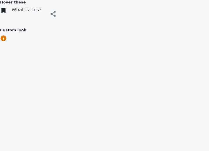
From frus-examples/widgets/src/features/feedback/widgets/tooltip.rs:
//! `Tooltip` — a short label that appears while the pointer rests on a widget (or on a
//! long press). For naming what an icon does; never for something the user must read.

use frus::{Color, Icon, IconButton, Icons, Insets, Row, Text, TextStyle, Tooltip, Widget, Wrap};

use crate::common::shared::{section, sections};

pub fn example() -> Box<dyn Widget> {
    sections(vec![
        // Wrap any widget. (An `IconButton` already shows its `label` as a tooltip.)
        Box::new(section(
            "Hover these",
            Wrap::new()
                .gap(16.0)
                .run_gap(8.0)
                .child(Tooltip::new("Saved to your library").child(Icon::new(Icons::BOOKMARK)))
                .child(
                    Tooltip::new("Plain text has tooltips too").child(Text::new("What is this?")),
                )
                .child(IconButton::new(Icons::SHARE).label("Share this page")),
        )),
        // Bubble colour, text, padding, shape and width are all overridable. A long
        // message wraps at `max_width`.
        Box::new(section(
            "Custom look",
            Row::new().spacing(16.0).child(
                Tooltip::new(
                    "A longer explanation, wrapped at 200 pixels so the bubble stays readable.",
                )
                .background(Color::hex("#FEF3C7"))
                .text_style(TextStyle::new(13.0).color(Color::hex("#78350F")))
                .padding(Insets::symmetric(12.0, 8.0))
                .radius(8.0)
                .max_width(200.0)
                .child(Icon::new(Icons::INFO).color(Color::hex("#D97706"))),
            ),
        )),
    ])
}
Properties
| Method | Argument | Effect |
|---|---|---|
.child() | child: impl Widget<Msg> + 'static | The widget the tooltip describes. |
.enabled() | enabled: bool | Whether the tooltip shows at all. A disabled one is its child and nothing more. |
.background() | color: Color | The bubble's surface, over the theme's and inverse_surface. |
.text_style() | style: TextStyle | The label's type, over the theme's and body_small. |
.text_color() | color: Color | The label's colour, over the theme's and on_inverse_surface. |
.text_align() | align: TextAlign | How the label sits in the bubble when it has wrapped onto more than one line. |
.padding() | padding: Insets | The room kept round the label. |
.shape() | shape: ShapeBorder | What shape the bubble is, over the theme's and the framework's four. |
.radius() | radius: impl Into<BorderRadius> | The shorthand for a rounded rectangle. |
.max_width() | width: f32 | How wide the bubble may get before the label wraps. |
Behaviour
A short label that appears while a pointer rests on something.
Tooltip::new("Delete this row").child(IconButton::new(Icons::DELETE).on_press(Msg::Delete))
It wraps a child, shows nothing until the child is hovered, and then floats a bubble above it — below, if there is no room above. An empty message shows nothing at all and costs nothing, which is what lets a caller write Tooltip::new(maybe_hint).child(..) without branching.
What this cannot do yet
All four are about time: how long a pointer must rest before the bubble appears, how long it stays, and whether a long press brings it up on a touch screen. The framework shows the bubble while the anchor is hovered and hides it when the pointer leaves, which is the whole of what the overlay system can express today. See the roadmap.
See also
- LinearProgressIndicator & CircularProgressIndicator: how far along some work is, or that it is under way.
- Skeleton: a pulsing placeholder in the shape of content that is still loading.
- The guide: Screens, navigation and dialogs
- API reference:
Tooltip
Source: crates/frus-widgets/src/tooltip.rs @ e6fba33f5b42