SnackBar and ScaffoldMessenger
Purpose
A short message at the bottom of the screen that goes away by itself.
Signature
pub struct SnackBar<Msg = crate::callback::Callback> { .. }

impl SnackBar {
    pub fn new(text: impl Into<String>) -> Self;
}
pub struct ScaffoldMessenger<Msg = crate::callback::Callback> { .. }

impl ScaffoldMessenger {
    pub fn new(position: SnackBarPosition) -> Self;
}
Example
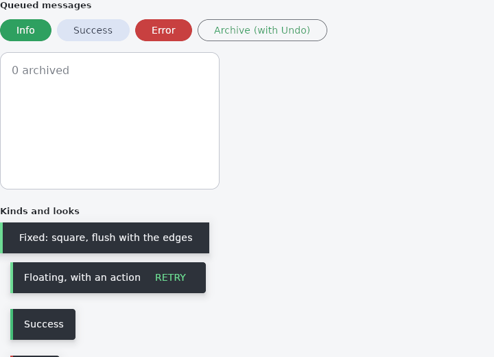
From frus-examples/widgets/src/features/feedback/widgets/snack_bar.rs:
//! `SnackBar`, `SnackBarQueue` and `ScaffoldMessenger` — a short message at the bottom
//! of the screen that goes away by itself.
//!
//! The three split the job: `SnackBar` is the bar, `ScaffoldMessenger` is the layer that
//! places it over the screen, and `SnackBarQueue` — plain application state — decides
//! which message shows and when it leaves.

use std::time::Duration;

use frus::{
    host, Align, Button, Color, Column, Container, ScaffoldMessenger, SnackBar, SnackBarBehavior,
    SnackBarKind, SnackBarPosition, SnackBarQueue, Stack, State, StateContext, StateHandle,
    StatefulWidget, Text, Variant, Widget, Wrap,
};

use crate::common::shared::{section, sections};

/// The preview is phone-sized: it fits a phone's page and reads like a screen.
pub const PREVIEW_WIDTH: f32 = 320.0;

pub fn example() -> Box<dyn Widget> {
    Box::new(SnackBarDemo.into_widget())
}

/// How long a message stays, and how long its fade-out takes.
pub const SHOWN: Duration = Duration::from_millis(3000);
pub const FADE: Duration = Duration::from_millis(300);

/// One queued message. The id tells a timer whether the message it was started for is
/// still the one on screen.
#[derive(Clone)]
pub struct Toast {
    id: u64,
    text: String,
    kind: SnackBarKind,
    undo: bool,
}

pub struct SnackBarDemo;

pub struct SnackBarDemoState {
    queue: SnackBarQueue<Toast>,
    next_id: u64,
    archived: u32,
}

impl SnackBarDemoState {
    /// Queues a message; returns its id when it went straight on screen, so the caller
    /// starts its timer.
    pub fn push(&mut self, text: &str, kind: SnackBarKind, undo: bool) -> Option<u64> {
        let id = self.next_id;
        self.next_id += 1;
        let was_empty = self.queue.is_empty();
        // The queue's own clock is not used: timers below decide when a message leaves.
        self.queue.push(
            Toast {
                id,
                text: text.into(),
                kind,
                undo,
            },
            0.0,
        );
        was_empty.then_some(id)
    }

    /// The id of the message on screen, if any.
    pub fn current_id(&self) -> Option<u64> {
        self.queue.current().map(|toast| toast.id)
    }

    /// Removes the current message; returns the next one's id so its timer starts.
    pub fn dismiss(&mut self) -> Option<u64> {
        self.queue.dismiss();
        self.current_id()
    }
}

/// The message `id` stays `SHOWN`, fades for `FADE`, then makes room for the next one.
/// A message already closed by its action or its cross is not touched again.
pub fn expire_later(handle: StateHandle<SnackBarDemoState>, id: u64) {
    host::after(SHOWN, move || {
        if handle.read(|s| s.current_id()) != Some(id) {
            return;
        }
        handle.set_state(|s| s.queue.start_leaving());
        let handle = handle.clone();
        host::after(FADE, move || {
            if handle.read(|s| s.current_id()) != Some(id) {
                return;
            }
            let mut next = None;
            handle.set_state(|s| next = s.dismiss());
            if let Some(next) = next {
                expire_later(handle.clone(), next);
            }
        });
    });
}

impl StatefulWidget for SnackBarDemo {
    type State = SnackBarDemoState;

    fn create_state(&self) -> SnackBarDemoState {
        SnackBarDemoState {
            queue: SnackBarQueue::new(),
            next_id: 0,
            archived: 0,
        }
    }
}

impl State for SnackBarDemoState {
    type Widget = SnackBarDemo;

    fn build(&self, cx: &StateContext<Self>) -> Box<dyn Widget> {
        let show = |text: &'static str, kind: SnackBarKind, undo: bool| {
            let handle = cx.handle();
            move || {
                let mut started = None;
                handle.set_state(|s| {
                    if undo {
                        s.archived += 1;
                    }
                    started = s.push(text, kind, undo);
                });
                if let Some(id) = started {
                    expire_later(handle.clone(), id);
                }
            }
        };
        // The action and the cross close the message at once.
        let close = {
            let handle = cx.handle();
            move || {
                let mut next = None;
                handle.set_state(|s| next = s.dismiss());
                if let Some(next) = next {
                    expire_later(handle.clone(), next);
                }
            }
        };
        let undo = {
            let close = close.clone();
            let handle = cx.handle();
            move || {
                handle.set_state(|s| s.archived = s.archived.saturating_sub(1));
                close();
            }
        };

        let buttons = Wrap::new()
            .gap(8.0)
            .run_gap(8.0)
            .child(Button::new("Info").on_press(show("Message sent", SnackBarKind::Info, false)))
            .child(
                Button::new("Success")
                    .variant(Variant::Tonal)
                    .on_press(show("Profile saved", SnackBarKind::Success, false)),
            )
            .child(Button::new("Error").variant(Variant::Danger).on_press(show(
                "Could not connect",
                SnackBarKind::Error,
                false,
            )))
            .child(
                Button::new("Archive (with Undo)")
                    .variant(Variant::Outlined)
                    .on_press(show("Chat archived", SnackBarKind::Info, true)),
            );

        // A stand-in for the screen: the messenger layer goes **on top** of it in a
        // `Stack`, and anchors its bar to the bottom. In an app the stack is the whole
        // window, around the `Scaffold`.
        let theme = cx.theme();
        let mut screen = Stack::new().width(PREVIEW_WIDTH).height(200.0).layer(
            Container::new()
                .width(PREVIEW_WIDTH)
                .height(200.0)
                .radius(12.0)
                .border(1.0, theme.outline_variant)
                .color(theme.surface)
                .child(Text::new(format!("{} archived", self.archived)).color(theme.muted))
                .padding(16.0),
        );
        if let Some(toast) = self.queue.current() {
            // A floating bar takes its own width, and keeps a margin around it.
            let mut bar = SnackBar::new(toast.text.clone())
                .behavior(SnackBarBehavior::Floating)
                .width(PREVIEW_WIDTH - 40.0)
                .close_icon(close.clone());
            bar = match toast.kind {
                SnackBarKind::Success => bar.success(),
                SnackBarKind::Error => bar.error(),
                SnackBarKind::Info => bar,
            };
            if toast.undo {
                bar = bar.action("Undo", undo.clone().into());
            }
            let layer = ScaffoldMessenger::new(SnackBarPosition::BottomCenter).toast(bar);
            // Fade in while showing, out while leaving.
            screen = screen.layer(if self.queue.is_leaving() {
                layer.fade_out(0.3)
            } else {
                layer.fade_in(0.25)
            });
        }

        sections(vec![
            Box::new(section(
                "Queued messages",
                Column::new()
                    .spacing(12.0)
                    .cross_axis_alignment(Align::Stretch)
                    .child(buttons)
                    .child(screen),
            )),
            // A bar is a widget like any other: here, still, to compare the looks.
            Box::new(section(
                "Kinds and looks",
                Column::new()
                    .spacing(8.0)
                    .cross_axis_alignment(Align::Stretch)
                    .child(SnackBar::new("Fixed: square, flush with the edges"))
                    .child(
                        SnackBar::new("Floating, with an action")
                            .behavior(SnackBarBehavior::Floating)
                            .action("Retry", cx.callback(|_: &mut SnackBarDemoState| {})),
                    )
                    .child(
                        SnackBar::new("Success")
                            .success()
                            .behavior(SnackBarBehavior::Floating),
                    )
                    .child(
                        SnackBar::new("Error")
                            .error()
                            .behavior(SnackBarBehavior::Floating),
                    )
                    .child(
                        SnackBar::new("Custom colours")
                            .behavior(SnackBarBehavior::Floating)
                            .background(Color::hex("#312E81"))
                            .text_color(Color::hex("#E0E7FF")),
                    ),
            )),
        ])
    }
}
Properties
| Type | Method | Argument | Effect |
|---|---|---|---|
SnackBar | .behavior() | behavior: SnackBarBehavior | — |
SnackBar | .shape() | shape: ShapeBorder | — |
SnackBar | .width() | width: f32 | — |
SnackBar | .margin() | margin: Insets | — |
SnackBar | .background() | color: Color | The bar's surface, over the theme's and the scheme's inverse_surface. |
SnackBar | .elevation() | elevation: f32 | 0.0 casts no shadow. |
SnackBar | .text_color() | color: Color | The message's colour, over the theme's and the scheme's on_inverse_surface. |
SnackBar | .action_text_color() | color: Color | The action's colour, over the theme's and the scheme's inverse_primary. |
SnackBar | .accent() | color: Color | The stripe down the leading edge, over the theme's and the kind's. |
SnackBar | .content_text_style() | style: TextStyle | — |
SnackBar | .action_text_style() | style: TextStyle | — |
SnackBar | .success() | — | The success variant. |
SnackBar | .error() | — | The error variant. |
SnackBar | .action() | label: impl Into<String>, message: Msg | Adds an action button (an uppercased label, Material style) that emits message on click — typically "UNDO", to undo whatever triggered the notification. |
SnackBar | .close_icon() | message: impl Into<Msg> | Carries the current action and the current style into the child. |
SnackBar | .close_icon_color() | color: Color | — |
SnackBar | .close_icon_label() | label: impl Into<String> | See crate::localizations. |
ScaffoldMessenger | .padding() | padding: f32 | Margin between the toasts and the edges. None by default: what a notification keeps clear of the page is the notification's own business — see SnackBar::margin. |
ScaffoldMessenger | .toast() | widget: impl Widget<Msg> + 'static | Adds a toast to the stack (call it several times to stack several). |
ScaffoldMessenger | .fade_in() | duration: f32 | Wraps every toast in an animated opacity (duration seconds): a fade-in built on the existing animation layer. Call this after the toasts. |
ScaffoldMessenger | .fade_out() | duration: f32 | The mirror of fade_in: animates the opacity toward 0 — the exit transition (the toast fades out before it is removed, Material style). The application plays it when the notification is leaving (see crate::SnackBarQueue::is_leaving). |
Behaviour
SnackBar
A transient notification, with an optional action (Material Snackbar style: "UNDO"). The action is a text button on the right that emits a message on click.
ScaffoldMessenger
A notification layer anchored in a corner.
See also
- SimpleDialog: a modal list of choices, answered by picking one.
- AboutDialog, AboutListTile & LicensePage: the "about this app" box, and the page listing the licences it ships.
- BottomSheet: a modal panel sliding up from the bottom, for contextual actions.
- DraggableScrollableSheet: a panel along the bottom that follows the finger between resting heights.
- MaterialBanner: a message across the top of the content that stays until it is answered.
- The guide: Screens, navigation and dialogs
- API reference:
SnackBar - API reference:
ScaffoldMessenger
Source: crates/frus-widgets/src/toast.rs, crates/frus-widgets/src/toasthost.rs @ e6fba33f5b42