LinearProgressIndicator and CircularProgressIndicator
Purpose
How far along some work is, or that it is under way.
Signature
pub struct LinearProgressIndicator { .. }

impl LinearProgressIndicator {
    pub fn new(value: f32) -> Self;
    pub fn indeterminate() -> Self;
    pub fn with_value(value: Option<f32>) -> Self;
}
pub struct CircularProgressIndicator { .. }

impl CircularProgressIndicator {
    pub fn new() -> Self;
    pub fn determinate(value: f32) -> Self;
    pub fn with_value(value: Option<f32>) -> Self;
}
Example
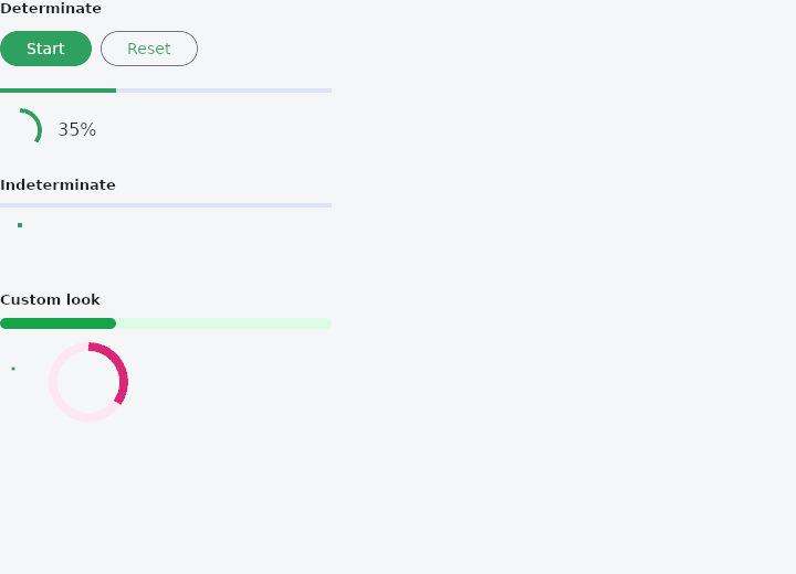
From frus-examples/widgets/src/features/feedback/widgets/progress_indicator.rs:
//! `LinearProgressIndicator` and `CircularProgressIndicator` — how far along some work is.
//! **Determinate** when you know the share done (a download), **indeterminate** when you
//! do not (waiting for a server).

use std::time::Duration;

use frus::{
    Align, Button, CircularProgressIndicator, Color, Column, LinearProgressIndicator, Row, State,
    StateContext, StatefulWidget, Text, Variant, Widget,
};

use crate::common::shared::{section, sections};

pub fn example() -> Box<dyn Widget> {
    Box::new(ProgressDemo.into_widget())
}

pub struct ProgressDemo;

pub struct ProgressDemoState {
    /// From 0 to 1.
    pub progress: f32,
    pub running: bool,
}

impl ProgressDemoState {
    /// One tick of the fake download: 2% more, stopping at the end.
    pub fn tick(&mut self) {
        self.progress = (self.progress + 0.02).min(1.0);
        if self.progress >= 1.0 {
            self.running = false;
        }
    }

    pub fn start(&mut self) {
        if self.progress >= 1.0 {
            self.progress = 0.0;
        }
        self.running = true;
    }
}

impl StatefulWidget for ProgressDemo {
    type State = ProgressDemoState;

    fn create_state(&self) -> ProgressDemoState {
        ProgressDemoState {
            progress: 0.35,
            running: false,
        }
    }
}

impl State for ProgressDemoState {
    type Widget = ProgressDemo;

    fn build(&self, cx: &StateContext<Self>) -> Box<dyn Widget> {
        // The timer exists only while a build asks for it: pause, and it stops.
        if self.running {
            cx.use_interval(
                Duration::from_millis(100),
                cx.callback(ProgressDemoState::tick),
            );
        }

        let controls = Row::new()
            .spacing(8.0)
            .child(
                Button::new(if self.running { "Pause" } else { "Start" }).on_press(cx.callback(
                    |s: &mut ProgressDemoState| {
                        if s.running {
                            s.running = false
                        } else {
                            s.start()
                        }
                    },
                )),
            )
            .child(
                Button::new("Reset")
                    .variant(Variant::Outlined)
                    .on_press(cx.callback(|s: &mut ProgressDemoState| {
                        s.progress = 0.0;
                        s.running = false;
                    })),
            );

        sections(vec![
            // `new(value)` with a value from 0 to 1.
            Box::new(section(
                "Determinate",
                Column::new()
                    .spacing(16.0)
                    .cross_axis_alignment(Align::Start)
                    .child(controls)
                    .child(LinearProgressIndicator::new(self.progress).width(300.0))
                    .child(
                        Row::new()
                            .spacing(16.0)
                            .cross_axis_alignment(Align::Center)
                            .child(CircularProgressIndicator::determinate(self.progress))
                            .child(Text::new(format!("{:.0}%", self.progress * 100.0))),
                    ),
            )),
            // No value: the bar runs and the arc spins for as long as they are shown.
            Box::new(section(
                "Indeterminate",
                Column::new()
                    .spacing(16.0)
                    .cross_axis_alignment(Align::Start)
                    .child(LinearProgressIndicator::indeterminate().width(300.0))
                    .child(CircularProgressIndicator::new()),
            )),
            // Colours, thickness, size and corners are all overridable.
            Box::new(section(
                "Custom look",
                Column::new()
                    .spacing(16.0)
                    .cross_axis_alignment(Align::Start)
                    .child(
                        LinearProgressIndicator::new(self.progress)
                            .width(300.0)
                            .min_height(10.0)
                            .radius(5.0)
                            .color(Color::hex("#16A34A"))
                            .track_color(Color::hex("#DCFCE7")),
                    )
                    .child(
                        Row::new()
                            .spacing(24.0)
                            .child(
                                CircularProgressIndicator::new()
                                    .size(24.0)
                                    .stroke_width(3.0),
                            )
                            .child(
                                CircularProgressIndicator::determinate(self.progress)
                                    .size(64.0)
                                    .stroke_width(8.0)
                                    .color(Color::hex("#DB2777"))
                                    .track_color(Color::hex("#FCE7F3")),
                            ),
                    ),
            )),
        ])
    }
}
Properties
| Type | Method | Argument | Effect |
|---|---|---|---|
LinearProgressIndicator | .width() | width: f32 | Sets the width, in logical pixels. |
LinearProgressIndicator | .color() | color: Color | The colour of the fill, over the theme's and primary. |
LinearProgressIndicator | .track_color() | color: Color | — |
LinearProgressIndicator | .min_height() | height: f32 | — |
LinearProgressIndicator | .radius() | radius: impl Into<BorderRadius> | The corners of the fill, the lines and the track. Unset, square in the 2023 look and 2 px in the newer one. |
LinearProgressIndicator | .stop_indicator_color() | color: Color | The dot at the far end of the track, in the newer look. Unset, the theme's, then primary. |
LinearProgressIndicator | .stop_indicator_radius() | radius: f32 | That dot's radius, in the newer look; never more than half the bar's height. Zero draws none. |
LinearProgressIndicator | .track_gap() | gap: f32 | The gap between a line and the track, in the newer look. |
LinearProgressIndicator | .year2023() | year2023: bool | — |
LinearProgressIndicator | .semantics_label() | label: impl Into<String> | What the bar is the progress of, for whoever cannot see it. |
LinearProgressIndicator | .semantics_value() | value: impl Into<String> | The value read out, in place of the percentage. |
CircularProgressIndicator | .size() | size: f32 | Unset, the theme's, then 36 (2023 look) or 40 (newer). |
CircularProgressIndicator | .color() | color: Color | The colour of the arc, over the theme's and primary. |
CircularProgressIndicator | .track_color() | color: Color | Unset, the theme's, then none in the 2023 look, secondary_container behind a determinate arc in the newer one. |
CircularProgressIndicator | .stroke_width() | width: f32 | How thick the arc is. Unset, the theme's, then four. |
CircularProgressIndicator | .stroke_align() | align: f32 | — |
CircularProgressIndicator | .stroke_cap() | cap: StrokeCap | How the arc's ends are drawn. |
CircularProgressIndicator | .track_gap() | gap: f32 | The gap between the arc and the track, in the newer look. |
CircularProgressIndicator | .padding() | padding: f32 | The room around the circle, on every side. |
CircularProgressIndicator | .year2023() | year2023: bool | — |
CircularProgressIndicator | .semantics_label() | label: impl Into<String> | What the indicator is the progress of, for whoever cannot see it. |
CircularProgressIndicator | .semantics_value() | value: impl Into<String> | The value read out, in place of the percentage. |
Behaviour
LinearProgressIndicator
A progress bar: a track, and either a fill proportional to a value or two lines that run along it while the length of the work is unknown.
Every piece of either is a builder.
CircularProgressIndicator
year2023(false) is its newer one: a 40 px circle inside 4 px of padding, the stroke inside it, round ends, and for a determinate indicator a track with a gap at each end of the arc.
See also
- MaterialBanner: a message across the top of the content that stays until it is answered.
- Alert: a message box in the flow of the page: info, success, warning or error.
- Skeleton: a pulsing placeholder in the shape of content that is still loading.
- Tooltip: a short label that appears while the pointer rests on a widget.
- The guide: Screens, navigation and dialogs
- API reference:
LinearProgressIndicator - API reference:
CircularProgressIndicator
Source: crates/frus-widgets/src/progressbar.rs, crates/frus-widgets/src/spinner.rs @ e6fba33f5b42