Table
Purpose
A controlled grid of text or widget cells; the app sorts and selects.
Signature
pub struct Table<Msg = crate::callback::Callback> { .. }

impl Table {
    pub fn new(columns: usize) -> Self;
}
Example
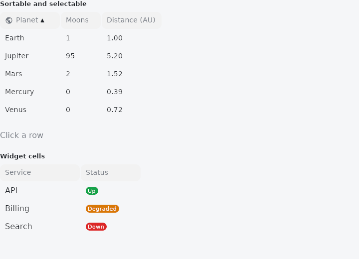
From frus-examples/widgets/src/features/display/widgets/table.rs:
//! `Table` — a grid of rows and columns that only shows what it is handed: the app
//! sorts its own data and decides what is selected. Cells can be text or widgets.

use frus::{Badge, Color, Colors, Icons, Table, Text, Widget};

use crate::common::shared::{section, sections};

/// One planet: name, moons, and how far from the sun (in astronomical units).
pub const PLANETS: [(&str, u32, f32); 5] = [
    ("Mercury", 0, 0.39),
    ("Venus", 0, 0.72),
    ("Earth", 1, 1.0),
    ("Mars", 2, 1.52),
    ("Jupiter", 95, 5.2),
];

pub fn example() -> Box<dyn Widget> {
    Box::new(frus::component(|cx| {
        let sort = cx.use_state(|| (0usize, true));
        let selected = cx.use_state(|| None::<usize>);

        // The base `Table` does not reorder anything: on a header click the app sorts its
        // own rows and hands them back, with `sorted` to draw the arrow.
        let (column, ascending) = sort.get();
        let rows = sorted_planets(column, ascending);

        let on_sort = sort.clone();
        let on_select = selected.clone();
        let sortable = rows
            .iter()
            .fold(
                Table::new(3)
                    .header(&["Planet", "Moons", "Distance (AU)"])
                    .header_icons(&[Some(Icons::PUBLIC), None, None])
                    .column_widths(&[120.0, 80.0, 120.0]),
                |table, &(name, moons, au)| {
                    table.row(&[
                        name,
                        moons.to_string().as_str(),
                        format!("{au:.2}").as_str(),
                    ])
                },
            )
            .sorted(column, ascending)
            .on_sort(move |clicked: usize| {
                on_sort.update(|(c, asc)| {
                    *asc = if *c == clicked { !*asc } else { true };
                    *c = clicked;
                })
            })
            // A row click reports the row as displayed; this table shows the app's order.
            .on_select_row(move |row: usize| on_select.set(Some(row)))
            .selected(&selected.get().into_iter().collect::<Vec<_>>());

        let picked = selected
            .get()
            .and_then(|row| rows.get(row))
            .map_or("Click a row".to_string(), |(name, ..)| {
                format!("Selected: {name}")
            });

        sections(vec![
            Box::new(section("Sortable and selectable", sortable)),
            Box::new(Text::new(picked).color(cx.theme().muted)),
            // A cell can be any widget: build it in a closure, which the table calls again
            // on every rebuild.
            Box::new(section(
                "Widget cells",
                Table::new(2)
                    .header(&["Service", "Status"])
                    .column_widths(&[160.0, 120.0])
                    .widget_row(vec![
                        Box::new(|| Box::new(Text::new("API")) as Box<dyn Widget>),
                        Box::new(|| Box::new(status("Up", "#16A34A")) as Box<dyn Widget>),
                    ])
                    .widget_row(vec![
                        Box::new(|| Box::new(Text::new("Billing")) as Box<dyn Widget>),
                        Box::new(|| Box::new(status("Degraded", "#D97706")) as Box<dyn Widget>),
                    ])
                    .widget_row(vec![
                        Box::new(|| Box::new(Text::new("Search")) as Box<dyn Widget>),
                        Box::new(|| Box::new(status("Down", "#DC2626")) as Box<dyn Widget>),
                    ]),
            )),
        ])
    }))
}

/// A coloured label for a status cell.
pub fn status(label: &str, hex: &str) -> Badge {
    Badge::new(label)
        .background_color(Color::hex(hex))
        .text_color(Colors::WHITE)
}

/// The planets ordered by one column — the sorting the app owns.
pub fn sorted_planets(column: usize, ascending: bool) -> Vec<(&'static str, u32, f32)> {
    let mut rows = PLANETS.to_vec();
    rows.sort_by(|a, b| match column {
        1 => a.1.cmp(&b.1),
        2 => a.2.total_cmp(&b.2),
        _ => a.0.cmp(b.0),
    });
    if !ascending {
        rows.reverse();
    }
    rows
}
Properties
| Method | Argument | Effect |
|---|---|---|
.heading_text_style() | style: TextStyle | — |
.data_text_style() | style: TextStyle | See heading_text_style. |
.header() | labels: &[&str] | Sets the header row (one label per column). |
.widget_header() | cells: Vec<CellFn<Msg>> | Replaces the header row with fully widget headers (one per column) — for heavily customised grids (a bespoke sort button, an embedded filter, a two-line title…). Automatic sorting and reordering do not apply here: the application wires the behaviour into the widgets it supplies (e.g. a button emitting its own sort message). Each factory is called again on every rebuild (a fresh widget). Excludes header (the last one called wins). |
.header_icons() | icons: &[Option<IconData>] | Gives header columns a leading icon (icon + label): None leaves the column without one. The header stays sortable and reorderable just like a text header (the icon is purely decorative). |
.header_action() | col: usize, make: impl Fn() -> Box<dyn Widget<Msg>> + 'static | Places an action widget (a filter button, a menu…) on the right of column col's header. It is a child of the cell: it captures its own click (deepest-first hit-test), while the rest of the header sorts and reorders as usual. The factory is called again on every rebuild (a fresh widget). |
.row() | cells: &[&str] | Adds a data row (one text value per column). |
.widget_row() | cells: Vec<CellFn<Msg>> | Adds a row whose every cell is a widget (an avatar, a chip, an action button…), supplied by a factory called again on every rebuild. The row stays selectable (a background on click, outside the internal clickable zones). |
.width() | width: f32 | Sets the table's total width, in logical pixels (the flexible columns share what is left). |
.column_widths() | widths: &[f32] | Fixed width of each column, in pixels (0 or less = a flexible column). Missing entries leave the column flexible. |
.on_sort() | on_sort: impl Fn(usize) -> R + 'static | Makes the headers clickable: on_sort(column) on a click on a header. |
.sorted() | column: usize, ascending: bool | States the sorted column and its direction (true = ascending) → shows the indicator. |
.on_select_row() | on_select: impl Fn(usize) -> R + 'static | Makes the rows clickable: on_select_row(row) on a click on a row. |
.checkboxes() | on_check: impl Fn(usize) -> R1 + 'static, on_check_all: Msg | Turns on multi-selection: a checkbox column (on the left) topped by a "check all" box. on_check(row) toggles one row, on_check_all toggles every row. The checked state mirrors selected. |
.frozen_columns() | n: usize | Freezes the first n columns: they stay pinned on the left while the rest scrolls horizontally (the scrolling columns' header follows its columns), with a separation shadow at the freeze edge. For wide grids where an identifier must stay in view. Requires a total width and columns that are all fixed (column_widths) — otherwise it does nothing. Text tables only; not combined with virtualisation / checkboxes / resizing / reordering. |
.frozen_columns_right() | m: usize | Freezes the last m columns (pinned on the right — action columns, totals…), the middle scrolling. Combines with frozen_columns (both edges frozen). Same conditions and exclusions. |
.virtual_rows() | count: usize, viewport_height: f32, build: impl Fn(usize) -> Vec<String> + 'static | Switches the table to virtualised mode: count data rows, of which only the visible ones are built/laid out/painted (internal vertical scrolling inside a viewport of viewport_height px). build(index) supplies the row's texts (one value per column). Indispensable for large grids (thousands of rows): the per-frame cost is ∝ the visible rows, not the total. The header stays pinned. |
.virtual_widget_rows() | count: usize, viewport_height: f32, build: impl Fn(usize) -> Vec<Box<dyn Widget<Msg>>> + 'static | Like virtual_rows, but every row is made of widgets (avatars, chips, buttons…): build(index) returns one widget per column. Only the visible rows are built. Click selection and checkboxes; the header stays pinned. Same exclusions (resizing / reordering). |
.on_resize() | on_resize: impl Fn(usize, f32) -> R + 'static | Makes the columns resizable with the mouse: a thin handle at each column's right edge (except the last) emits on_resize(column, delta_px) when dragged. The application accumulates the width, e.g. widths[col] = (widths[col] + delta).max(MIN), and hands it back through column_widths. Only has an effect when every column has a fixed width (so the edges are known). |
.on_reorder() | on_reorder: impl Fn(usize, usize) -> R + 'static | Makes the columns reorderable: dragging a header (past the threshold) and dropping it on another emits on_reorder(from, to); the application permutes its own column order. A plain click still sorts (on_sort). Does nothing when the headers are not clickable. |
.selected() | rows: &[usize] | States the selected rows (highlighted, their boxes checked). |
Behaviour
A data grid with fixed or flexible columns (see the module).
See also
- GridTile & GridTileBar: a cell of an image grid with a caption bar laid over it.
- DataTable: a table that sorts, searches, pages and selects its rows for you.
- BarChart & LineChart: themed charts for comparing amounts and reading trends.
- Timeline: a vertical chronology of events joined by a line.
- Tree: a hierarchy of rows that expand, collapse and select.
- The guide: Text, colour and the theme
- API reference:
Table
Source: crates/frus-widgets/src/table.rs @ e6fba33f5b42