ListTile
Purpose
One row of a list: leading, title, subtitle and trailing slots.
Signature
pub struct ListTile<Msg = crate::callback::Callback> { .. }

impl ListTile {
    pub fn new() -> Self;
}
Example
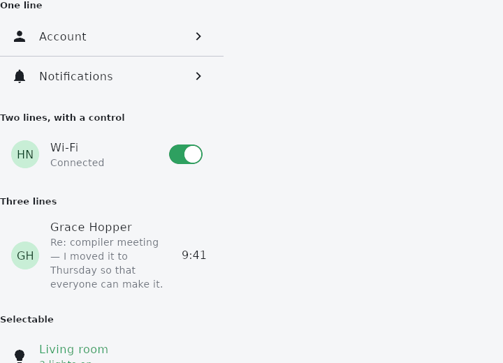
From frus-examples/widgets/src/features/display/widgets/listtile.rs:
//! `ListTile` — one row of a list: something in front, one to three lines of text, and
//! something behind. The shape of a settings line, a contact, a menu entry.

use frus::{
    Align, CircleAvatar, Column, Container, Divider, Icon, Icons, ListTile, Switch, Text, Widget,
};

use crate::common::shared::{section, sections};

const ROOMS: [(&str, &str); 3] = [
    ("Living room", "3 lights on"),
    ("Kitchen", "All off"),
    ("Bedroom", "1 light on"),
];

pub fn example() -> Box<dyn Widget> {
    Box::new(frus::component(|cx| {
        let selected = cx.use_state(|| 0usize);
        let wifi = cx.use_state(|| true);

        // `selected` tints the tile and its text with the theme's accent; `on_tap` makes
        // the whole row pressable.
        let rooms = ROOMS.iter().enumerate().fold(
            Column::new().cross_axis_alignment(Align::Stretch),
            |list, (i, (room, status))| {
                let select = selected.clone();
                list.child(
                    ListTile::new()
                        .leading(Icon::new(Icons::LIGHTBULB))
                        .title(*room)
                        .subtitle(*status)
                        .selected(selected.get() == i)
                        .on_tap(move || select.set(i)),
                )
            },
        );

        let toggle = wifi.clone();
        sections(vec![
            // One line: a title, with an icon in front and a chevron behind.
            Box::new(section(
                "One line",
                list(
                    Column::new()
                        .cross_axis_alignment(Align::Stretch)
                        .child(
                            ListTile::new()
                                .leading(Icon::new(Icons::PERSON))
                                .title("Account")
                                .trailing(Icon::new(Icons::CHEVRON_RIGHT)),
                        )
                        .child(Divider::new().height(1.0))
                        .child(
                            ListTile::new()
                                .leading(Icon::new(Icons::NOTIFICATIONS))
                                .title("Notifications")
                                .trailing(Icon::new(Icons::CHEVRON_RIGHT)),
                        ),
                ),
            )),
            // Two lines: a subtitle under the title, and any widget behind — here a live
            // switch, which keeps its own tap.
            Box::new(section(
                "Two lines, with a control",
                list(
                    ListTile::new()
                        .leading(CircleAvatar::initials("Home Network"))
                        .title("Wi-Fi")
                        .subtitle(if wifi.get() { "Connected" } else { "Off" })
                        .trailing(Switch::new(wifi.get()).on_toggle(move |on: bool| toggle.set(on))),
                ),
            )),
            // Three lines: a subtitle long enough to wrap onto a second line.
            Box::new(section(
                "Three lines",
                list(
                    ListTile::new()
                        .leading(CircleAvatar::initials("Grace Hopper"))
                        .title("Grace Hopper")
                        .subtitle("Re: compiler meeting — I moved it to Thursday so that everyone can make it.")
                        .three_line()
                        .trailing(Text::new("9:41")),
                ),
            )),
            Box::new(section("Selectable", list(rooms))),
            // Dense tiles are shorter, for a compact list; disabled ones dim and ignore taps.
            Box::new(section(
                "Dense and disabled",
                list(
                    Column::new()
                        .cross_axis_alignment(Align::Stretch)
                        .child(
                            ListTile::new()
                                .dense()
                                .leading(Icon::new(Icons::FOLDER))
                                .title("Documents")
                                .subtitle("Dense"),
                        )
                        .child(
                            ListTile::new()
                                .leading(Icon::new(Icons::LOCK))
                                .title("Admin settings")
                                .subtitle("You do not have access")
                                .enabled(false),
                        ),
                ),
            )),
        ])
    }))
}

/// Tiles fill the width they are given, so the demo gives them a list-like width.
fn list(child: impl Widget + 'static) -> Container {
    Container::new().width(320.0).child(child)
}
Properties
| Method | Argument | Effect |
|---|---|---|
.leading() | leading: impl Widget<Msg> + 'static | What goes in front: an icon, an avatar, a checkbox. |
.trailing() | trailing: impl Widget<Msg> + 'static | What goes behind: a chevron, a switch, a timestamp. |
.title() | title: impl Into<String> | The first line, styled by the tile (body_large on on_surface). |
.title_child() | title: impl Widget<Msg> + 'static | The first line as a widget, for a caller who wants something the tile would not have made — a rich span, a row of chips. |
.subtitle() | subtitle: impl Into<String> | The second line, styled by the tile (body_medium on on_surface_variant). Its presence is what makes the tile a two-line one. |
.subtitle_child() | subtitle: impl Widget<Msg> + 'static | The second line as a widget. See Self::title_child. |
.three_line() | — | Room for three lines rather than two, for a subtitle that wraps. |
.dense() | — | The compact height, for a dense list. |
.selected() | selected: bool | Marks the tile as the chosen one: its text and its two slots take the primary colour. |
.enabled() | enabled: bool | Available or not. A disabled tile flattens and stops answering. |
.on_tap() | msg: impl Into<Msg> | The message a tap sends. |
.padding() | padding: Insets | Room around the content, replacing the 16 / 24 default. |
.title_gap() | gap: f32 | The gap either side of the text. |
.min_leading_width() | width: f32 | The narrowest the leading slot may be. |
.min_height() | height: f32 | A height of the caller's choosing, replacing the one the line count implies. |
.title_style() | style: TextStyle | The title's text style. |
.subtitle_style() | style: TextStyle | The subtitle's text style. |
.tile_color() | color: Color | The tile's own background. |
.selected_color() | color: Color | The colour the text and the two slots take when the tile is the chosen one. |
.selected_tile_color() | color: Color | — |
.icon_color() | color: Color | — |
.text_color() | color: Color | — |
.shape() | shape: ShapeBorder | The surface takes it, and so does the ink, so a rounded tile does not splash square corners over a list. |
Behaviour
A row of a list: leading, title, subtitle, trailing.
See also
- Image & ImageIcon: bitmaps from assets, pixels or the network, fitted into a box.
- Divider & VerticalDivider: thin rules that separate content across a column or down a row.
- GridTile & GridTileBar: a cell of an image grid with a caption bar laid over it.
- DataTable: a table that sorts, searches, pages and selects its rows for you.
- Table: a controlled grid of text or widget cells; the app sorts and selects.
- The guide: Text, colour and the theme
- API reference:
ListTile
Source: crates/frus-widgets/src/listtile.rs @ e6fba33f5b42