Icon
Purpose
Vector icons from the bundled set, or your own, sized and coloured.
Signature
pub struct Icon { .. }

impl Icon {
    pub fn new(icon: IconData) -> Self;
    pub fn animated(icon: AnimatedIconData, on: bool) -> Self;
}
Example
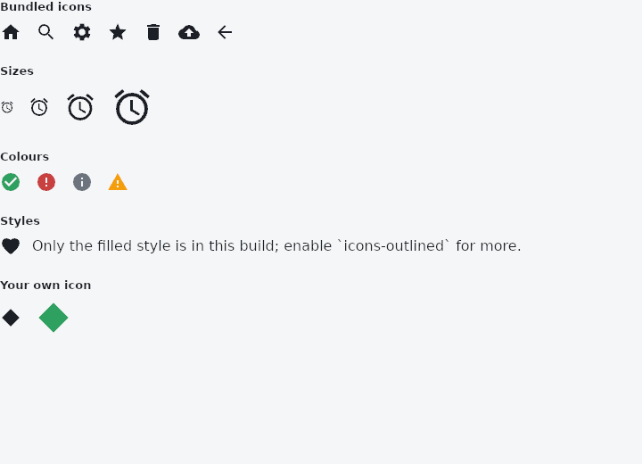
From frus-examples/widgets/src/features/display/widgets/icon.rs:
//! `Icon` — a vector icon from the bundled set (`Icons::…`), or one of your own,
//! scaled and coloured to the theme.

use frus::{
    Align, Color, Column, Expanded, Icon, IconData, Icons, Path, Point, Row, Text, Widget, Wrap,
};

use crate::common::shared::{section, sections};

/// An icon of your own: a path on the same 24 × 24 grid the bundled ones use, y
/// downwards. A function pointer keeps it a `const`, declared like `Icons::STAR`.
const DIAMOND: IconData = IconData::custom(diamond);

fn diamond() -> Path {
    Path::new()
        .move_to(Point::new(12.0, 2.0))
        .line_to(Point::new(22.0, 12.0))
        .line_to(Point::new(12.0, 22.0))
        .line_to(Point::new(2.0, 12.0))
        .close()
}

pub fn example() -> Box<dyn Widget> {
    Box::new(frus::component(|cx| {
        let theme = cx.theme();

        // The filled style is always bundled. Outlined, rounded and sharp each sit behind
        // a cargo feature (`icons-outlined`, `icons-rounded`, `icons-sharp`), so an app
        // pays only for the artwork it uses. Looking one up by name says whether it is in
        // this build: `None` means the feature is off.
        let outlined = Icons::by_name("favorite_outlined");
        let style_row = match outlined {
            Some(icon) => Row::new()
                .spacing(12.0)
                .child(Icon::new(Icons::FAVORITE))
                .child(Icon::new(icon))
                .child(Text::new("filled and outlined")),
            None => Row::new()
                .spacing(12.0)
                .child(Icon::new(Icons::FAVORITE))
                // `Expanded` gives the sentence the rest of the row, and `wrap` lets it
                // break into lines there instead of running past the edge.
                .child(Expanded::new(
                    Text::new(
                        "Only the filled style is in this build; enable `icons-outlined` for more.",
                    )
                    .wrap(),
                )),
        };

        sections(vec![
            // An icon takes the theme's icon size (24) and colour unless told otherwise.
            Box::new(section(
                "Bundled icons",
                Wrap::new()
                    .gap(16.0)
                    .run_gap(12.0)
                    .child(Icon::new(Icons::HOME))
                    .child(Icon::new(Icons::SEARCH))
                    .child(Icon::new(Icons::SETTINGS))
                    .child(Icon::new(Icons::STAR))
                    .child(Icon::new(Icons::DELETE))
                    .child(Icon::new(Icons::CLOUD_UPLOAD))
                    .child(Icon::new(Icons::ARROW_BACK)),
            )),
            Box::new(section(
                "Sizes",
                Row::new()
                    .spacing(16.0)
                    .child(Icon::new(Icons::ALARM).size(16.0))
                    .child(Icon::new(Icons::ALARM).size(24.0))
                    .child(Icon::new(Icons::ALARM).size(36.0))
                    .child(Icon::new(Icons::ALARM).size(48.0)),
            )),
            // Theme colours keep icons right in light and dark mode; a literal colour is
            // for brand marks and status.
            Box::new(section(
                "Colours",
                Row::new()
                    .spacing(16.0)
                    .child(Icon::new(Icons::CHECK_CIRCLE).color(theme.primary))
                    .child(Icon::new(Icons::ERROR).color(theme.error))
                    .child(Icon::new(Icons::INFO).color(theme.muted))
                    .child(Icon::new(Icons::WARNING).color(Color::hex("#F59E0B"))),
            )),
            Box::new(section("Styles", style_row)),
            Box::new(section(
                "Your own icon",
                Column::new()
                    .cross_axis_alignment(Align::Start)
                    .spacing(8.0)
                    .child(
                        Row::new()
                            .spacing(16.0)
                            .child(Icon::new(DIAMOND))
                            .child(Icon::new(DIAMOND).size(40.0).color(theme.primary)),
                    ),
            )),
        ])
    }))
}
Properties
| Method | Argument | Effect |
|---|---|---|
.size() | size: f32 | Sets the size, that is, the square's side, in logical pixels. Outranks the theme. |
.color() | color: Color | Forces the colour; the theme's otherwise, and on_surface if it says nothing. |
Behaviour
A vector icon. Size and colour can both be customised; they default to 24 px and the theme's foreground colour (on_surface).
See also
- CircleAvatar: a circle that stands for a person: a picture, initials or an icon.
- Badge: a small count or dot that says there is something new.
- Image & ImageIcon: bitmaps from assets, pixels or the network, fitted into a box.
- Divider & VerticalDivider: thin rules that separate content across a column or down a row.
- ListTile: one row of a list: leading, title, subtitle and trailing slots.
- The guide: Text, colour and the theme
- API reference:
Icon
Source: crates/frus-widgets/src/icon.rs @ e6fba33f5b42