Chip
Purpose
Compact elements for filters, choices, entries and actions.
Signature
pub struct Chip<Msg = crate::callback::Callback> { .. }

impl Chip {
    pub fn new(label: impl Into<String>) -> Self;
}
Example
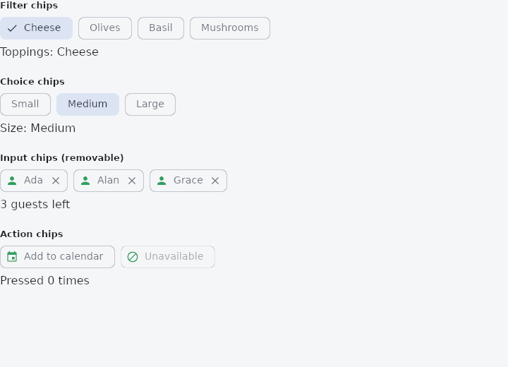
From frus-examples/widgets/src/features/display/widgets/chip.rs:
//! `Chip` — a compact element for an attribute, a filter, a choice or an entry. One
//! widget; what makes it one kind or another is what it can do: be selected, carry an
//! icon, be removed, be pressed.

use frus::{Align, Chip, Column, Icons, Text, Widget, Wrap};

use crate::common::shared::{section, sections};

const TOPPINGS: [&str; 4] = ["Cheese", "Olives", "Basil", "Mushrooms"];
const SIZES: [&str; 3] = ["Small", "Medium", "Large"];

pub fn example() -> Box<dyn Widget> {
    // `frus::component` turns a closure into a widget that can keep state with hooks:
    // each `use_state` value survives rebuilds, and setting it rebuilds the component.
    Box::new(frus::component(|cx| {
        let toppings = cx.use_state(|| vec![true, false, false, false]);
        let size = cx.use_state(|| 1usize);
        let guests = cx.use_state(|| vec!["Ada", "Alan", "Grace"]);
        let presses = cx.use_state(|| 0u32);

        // Filter chips: each one toggles independently, and a checkmark shows the ones on.
        let filters = TOPPINGS.iter().enumerate().fold(
            Wrap::new().gap(8.0).run_gap(8.0),
            |row, (i, name)| {
                let toppings_handle = toppings.clone();
                row.child(
                    Chip::new(*name)
                        .selected(toppings.with(|on| on[i]))
                        .on_press(move || toppings_handle.update(|on| on[i] = !on[i])),
                )
            },
        );

        // Choice chips: exactly one is selected. No checkmark, the fill says it.
        let choices =
            SIZES
                .iter()
                .enumerate()
                .fold(Wrap::new().gap(8.0).run_gap(8.0), |row, (i, name)| {
                    let size_handle = size.clone();
                    row.child(
                        Chip::new(*name)
                            .selected(size.get() == i)
                            .show_checkmark(false)
                            .on_press(move || size_handle.set(i)),
                    )
                });

        // Input chips: entries the user added, each with a leading icon and a delete cross.
        let entries =
            guests
                .get()
                .into_iter()
                .fold(Wrap::new().gap(8.0).run_gap(8.0), |row, name| {
                    let guests_handle = guests.clone();
                    row.child(Chip::new(name).leading(Icons::PERSON).on_remove(move || {
                        guests_handle.update(|list| list.retain(|g| *g != name))
                    }))
                });

        // Action chips: a pressable shortcut, like a small button.
        let presses_handle = presses.clone();
        let actions = Wrap::new()
            .gap(8.0)
            .run_gap(8.0)
            .child(
                Chip::new("Add to calendar")
                    .leading(Icons::EVENT)
                    .on_press(move || presses_handle.update(|n| *n += 1)),
            )
            // A disabled chip stays visible, dimmed, and ignores presses.
            .child(
                Chip::new("Unavailable")
                    .leading(Icons::BLOCK)
                    .enabled(false),
            );

        let chosen: Vec<&str> = TOPPINGS
            .iter()
            .zip(toppings.get())
            .filter_map(|(name, on)| on.then_some(*name))
            .collect();

        sections(vec![
            Box::new(section(
                "Filter chips",
                Column::new()
                    .cross_axis_alignment(Align::Start)
                    .spacing(8.0)
                    .child(filters)
                    .child(Text::new(format!("Toppings: {}", chosen.join(", ")))),
            )),
            Box::new(section(
                "Choice chips",
                Column::new()
                    .cross_axis_alignment(Align::Start)
                    .spacing(8.0)
                    .child(choices)
                    .child(Text::new(format!("Size: {}", SIZES[size.get()]))),
            )),
            Box::new(section(
                "Input chips (removable)",
                Column::new()
                    .cross_axis_alignment(Align::Start)
                    .spacing(8.0)
                    .child(entries)
                    .child(Text::new(format!("{} guests left", guests.with(Vec::len)))),
            )),
            Box::new(section(
                "Action chips",
                Column::new()
                    .cross_axis_alignment(Align::Start)
                    .spacing(8.0)
                    .child(actions)
                    .child(Text::new(format!("Pressed {} times", presses.get()))),
            )),
        ])
    }))
}
Properties
| Method | Argument | Effect |
|---|---|---|
.selected() | selected: bool | Marks the chip selected: it fills, its label takes the colour that goes with the fill, and a checkmark appears in the leading slot unless there is an icon there already (or Chip::show_checkmark says otherwise). |
.leading() | icon: IconData | A leading icon — the avatar or glyph an entry chip carries. |
.enabled() | enabled: bool | Greys the chip out and makes it inert: no press, no ink, out of the tab order, and announced to a reader as disabled rather than simply going quiet. |
.on_press() | message: impl Into<Msg> | The message the chip emits when pressed. A chip with none is inert, which is what an attribute chip is. |
.on_remove() | message: impl Into<Msg> | Adds a delete cross that emits message. |
.show_checkmark() | show: bool | Whether a selected chip shows a checkmark. On by default. |
.color() | color: Color | The surface under an unselected chip. Transparent by default. |
.selected_color() | color: Color | The surface under a selected one. |
.label_color() | color: Color | The label's colour when unselected. |
.selected_label_color() | color: Color | The label's colour when selected. |
.label_style() | style: TextStyle | The label's type. Defaults to the theme's label_large step. |
.border_color() | color: Color | The outline's colour. |
.border_width() | width: f32 | The outline's thickness; 0.0 removes it. |
.radius() | radius: impl Into<BorderRadius> | The corner radii (uniform via f32, per corner via BorderRadius) — the shorthand for a rounded rectangle. See Chip::shape. |
.shape() | shape: ShapeBorder | The last of the two to be called is the one that counts: they are one property. |
.padding() | padding: f32 | The room inside the outline. |
.label_padding() | padding: f32 | The room on either side of the label. |
.height() | height: f32 | The chip's height. |
.icon_size() | size: f32 | The size of the leading icon, the checkmark and the delete cross. |
Behaviour
A compact label — an attribute, a filter or an entry.
See also
- Card: a themed surface that groups one piece of content: elevated, filled or outlined.
- CircleAvatar: a circle that stands for a person: a picture, initials or an icon.
- Badge: a small count or dot that says there is something new.
- Icon: vector icons from the bundled set, or your own, sized and coloured.
- The guide: Text, colour and the theme
- API reference:
Chip
Source: crates/frus-widgets/src/chip.rs @ e6fba33f5b42