Card
Purpose
A themed surface that groups one piece of content: elevated, filled or outlined.
Signature
pub struct Card<Msg = crate::callback::Callback> { .. }

impl Card {
    pub fn new() -> Self;
}
Example
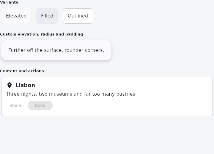
From frus-examples/widgets/src/features/display/widgets/card.rs:
//! `Card` — a themed surface that groups one piece of content: elevated, filled or
//! outlined.

use frus::{
    Align, Button, Card, CardVariant, Column, FontWeight, Icon, Icons, Row, Text, Variant, Widget,
    Wrap,
};

use crate::common::shared::{section, sections};

pub fn example() -> Box<dyn Widget> {
    sections(vec![
        // The three variants say how far the card stands off what is behind it: a shadow
        // (elevated, the default), a tonal fill, or only an outline.
        Box::new(section(
            "Variants",
            Wrap::new()
                .gap(8.0)
                .run_gap(8.0)
                .child(labelled(Card::new(), "Elevated"))
                .child(labelled(Card::new().filled(), "Filled"))
                .child(labelled(Card::new().outlined(), "Outlined")),
        )),
        // Every default is overridable: depth, rounding, colour, padding, margin.
        Box::new(section(
            "Custom elevation, radius and padding",
            Card::new()
                .variant(CardVariant::Elevated)
                .elevation(6.0)
                .radius(20.0)
                .padding(24.0)
                .child(Text::new("Further off the surface, rounder corners.")),
        )),
        // The usual shape of a card: a heading, some text, and actions at the bottom.
        Box::new(section(
            "Content and actions",
            Card::new().outlined().child(
                Column::new()
                    .cross_axis_alignment(Align::Start)
                    .spacing(8.0)
                    .child(
                        Row::new()
                            .spacing(8.0)
                            .child(Icon::new(Icons::LOCATION_ON))
                            .child(Text::new("Lisbon").size(18.0).weight(FontWeight::SemiBold)),
                    )
                    .child(Text::new(
                        "Three nights, two museums and far too many pastries.",
                    ))
                    .child(
                        Row::new()
                            .spacing(8.0)
                            .child(Button::new("Share").variant(Variant::Text))
                            .child(Button::new("Book").variant(Variant::Tonal)),
                    ),
            ),
        )),
    ])
}

/// A small card holding one word — the variants side by side.
fn labelled(card: Card, label: &str) -> Card {
    card.child(Text::new(label))
}
Properties
| Method | Argument | Effect |
|---|---|---|
.variant() | variant: CardVariant | Chooses the variant. |
.filled() | — | A flat tonal card: no shadow, no outline. |
.outlined() | — | An outlined card: a hairline, no shadow. |
.padding() | padding: f32 | Uniform padding inside the card. |
.margin() | margin: f32 | Uniform room outside the card. Defaults to CARD_MARGIN; 0.0 for a caller that spaces its children itself. |
.elevation() | elevation: f32 | How far off the surface the card sits. 0.0 removes the shadow; the default is CARD_ELEVATION for an elevated card and nothing for the other two. |
.color() | color: Color | Overrides the background colour. |
.shape() | shape: ShapeBorder | Overrides the corner radii (uniform via f32, per corner via BorderRadius). They are one field, and the last of the two called is the one that counts. |
.radius() | radius: impl Into<BorderRadius> | Rounds the card's corners with radius. It is the same field as shape: the last of the two called is the one that counts. |
.child() | child: impl Widget<Msg> + 'static | Sets the card's content. |
Behaviour
A card: a surface container, in the theme's colours.
Card::new().child(content)                          // elevated, the default
Card::new().outlined().child(content)               // an outline, no shadow
Card::new().elevation(6.0).radius(20.0)             // further off the surface
Card::new().color(theme.scheme.primary_container)   // its own colour
Card::new().margin(0.0)                             // flush, for a caller that
                                                    // spaces its own children
Everything here is a default, not a rule: the colour, the rounding, the depth, the margin and the padding are all the caller's to set.
See also
- Chip: compact elements for filters, choices, entries and actions.
- CircleAvatar: a circle that stands for a person: a picture, initials or an icon.
- Badge: a small count or dot that says there is something new.
- The guide: Text, colour and the theme
- API reference:
Card
Source: crates/frus-widgets/src/card.rs @ e6fba33f5b42