Badge
Purpose
A small count or dot that says there is something new.
Signature
pub struct Badge { .. }

impl Badge {
    pub fn new(text: impl Into<String>) -> Self;
    pub fn count(count: u32) -> Self;
    pub fn dot() -> Self;
}
Example
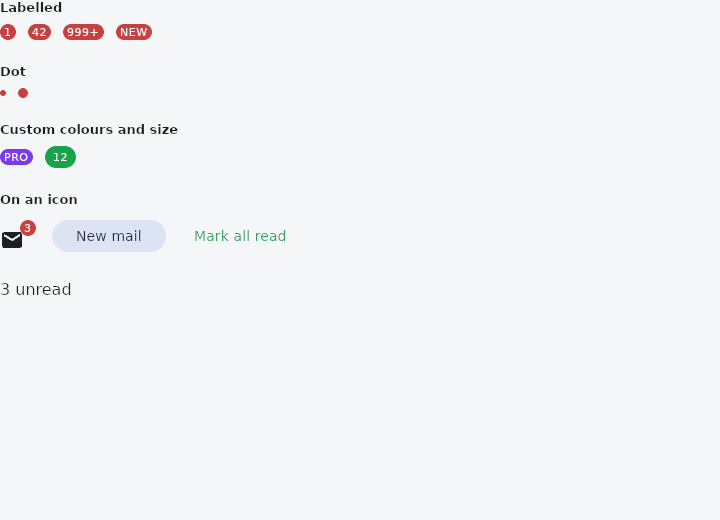
From frus-examples/widgets/src/features/display/widgets/badge.rs:
//! `Badge` — the small mark that says "there is something here": a count on an inbox,
//! a dot on a bell.

use frus::{
    Badge, Button, Color, Colors, Icon, Icons, Positioned, Row, Stack, Text, Variant, Widget,
};

use crate::common::shared::{section, sections};

pub fn example() -> Box<dyn Widget> {
    Box::new(frus::component(|cx| {
        let unread = cx.use_state(|| 3u32);

        // A badge is a standalone mark. To pin one to an icon's corner, lay both in a
        // `Stack` and place the badge with `Positioned`.
        let inbox = Stack::new()
            .width(36.0)
            .height(32.0)
            .layer(
                Positioned::new(Icon::new(Icons::MAIL))
                    .left(0.0)
                    .bottom(0.0),
            )
            .layer(
                Positioned::new(
                    // A count of zero hides the label and leaves a dot — or, as here, the
                    // application drops the badge altogether.
                    if unread.get() > 0 {
                        Box::new(Badge::new(count_label(unread.get()))) as Box<dyn Widget>
                    } else {
                        Box::new(Row::new())
                    },
                )
                .right(0.0)
                .top(0.0),
            );

        let more = unread.clone();
        let clear = unread.clone();

        sections(vec![
            // With a label it is a pill carrying a number or a word.
            Box::new(section(
                "Labelled",
                Row::new()
                    .spacing(12.0)
                    .child(Badge::new("1"))
                    .child(Badge::new("42"))
                    .child(Badge::new("999+"))
                    .child(Badge::new("NEW")),
            )),
            // Without one it is a dot: something happened, without saying how much.
            Box::new(section(
                "Dot",
                Row::new()
                    .spacing(12.0)
                    .child(Badge::dot())
                    .child(Badge::dot().small_size(10.0)),
            )),
            // Colours and sizes are the theme's by default and yours to override.
            Box::new(section(
                "Custom colours and size",
                Row::new()
                    .spacing(12.0)
                    .child(
                        Badge::new("PRO")
                            .background_color(Color::hex("#7C3AED"))
                            .text_color(Colors::WHITE),
                    )
                    .child(
                        Badge::new("12")
                            .background_color(Color::hex("#16A34A"))
                            .large_size(22.0)
                            .padding(8.0),
                    ),
            )),
            // A live count on an icon.
            Box::new(section(
                "On an icon",
                Row::new()
                    .spacing(16.0)
                    .child(inbox)
                    .child(
                        Button::new("New mail")
                            .variant(Variant::Tonal)
                            .on_press(move || more.update(|n| *n += 1)),
                    )
                    .child(
                        Button::new("Mark all read")
                            .variant(Variant::Text)
                            .on_press(move || clear.set(0)),
                    ),
            )),
            Box::new(Text::new(format!("{} unread", unread.get()))),
        ])
    }))
}

/// Counts above 99 are shown as "99+", so the pill stays small.
pub fn count_label(count: u32) -> String {
    if count > 99 {
        "99+".to_string()
    } else {
        count.to_string()
    }
}
Properties
| Method | Argument | Effect |
|---|---|---|
.max_count() | max: u32 | The largest count written out; past it the badge reads max+. 999 by default. |
.label_visible() | visible: bool | Whether the badge is shown. false takes it away — on its own it takes no room and draws nothing, and on a child only the child is left — so a count of zero needs no if around the widget: Badge::count(n).label_visible(n > 0). |
.background_color() | color: Color | — |
.text_color() | color: Color | The label's colour on that fill; the theme's on_error otherwise. |
.text_style() | style: TextStyle | The label's whole style — size, weight, family. Its colour is text_color's. |
.small_size() | size: f32 | The diameter of a badge with no label. |
.large_size() | size: f32 | The height of a badge that carries one. |
.padding() | padding: f32 | The label's room either side. |
.alignment() | alignment: impl Into<AlignmentGeometry> | Where on its child a pinned badge goes (Badge::on): the child's top-end corner by default, or the theme's. An AlignmentDirectional follows the reading direction. |
.offset() | across: f32, down: f32 | How far a pinned badge with a label is moved from its place, (across, down): a little past the end and above the top by default — (4, -4), mirrored for a right-to-left reading — or the theme's. A dot is not moved: it sits in the corner. |
Behaviour
A small mark: a counted pill, or a dot.
See also
- Chip: compact elements for filters, choices, entries and actions.
- CircleAvatar: a circle that stands for a person: a picture, initials or an icon.
- Icon: vector icons from the bundled set, or your own, sized and coloured.
- Image & ImageIcon: bitmaps from assets, pixels or the network, fitted into a box.
- Divider & VerticalDivider: thin rules that separate content across a column or down a row.
- The guide: Text, colour and the theme
- API reference:
Badge
Source: crates/frus-widgets/src/badge.rs @ e6fba33f5b42