PopupMenuButton and MenuItem
Purpose
A list of actions floating over a button: icons, ticks, shortcuts and rules.
Signature
pub struct PopupMenuButton<Msg = crate::callback::Callback> { .. }

impl PopupMenuButton {
    pub fn new(anchor: impl Widget<Msg> + 'static, open: bool, on_dismiss: Msg) -> Self;
}
pub struct MenuItem<Msg = crate::callback::Callback> { .. }

impl MenuItem {
    pub fn new(label: impl Into<String>, message: Msg) -> Self;
    pub fn widget(child: impl Widget<Msg> + 'static, message: Msg) -> Self;
    pub fn icon(icon: IconData, label: impl Into<String>, message: Msg) -> Self;
    pub fn checked(label: impl Into<String>, checked: bool, message: Msg) -> Self;
    pub fn divider() -> Self;
}
Example
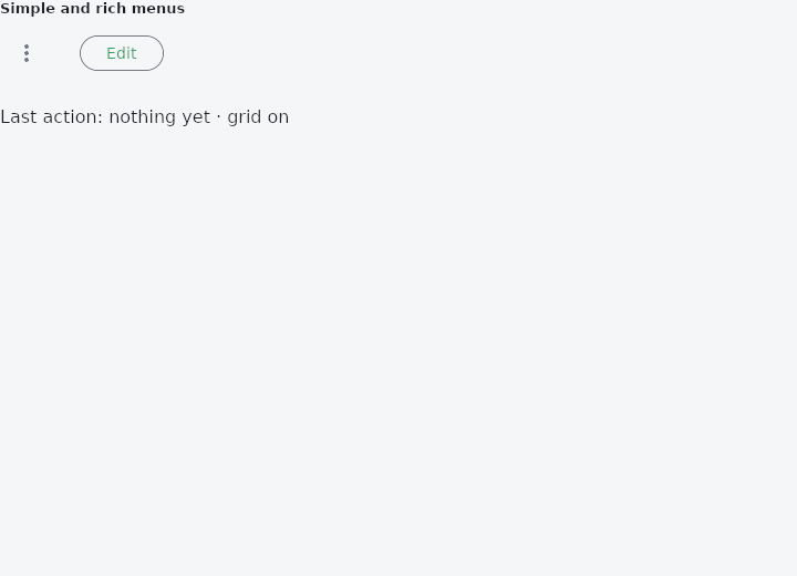
From frus-examples/widgets/src/features/buttons/widgets/popup_menu_button.rs:
//! `PopupMenuButton` and `MenuItem` — a list of actions that floats over a button and
//! closes on a click outside. For the "more" menu of a row or an app bar.

use frus::{
    Button, Callback, IconButton, Icons, MenuItem, PopupMenuButton, Row, State, StateContext,
    StatefulWidget, Text, Variant, Widget,
};

use crate::common::shared::{section, sections};

pub fn example() -> Box<dyn Widget> {
    Box::new(PopupDemo.into_widget())
}

struct PopupDemo;

/// Menus are **controlled**: the application keeps which one is open. Here at most one
/// is, so a single field says which.
struct PopupDemoState {
    open: Option<Menu>,
    last: String,
    show_grid: bool,
}

#[derive(Clone, Copy, PartialEq)]
enum Menu {
    Simple,
    Rich,
}

impl PopupDemoState {
    fn toggle(&mut self, menu: Menu) {
        self.open = if self.open == Some(menu) {
            None
        } else {
            Some(menu)
        };
    }

    /// An item was chosen: remember it, and close the menu.
    fn chose(&mut self, what: &str) {
        self.last = what.to_string();
        self.open = None;
    }
}

impl StatefulWidget for PopupDemo {
    type State = PopupDemoState;

    fn create_state(&self) -> PopupDemoState {
        PopupDemoState {
            open: None,
            last: "nothing yet".into(),
            show_grid: true,
        }
    }
}

impl State for PopupDemoState {
    type Widget = PopupDemo;

    fn build(&self, cx: &StateContext<Self>) -> Box<dyn Widget> {
        let pick = |what: &'static str| -> Callback {
            cx.callback(move |s: &mut PopupDemoState| s.chose(what))
        };
        // A click outside the menu sends this.
        let close = cx.callback(|s: &mut PopupDemoState| s.open = None);

        // The anchor is any widget; here an icon button that opens and closes the menu.
        let simple = PopupMenuButton::new(
            IconButton::new(Icons::MORE_VERT)
                .label("More")
                .on_press(cx.callback(|s: &mut PopupDemoState| s.toggle(Menu::Simple))),
            self.open == Some(Menu::Simple),
            close.clone(),
        )
        .item("Rename", pick("Rename"))
        .item("Duplicate", pick("Duplicate"))
        .item("Delete", pick("Delete"));

        // `MenuItem` covers the rows that are not just words: an icon, a tick, a
        // keyboard shortcut, a rule between groups, a row that is unavailable.
        let rich = PopupMenuButton::new(
            Button::new("Edit")
                .variant(Variant::Outlined)
                .on_press(cx.callback(|s: &mut PopupDemoState| s.toggle(Menu::Rich))),
            self.open == Some(Menu::Rich),
            close,
        )
        .entry(MenuItem::icon(Icons::CONTENT_CUT, "Cut", pick("Cut")).shortcut("Ctrl+X"))
        .entry(MenuItem::icon(Icons::CONTENT_COPY, "Copy", pick("Copy")).shortcut("Ctrl+C"))
        .entry(MenuItem::icon(Icons::CONTENT_PASTE, "Paste", pick("Paste")).enabled(false))
        .divider()
        .entry(MenuItem::checked(
            "Show grid",
            self.show_grid,
            cx.callback(|s: &mut PopupDemoState| {
                s.show_grid = !s.show_grid;
                s.open = None;
            }),
        ));
        // The panel's look (shape, elevation, padding) comes from the theme's
        // `MenuTheme`, so every menu of the app agrees.

        sections(vec![
            Box::new(section(
                "Simple and rich menus",
                Row::new().spacing(24.0).child(simple).child(rich),
            )),
            Box::new(Text::new(format!(
                "Last action: {} · grid {}",
                self.last,
                if self.show_grid { "on" } else { "off" }
            ))),
        ])
    }
}
Properties
| Type | Method | Argument | Effect |
|---|---|---|---|
PopupMenuButton | .text_style() | style: TextStyle | — |
PopupMenuButton | .background() | color: Color | — |
PopupMenuButton | .shape() | shape: ShapeBorder | What shape the panel is, over the theme's and the framework's corner. |
PopupMenuButton | .radius() | radius: impl Into<BorderRadius> | Reaching past that for a single widget would make the menu the only thing on screen ignoring the number an application set. |
PopupMenuButton | .elevation() | elevation: f32 | How far off the page the panel sits, in pixels. Three by default. |
PopupMenuButton | .shadow_color() | color: Color | The colour of the panel's shadow, over the theme's and the scheme's shadow at 30 %. It is used as given, alpha and all: Color::TRANSPARENT casts none. |
PopupMenuButton | .menu_padding() | padding: Insets | The room kept above and below the rows, inside the panel. |
PopupMenuButton | .item_padding() | padding: Insets | The room kept either side of a row's label. |
PopupMenuButton | .item_height() | height: f32 | How tall one row is, as a floor — a row still grows to fit the reader's type. The default is the smallest box a finger can be asked to hit. |
PopupMenuButton | .enabled() | enabled: bool | Whether the menu can be used. Disabled it is inert and, like a disabled DropdownButton, never open: a floating panel over an anchor that answers nothing traps a press and returns no message. |
PopupMenuButton | .item() | label: impl Into<String>, message: Msg | Adds an action: a label plus a message on click. Ignored when the menu is closed. |
PopupMenuButton | .item_widget() | child: impl Widget<Msg> + 'static, message: Msg | Adds a row the caller draws — two lines, a swatch, a badge, rich text — plus the message it sends. |
PopupMenuButton | .icon_item() | icon: IconData, label: impl Into<String>, message: Msg | Adds an action with a picture in the leading column. |
PopupMenuButton | .checked_item() | label: impl Into<String>, checked: bool, message: Msg | Adds an action that is on or off, ticked when it is on. |
PopupMenuButton | .divider() | — | Adds the rule between two groups of actions. |
PopupMenuButton | .entry() | item: MenuItem<Msg> | Adds an entry however it was built — the door to MenuItem::enabled and MenuItem::shortcut, which no shorthand carries. Ignored when the menu is closed. |
MenuItem | .enabled() | enabled: bool | Whether this row can be used, over the menu's own availability. |
MenuItem | .shortcut() | keys: impl Into<String> | The keys that work this action, shown muted on the right. |
Behaviour
PopupMenuButton
A controlled action menu, opened and closed by the application.
MenuItem
One entry of a PopupMenuButton's list: an action, or the rule between two groups of them.
The shorthands on the button itself — item, icon_item, checked_item, item_widget and divider — each build one of these, and are what most call sites should write. This type is the door to the two things a shorthand cannot carry: a row that is not available while the rest of the menu is, and the keys that work an action.
use frus_widgets::{Container, Icons, MenuItem, PopupMenuButton};

#[derive(Clone)]
enum Msg {
    Close,
    Cut,
    Paste,
    Wrap,
}

let menu = PopupMenuButton::new(Container::<Msg>::new(), true, Msg::Close)
    .entry(MenuItem::icon(Icons::CONTENT_CUT, "Cut", Msg::Cut).shortcut("Ctrl+X"))
    .entry(MenuItem::new("Paste", Msg::Paste).enabled(false))
    .divider()
    .checked_item("Word wrap", true, Msg::Wrap);
See also
- SegmentedButton: one outlined control with a few segments, exactly one of them chosen.
- ToggleButtons: a bank of buttons sharing their edges, each switched on or off on its own.
- MenuAnchor: a floating panel with any content, anchored to a widget.
- MenuBar & SubmenuButton: a desktop window's menus along the top, with submenus inside them.
- DropdownButton: a button showing the current choice, whose options float below it.
- The guide: Taking input
- API reference:
PopupMenuButton - API reference:
MenuItem
Source: crates/frus-widgets/src/menu.rs, crates/frus-widgets/src/menu.rs @ e6fba33f5b42