MenuAnchor
Purpose
A floating panel with any content, anchored to a widget.
Signature
pub struct MenuAnchor<Msg = crate::callback::Callback> { .. }

impl MenuAnchor {
    pub fn new(anchor: impl Widget<Msg> + 'static, open: bool, on_dismiss: Msg) -> Self;
}
Example
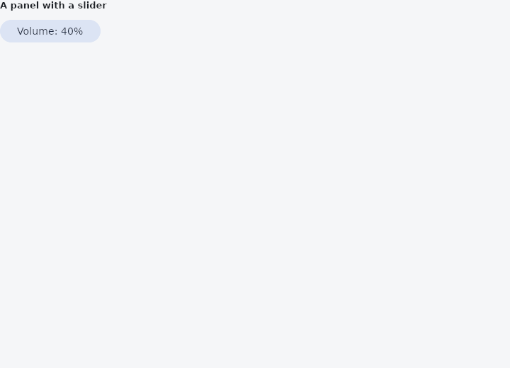
From frus-examples/widgets/src/features/buttons/widgets/menu_anchor.rs:
//! `MenuAnchor` — a floating panel with **any content**, anchored to a widget and closed
//! by a click outside. A popup menu is a list of rows; this is for everything else.

use frus::{
    Align, Button, Column, FontWeight, Insets, MenuAnchor, Slider, State, StateContext,
    StatefulWidget, Text, Variant, Widget,
};

use crate::common::shared::{section, sections};

pub fn example() -> Box<dyn Widget> {
    Box::new(AnchorDemo.into_widget())
}

struct AnchorDemo;

struct AnchorDemoState {
    open: bool,
    volume: f32,
}

impl StatefulWidget for AnchorDemo {
    type State = AnchorDemoState;

    fn create_state(&self) -> AnchorDemoState {
        AnchorDemoState {
            open: false,
            volume: 0.4,
        }
    }
}

impl State for AnchorDemoState {
    type Widget = AnchorDemo;

    fn build(&self, cx: &StateContext<Self>) -> Box<dyn Widget> {
        // The panel holds live widgets: dragging the slider changes the state while the
        // panel stays open.
        let panel = Column::new()
            .spacing(8.0)
            .cross_axis_alignment(Align::Start)
            .child(Text::new("Volume").weight(FontWeight::SemiBold))
            .child(
                Slider::new(self.volume)
                    .width(200.0)
                    .on_change(cx.handler(|s: &mut AnchorDemoState, v: f32| s.volume = v)),
            )
            .child(
                Button::new("Done")
                    .variant(Variant::Text)
                    .on_press(cx.callback(|s: &mut AnchorDemoState| s.open = false)),
            );

        let anchor = MenuAnchor::new(
            Button::new(format!("Volume: {:.0}%", self.volume * 100.0))
                .variant(Variant::Tonal)
                .on_press(cx.callback(|s: &mut AnchorDemoState| s.open = !s.open)),
            self.open,
            cx.callback(|s: &mut AnchorDemoState| s.open = false),
        )
        .content(panel)
        .menu_padding(Insets::uniform(16.0))
        .radius(16.0);

        sections(vec![Box::new(section("A panel with a slider", anchor))])
    }
}
Properties
| Method | Argument | Effect |
|---|---|---|
.content() | content: impl Widget<Msg> + 'static | Sets the floating content, which is shown only when open. |
.background() | color: Color | — |
.shape() | shape: ShapeBorder | What shape the panel is, over the theme's and the framework's corner. |
.radius() | radius: impl Into<BorderRadius> | See PopupMenuButton::radius for why it is not the default. |
.elevation() | elevation: f32 | How far off the page the panel sits, in pixels. Three by default. |
.shadow_color() | color: Color | The colour of the panel's shadow, over the theme's and the scheme's shadow at 30 %. Color::TRANSPARENT casts none. |
.menu_padding() | padding: Insets | The room kept around the content, inside the panel. Eight above and below by default, and nothing either side. |
Behaviour
A popover: an anchor plus an optional floating panel.
Each of those answers to the builders below, then to MenuTheme. Content that brings a surface of its own — a Card — would be a surface on a surface; hand the anchor what goes on the panel instead.
See also
- ToggleButtons: a bank of buttons sharing their edges, each switched on or off on its own.
- PopupMenuButton & MenuItem: a list of actions floating over a button: icons, ticks, shortcuts and rules.
- MenuBar & SubmenuButton: a desktop window's menus along the top, with submenus inside them.
- DropdownButton: a button showing the current choice, whose options float below it.
- DropdownMenu: a dropdown that looks like a text field and filters its choices as you type.
- The guide: Taking input
- API reference:
MenuAnchor
Source: crates/frus-widgets/src/popover.rs @ e6fba33f5b42