IconButton
Purpose
A square button holding one icon, with four looks and a selected state.
Signature
pub struct IconButton<Msg = crate::callback::Callback> { .. }

impl IconButton {
    pub fn new(icon: IconData) -> Self;
    pub fn glyph(glyph: impl Into<String>) -> Self;
    pub fn image(icon: crate::ImageIcon) -> Self;
    pub fn animated(icon: crate::icons::AnimatedIconData, on: bool) -> Self;
}
Example
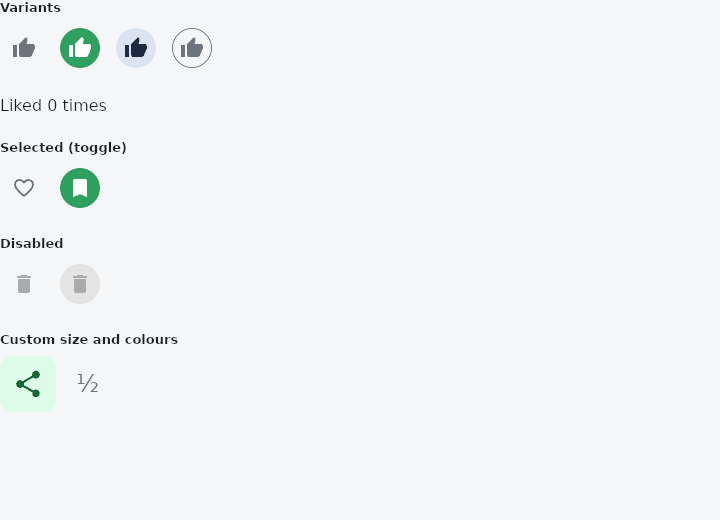
From frus-examples/widgets/src/features/buttons/widgets/icon_button.rs:
//! `IconButton` — a square button holding one icon, for compact actions in toolbars,
//! list rows and app bars.

use frus::{
    Color, IconButton, IconButtonVariant, Icons, Row, State, StateContext, StatefulWidget, Text,
    Widget, Wrap,
};

use crate::common::shared::{section, sections};

pub fn example() -> Box<dyn Widget> {
    Box::new(IconButtonDemo.into_widget())
}

struct IconButtonDemo;

struct IconButtonDemoState {
    favorite: bool,
    bookmarked: bool,
    likes: u32,
}

impl StatefulWidget for IconButtonDemo {
    type State = IconButtonDemoState;

    fn create_state(&self) -> IconButtonDemoState {
        IconButtonDemoState {
            favorite: false,
            bookmarked: true,
            likes: 0,
        }
    }
}

impl State for IconButtonDemoState {
    type Widget = IconButtonDemo;

    fn build(&self, cx: &StateContext<Self>) -> Box<dyn Widget> {
        let like = || cx.callback(|s: &mut IconButtonDemoState| s.likes += 1);

        sections(vec![
            // `label` is what a screen reader announces and what the tooltip says: an
            // icon alone means nothing to someone who cannot see it, so always give one.
            Box::new(section(
                "Variants",
                Wrap::new()
                    .gap(8.0)
                    .run_gap(8.0)
                    .child(
                        IconButton::new(Icons::THUMB_UP)
                            .label("Like")
                            .on_press(like()),
                    )
                    .child(
                        IconButton::new(Icons::THUMB_UP)
                            .label("Like")
                            .variant(IconButtonVariant::Filled)
                            .on_press(like()),
                    )
                    .child(
                        IconButton::new(Icons::THUMB_UP)
                            .label("Like")
                            .variant(IconButtonVariant::Tonal)
                            .on_press(like()),
                    )
                    .child(
                        IconButton::new(Icons::THUMB_UP)
                            .label("Like")
                            .variant(IconButtonVariant::Outlined)
                            .on_press(like()),
                    ),
            )),
            Box::new(Text::new(format!("Liked {} times", self.likes))),
            // A toggle: `selected` swaps to the filled look. The state is yours — the
            // button only shows it — so the press flips a field.
            Box::new(section(
                "Selected (toggle)",
                Row::new()
                    .spacing(8.0)
                    .child(
                        IconButton::new(if self.favorite {
                            Icons::FAVORITE
                        } else {
                            Icons::FAVORITE_BORDER
                        })
                        .label("Favourite")
                        .selected(self.favorite)
                        .on_press(
                            cx.callback(|s: &mut IconButtonDemoState| s.favorite = !s.favorite),
                        ),
                    )
                    .child(
                        IconButton::new(if self.bookmarked {
                            Icons::BOOKMARK
                        } else {
                            Icons::BOOKMARK_BORDER
                        })
                        .label("Bookmark")
                        .variant(IconButtonVariant::Filled)
                        .selected(self.bookmarked)
                        .on_press(
                            cx.callback(|s: &mut IconButtonDemoState| s.bookmarked = !s.bookmarked),
                        ),
                    ),
            )),
            // Disabled: no press to answer, greyed out.
            Box::new(section(
                "Disabled",
                Row::new()
                    .spacing(8.0)
                    .child(
                        IconButton::new(Icons::DELETE)
                            .label("Delete")
                            .enabled(false),
                    )
                    .child(
                        IconButton::new(Icons::DELETE)
                            .label("Delete")
                            .variant(IconButtonVariant::Filled)
                            .enabled(false),
                    ),
            )),
            // Size, icon size, colours and corners are all yours to change.
            Box::new(section(
                "Custom size and colours",
                Row::new()
                    .spacing(8.0)
                    .child(
                        IconButton::new(Icons::SHARE)
                            .label("Share")
                            .size(56.0)
                            .icon_size(32.0)
                            .color(Color::hex("#DCFCE7"))
                            .icon_color(Color::hex("#166534"))
                            .radius(12.0)
                            .on_press(like()),
                    )
                    // A glyph works where the icon set has nothing that fits.
                    .child(IconButton::glyph("½").label("Half").on_press(like())),
            )),
        ])
    }
}
Properties
| Method | Argument | Effect |
|---|---|---|
.label() | label: impl Into<String> | What a screen reader announces. An icon has no text of its own, so without this the button is a shape with no name. |
.variant() | variant: IconButtonVariant | Chooses how much surface the button brings. |
.selected() | selected: bool | Makes it a toggle, on or off; on, the glyph takes the accent. A button never told is a plain button, and assistive technology offers it as one to press, not to switch. |
.enabled() | enabled: bool | Enables or disables it. Disabled, it is greyed out and emits nothing. |
.on_press() | message: impl Into<Msg> | The message emitted on click. |
.size() | size: f32 | The box's side. |
.icon_size() | size: f32 | The glyph's size inside it. |
.color() | color: Color | The surface under the glyph. |
.icon_color() | color: Color | The glyph's colour. |
.border_color() | color: Color | The outline's colour. |
.border_width() | width: f32 | The outline's thickness; 0.0 removes it. |
.radius() | radius: impl Into<BorderRadius> | The corner radii. Unset, the button is a circle. |
.tap_target() | target: TapTarget | How much room it reserves for a finger (TapTarget). Unset, the theme's answer, which is Padded — at least 48 pixels either way, whatever this control paints in the middle of it. |
Behaviour
A button holding one glyph.
See also
- Button: the labelled button: filled, tonal, elevated, outlined or text, with an optional icon.
- FloatingActionButton: the screen's main action, floating above it: small, regular, large or extended.
- SegmentedButton: one outlined control with a few segments, exactly one of them chosen.
- ToggleButtons: a bank of buttons sharing their edges, each switched on or off on its own.
- The guide: Taking input
- API reference:
IconButton
Source: crates/frus-widgets/src/iconbutton.rs @ e6fba33f5b42