DropdownMenu
Purpose
A dropdown that looks like a text field and filters its choices as you type.
Signature
pub struct DropdownMenu<Msg = crate::callback::Callback> { .. }

impl DropdownMenu {
    pub fn new<R1: crate::callback::IntoMsg<Msg>>(
        query: impl Into<String>,
        open: bool,
        on_input: impl Fn(String) -> R1 + 'static,
        on_toggle: Msg,
    ) -> Self;
}
Example
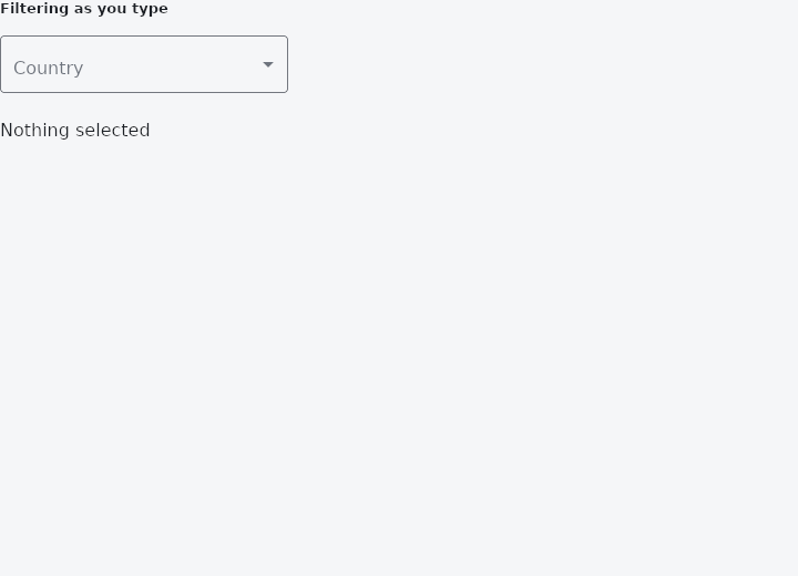
From frus-examples/widgets/src/features/buttons/widgets/dropdown_menu.rs:
//! `DropdownMenu` — a dropdown that looks like a text field and filters its choices as
//! you type. For a closed list too long to scan (countries, time zones).

use frus::{DropdownMenu, State, StateContext, StatefulWidget, Text, Widget};

use crate::common::shared::{section, sections};

pub fn example() -> Box<dyn Widget> {
    Box::new(DropdownMenuDemo.into_widget())
}

const COUNTRIES: [&str; 8] = [
    "Argentina",
    "Belgium",
    "Canada",
    "Denmark",
    "France",
    "Ghana",
    "Japan",
    "Kenya",
];

struct DropdownMenuDemo;

struct DropdownMenuDemoState {
    /// What is typed while the menu is open. The field shows the **selected** choice
    /// again as soon as the menu closes, so a half-typed query never looks like a value.
    query: String,
    open: bool,
    selected: Option<usize>,
}

impl StatefulWidget for DropdownMenuDemo {
    type State = DropdownMenuDemoState;

    fn create_state(&self) -> DropdownMenuDemoState {
        DropdownMenuDemoState {
            query: String::new(),
            open: false,
            selected: None,
        }
    }
}

impl State for DropdownMenuDemoState {
    type Widget = DropdownMenuDemo;

    fn build(&self, cx: &StateContext<Self>) -> Box<dyn Widget> {
        let menu = DropdownMenu::new(
            self.query.clone(),
            self.open,
            // Typing keeps the menu open and narrows the list.
            cx.handler(|s: &mut DropdownMenuDemoState, query: String| {
                s.query = query;
                s.open = true;
            }),
            cx.callback(|s: &mut DropdownMenuDemoState| s.open = !s.open),
        )
        .label("Country")
        .placeholder("Type to filter")
        .width(260.0)
        .max_visible(5)
        .selected(self.selected)
        // The index is into the full list, whatever the filter left showing.
        .options(
            &COUNTRIES,
            cx.handler(|s: &mut DropdownMenuDemoState, i: usize| {
                s.selected = Some(i);
                s.open = false;
                s.query.clear();
            }),
        );

        sections(vec![
            Box::new(section("Filtering as you type", menu)),
            Box::new(Text::new(match self.selected {
                Some(i) => format!("Selected: {}", COUNTRIES[i]),
                None => "Nothing selected".to_string(),
            })),
        ])
    }
}
Properties
| Method | Argument | Effect |
|---|---|---|
.label() | label: impl Into<String> | The name of the field, floating over its border the way a TextField's does. |
.placeholder() | placeholder: impl Into<String> | What the field shows while nothing is selected. |
.width() | width: f32 | The field's width, and the list's, in logical pixels (240 by default). |
.selected() | index: Option<usize> | Which choice is selected — the one ticked in the list, and the one the closed field shows. |
.enabled() | enabled: bool | Whether the control can be used at all. Disabled it is inert and, like a disabled DropdownButton, never open. |
.filter() | filter: bool | Whether typing filters the list. On by default. |
.max_visible() | rows: usize | Limits the number of visible choices; past that the list scrolls instead of stretching down the screen. |
.text_style() | style: TextStyle | — |
.menu_background() | color: Color | The surface the choices float on, over MenuTheme::background and surface_container. |
.menu_shape() | shape: ShapeBorder | What shape the panel is, over the theme's and the framework's corner. |
.menu_radius() | radius: impl Into<BorderRadius> | The shorthand for a rounded panel. |
.menu_elevation() | elevation: f32 | How far off the page the panel sits, in pixels. Three by default. |
.menu_shadow_color() | color: Color | The colour of the panel's shadow, over the theme's and the scheme's shadow at 30 %. Color::TRANSPARENT casts none. |
.menu_padding() | padding: Insets | The room kept above and below the choices, inside the panel. Eight by default. |
.options() | labels: &[&str], on_select: impl Fn(usize) -> R1 + 'static | The choices, as words. on_select maps the chosen index to a message. |
.options_widgets() | options: Vec<DropdownOption<Msg>>, on_select: impl Fn(usize) -> R1 + 'static | The same, for choices that are not words — see DropdownOption. |
Behaviour
A dropdown that looks like a text field, filters as it is typed into, and drops its choices below itself.
Controlled, like everything else here: the application holds the query, whether the menu is open, and which choice is selected.
use frus_widgets::{DropdownMenu, DropdownOption};

let field = DropdownMenu::new(&query, open, Msg::Query, Msg::Toggle)
    .label("Colour")
    .selected(chosen)
    .options(&["Red", "Green", "Blue"], Msg::Pick);
See also
- MenuBar & SubmenuButton: a desktop window's menus along the top, with submenus inside them.
- DropdownButton: a button showing the current choice, whose options float below it.
- BackButton, CloseButton & DrawerButton: icon buttons whose meaning is fixed: back, close, and the two drawers.
- The guide: Taking input
- API reference:
DropdownMenu
Source: crates/frus-widgets/src/dropdownmenu.rs @ e6fba33f5b42