Button
Purpose
The labelled button: filled, tonal, elevated, outlined or text, with an optional icon.
Signature
pub struct Button<Msg = crate::callback::Callback> { .. }

impl Button {
    pub fn new(label: impl Into<String>) -> Self;
    pub fn with_child(child: impl Widget<Msg> + 'static) -> Self;
}
Example
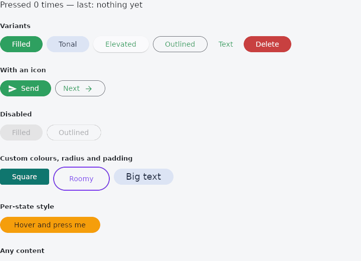
From frus-examples/widgets/src/features/buttons/widgets/button.rs:
//! `Button` — the labelled button, in its five variants: filled, tonal, elevated,
//! outlined and text. One widget, one `variant`, everything else shared.

use frus::{
    Button, ButtonStyle, Color, Icon, IconAlignment, Icons, Insets, State, StateContext,
    StatefulWidget, Text, Variant, Widget, WidgetState, WidgetStateProperty, Wrap,
};

use crate::common::shared::{section, sections};

pub fn example() -> Box<dyn Widget> {
    Box::new(ButtonDemo.into_widget())
}

/// The demo keeps one number — how many times a button was pressed — so that every
/// press visibly does something.
struct ButtonDemo;

struct ButtonDemoState {
    presses: u32,
    last: &'static str,
}

impl StatefulWidget for ButtonDemo {
    type State = ButtonDemoState;

    fn create_state(&self) -> ButtonDemoState {
        ButtonDemoState {
            presses: 0,
            last: "nothing yet",
        }
    }
}

impl ButtonDemoState {
    fn pressed(&mut self, which: &'static str) {
        self.presses += 1;
        self.last = which;
    }
}

impl State for ButtonDemoState {
    type Widget = ButtonDemo;

    fn build(&self, cx: &StateContext<Self>) -> Box<dyn Widget> {
        // A button with no `on_press` is disabled; `cx.callback` is what makes it live.
        let press =
            |which: &'static str| cx.callback(move |s: &mut ButtonDemoState| s.pressed(which));

        sections(vec![
            Box::new(Text::new(format!(
                "Pressed {} times — last: {}",
                self.presses, self.last
            ))),
            // From the loudest to the quietest. Use one `Filled` per screen for the main
            // action, `Tonal` beside it, `Outlined`/`Text` for the secondary ones, and
            // `Elevated` when the button sits over busy content.
            Box::new(section(
                "Variants",
                Wrap::new()
                    .gap(8.0)
                    .run_gap(8.0)
                    .child(Button::new("Filled").on_press(press("Filled")))
                    .child(
                        Button::new("Tonal")
                            .variant(Variant::Tonal)
                            .on_press(press("Tonal")),
                    )
                    .child(
                        Button::new("Elevated")
                            .variant(Variant::Elevated)
                            .on_press(press("Elevated")),
                    )
                    .child(
                        Button::new("Outlined")
                            .variant(Variant::Outlined)
                            .on_press(press("Outlined")),
                    )
                    .child(
                        Button::new("Text")
                            .variant(Variant::Text)
                            .on_press(press("Text")),
                    )
                    // `Danger` is a filled button in the error colours: for the action
                    // that destroys something.
                    .child(
                        Button::new("Delete")
                            .variant(Variant::Danger)
                            .on_press(press("Delete")),
                    ),
            )),
            // An icon goes before the label, or after it with `IconAlignment::End`.
            Box::new(section(
                "With an icon",
                Wrap::new()
                    .gap(8.0)
                    .run_gap(8.0)
                    .child(
                        Button::new("Send")
                            .icon(Icon::new(Icons::SEND))
                            .on_press(press("Send")),
                    )
                    .child(
                        Button::new("Next")
                            .variant(Variant::Outlined)
                            .icon(Icon::new(Icons::ARROW_FORWARD))
                            .icon_alignment(IconAlignment::End)
                            .on_press(press("Next")),
                    ),
            )),
            // `enabled(false)` greys a button out and makes it ignore presses — for an
            // action that is not possible yet (a form that is still invalid, say).
            Box::new(section(
                "Disabled",
                Wrap::new()
                    .gap(8.0)
                    .run_gap(8.0)
                    .child(
                        Button::new("Filled")
                            .enabled(false)
                            .on_press(press("never")),
                    )
                    .child(
                        Button::new("Outlined")
                            .variant(Variant::Outlined)
                            .enabled(false)
                            .on_press(press("never")),
                    ),
            )),
            // The common overrides have their own setters: colours, corners, padding,
            // height and text size. Anything they do not set comes from the theme.
            Box::new(section(
                "Custom colours, radius and padding",
                Wrap::new()
                    .gap(8.0)
                    .run_gap(8.0)
                    .child(
                        Button::new("Square")
                            .color(Color::hex("#0F766E"))
                            .label_color(Color::hex("#FFFFFF"))
                            .radius(4.0)
                            .on_press(press("Square")),
                    )
                    .child(
                        Button::new("Roomy")
                            .variant(Variant::Outlined)
                            .border_color(Color::hex("#7C3AED"))
                            .border_width(2.0)
                            .label_color(Color::hex("#7C3AED"))
                            .padding(32.0)
                            .height(48.0)
                            .on_press(press("Roomy")),
                    )
                    .child(
                        Button::new("Big text")
                            .variant(Variant::Tonal)
                            .size(18.0)
                            .on_press(press("Big text")),
                    ),
            )),
            // `ButtonStyle` describes the look **state by state**: here the fill changes
            // while the pointer is over the button and while it is held down.
            Box::new(section(
                "Per-state style",
                Button::new("Hover and press me")
                    .style(
                        ButtonStyle::new()
                            .background_color(
                                WidgetStateProperty::new()
                                    .when(WidgetState::Pressed, Color::hex("#B45309"))
                                    .when(WidgetState::Hovered, Color::hex("#D97706"))
                                    .otherwise(Color::hex("#F59E0B")),
                            )
                            .foreground_color(WidgetStateProperty::all(Color::hex("#1C1917")))
                            .padding(WidgetStateProperty::all(Insets::symmetric(28.0, 12.0))),
                    )
                    .on_press(press("Per-state")),
            )),
            // `with_child` takes any widget as the content.
            Box::new(section(
                "Any content",
                Button::with_child(Text::new("Custom child").italic())
                    .variant(Variant::Outlined)
                    .on_press(press("Custom child")),
            )),
        ])
    }
}
Properties
| Method | Argument | Effect |
|---|---|---|
.icon() | icon: impl Widget<Msg> + 'static | — |
.enabled() | enabled: bool | Enables or disables the button. |
.style() | style: ButtonStyle | The builders below each set one property of it. |
.radius() | radius: impl Into<BorderRadius> | The corner radii (uniform via f32, per corner via BorderRadius). Unset, a stadium. |
.shape() | shape: ShapeBorder | — |
.variant() | variant: Variant | — |
.label_style() | style: TextStyle | The label's type. Unset, the theme's label_large. |
.size() | size: f32 | Font size — sugar for Button::label_style with the label step resized. |
.color() | color: Color | The surface while enabled. |
.label_color() | color: Color | The label's colour while enabled. |
.border_color() | color: Color | The outline's colour, 1 px thick unless border_width says. |
.border_width() | width: f32 | The outline's thickness; 0.0 removes it. |
.padding() | padding: f32 | The room either side of the content. |
.height() | height: f32 | — |
.min_width() | width: f32 | The narrowest it will be, before the visual density. |
.elevation() | elevation: f32 | How far it sits off the surface in every state while enabled. Unset, the variant's: an elevated button rests at 1 and rises to 3 under a pointer; a filled or tonal one is flat and rises to 1; an outlined or text one stays flat. |
.icon_alignment() | alignment: IconAlignment | Which side of the label an icon goes. |
.on_press() | message: impl Into<Msg> | Message emitted on a press. |
.on_long_press() | message: impl Into<Msg> | Message emitted on a long press, which takes the place of the press. |
Behaviour
The example shows it at work; the API reference has every method.
See also
- IconButton: a square button holding one icon, with four looks and a selected state.
- FloatingActionButton: the screen's main action, floating above it: small, regular, large or extended.
- SegmentedButton: one outlined control with a few segments, exactly one of them chosen.
- The guide: Taking input
- API reference:
Button
Source: crates/frus-widgets/src/button.rs @ e6fba33f5b42