BackButton and CloseButton and DrawerButton
Purpose
Icon buttons whose meaning is fixed: back, close, and the two drawers.
Signature
pub struct BackButton<Msg = crate::callback::Callback>(Action<Msg>);

impl BackButton {
    pub fn new() -> Self;
}
pub struct CloseButton<Msg = crate::callback::Callback>(Action<Msg>);

impl CloseButton {
    pub fn new() -> Self;
}
pub struct DrawerButton<Msg = crate::callback::Callback>(Action<Msg>);

impl DrawerButton {
    pub fn new() -> Self;
}
Example
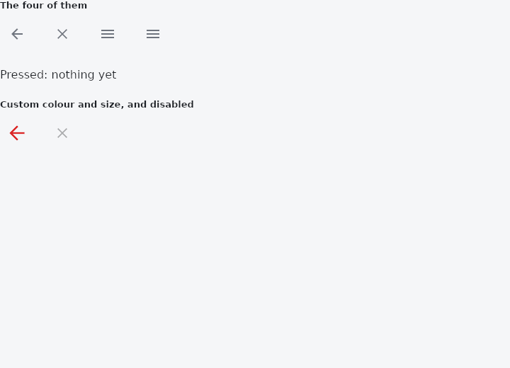
From frus-examples/widgets/src/features/buttons/widgets/action_buttons.rs:
//! `BackButton`, `CloseButton`, `DrawerButton` and `EndDrawerButton` — icon buttons
//! whose meaning is fixed. They know their icon and their accessible name (translated
//! by the framework), so an app bar never spells them out by hand.

use frus::{
    BackButton, CloseButton, Color, DrawerButton, EndDrawerButton, State, StateContext,
    StatefulWidget, Text, Widget, Wrap,
};

use crate::common::shared::{section, sections};

pub fn example() -> Box<dyn Widget> {
    Box::new(ActionButtonsDemo.into_widget())
}

struct ActionButtonsDemo;

struct ActionButtonsDemoState {
    last: &'static str,
}

impl StatefulWidget for ActionButtonsDemo {
    type State = ActionButtonsDemoState;

    fn create_state(&self) -> ActionButtonsDemoState {
        ActionButtonsDemoState {
            last: "nothing yet",
        }
    }
}

impl State for ActionButtonsDemoState {
    type Widget = ActionButtonsDemo;

    fn build(&self, cx: &StateContext<Self>) -> Box<dyn Widget> {
        let say =
            |what: &'static str| cx.callback(move |s: &mut ActionButtonsDemoState| s.last = what);

        sections(vec![
            // In a real page: `BackButton` pops the route (`cx.router().pop()`),
            // `CloseButton` dismisses a full-screen dialog, and the drawer buttons open
            // the scaffold's drawers. An `AppBar` adds the right one by itself.
            Box::new(section(
                "The four of them",
                Wrap::new()
                    .gap(16.0)
                    .run_gap(8.0)
                    .child(BackButton::new().on_press(say("Back")))
                    .child(CloseButton::new().on_press(say("Close")))
                    .child(DrawerButton::new().on_press(say("Open drawer")))
                    .child(EndDrawerButton::new().on_press(say("Open end drawer"))),
            )),
            Box::new(Text::new(format!("Pressed: {}", self.last))),
            Box::new(section(
                "Custom colour and size, and disabled",
                Wrap::new()
                    .gap(16.0)
                    .run_gap(8.0)
                    .child(
                        BackButton::new()
                            .color(Color::hex("#DC2626"))
                            .icon_size(32.0)
                            .on_press(say("Big back")),
                    )
                    .child(CloseButton::new().enabled(false)),
            )),
        ])
    }
}
Properties
| Type | Method | Argument | Effect |
|---|---|---|---|
BackButton | .on_press() | message: impl Into<Msg> | What it does. Without a message it is inert: it draws, it is named, and it answers nothing. Disabled is the other thing, and says so. |
BackButton | .color() | color: Color | The glyph's colour. |
BackButton | .icon_size() | size: f32 | The glyph's size. |
BackButton | .enabled() | enabled: bool | Whether it can be pressed. |
CloseButton | .on_press() | message: impl Into<Msg> | What it does. Without a message it is inert: it draws, it is named, and it answers nothing. Disabled is the other thing, and says so. |
CloseButton | .color() | color: Color | The glyph's colour. |
CloseButton | .icon_size() | size: f32 | The glyph's size. |
CloseButton | .enabled() | enabled: bool | Whether it can be pressed. |
DrawerButton | .on_press() | message: impl Into<Msg> | What it does. Without a message it is inert: it draws, it is named, and it answers nothing. Disabled is the other thing, and says so. |
DrawerButton | .color() | color: Color | The glyph's colour. |
DrawerButton | .icon_size() | size: f32 | The glyph's size. |
DrawerButton | .enabled() | enabled: bool | Whether it can be pressed. |
Behaviour
BackButton
The back arrow, named in the reader's language.
CloseButton
The cross that dismisses something, named in the reader's language.
DrawerButton
The bars that open the panel on the leading edge, named in the reader's language.
See also
- DropdownButton: a button showing the current choice, whose options float below it.
- DropdownMenu: a dropdown that looks like a text field and filters its choices as you type.
- The guide: Taking input
- API reference:
BackButton - API reference:
CloseButton - API reference:
DrawerButton
Source: crates/frus-widgets/src/actionbutton.rs, crates/frus-widgets/src/actionbutton.rs, crates/frus-widgets/src/actionbutton.rs @ e6fba33f5b42