AnimatedSize
Purpose
A box that follows its child's size over time instead of jumping.
Signature
pub struct AnimatedSize<Msg = crate::callback::Callback> { .. }

impl AnimatedSize {
    pub fn new(duration: f32, child: impl Widget<Msg> + 'static) -> Self;
}
Example
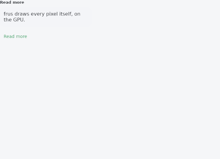
From frus-examples/widgets/src/features/animation/widgets/animated_size.rs:
//! `AnimatedSize` — a box that follows its child's size over time: when the content grows
//! or shrinks, the box moves to the new size instead of jumping, and clips the child on
//! the way.

use frus::{
    component, Align, AnimatedSize, Button, Column, Component, Container, Curve, Text, Variant,
    Widget,
};

use crate::common::shared::{section, sections};

const SUMMARY: &str = "frus draws every pixel itself, on the GPU.";
const MORE: &str = "That is why a widget looks the same on the desktop, on Android and in a \
                    browser: no native control is borrowed, so nothing changes from one \
                    platform to the next except what the platform should change — scrolling \
                    physics, page transitions, the text selection handles.";

pub fn example() -> Box<dyn Widget> {
    sections(vec![
        // "Read more": the paragraph's box opens and closes smoothly; what is below it
        // follows the box.
        Box::new(section("Read more", read_more())),
    ])
}

fn read_more() -> Component {
    component(|cx| {
        let expanded = cx.use_state(|| false);
        let open = expanded.get();
        let scheme = &cx.theme().scheme;

        // The child changes; `AnimatedSize` notices on the next layout and animates its
        // own box from the old size to the new one.
        let mut body = Column::new()
            .spacing(8.0)
            .cross_axis_alignment(Align::Start)
            .child(Text::new(SUMMARY));
        if open {
            body = body.child(Text::new(MORE).color(scheme.on_surface_variant));
        }

        let toggle = expanded.clone();
        Box::new(
            Column::new()
                .spacing(12.0)
                .cross_axis_alignment(Align::Start)
                .child(
                    Container::new()
                        .width(300.0)
                        .padding(12.0)
                        .radius(12.0)
                        .color(scheme.surface_container)
                        .child(AnimatedSize::new(0.3, body).curve(Curve::ease_in_out())),
                )
                .child(
                    Button::new(if open { "Read less" } else { "Read more" })
                        .variant(Variant::Text)
                        .on_press(move || toggle.update(|open| *open = !*open)),
                ),
        )
    })
}
Properties
| Method | Argument | Effect |
|---|---|---|
.curve() | curve: Curve | The easing of the move. |
.alignment() | alignment: Alignment | Where the child sits in a box that is not its size yet. |
.clip() | clip: bool | Whether the child is cut to the box while it does not fit. On by default. |
.width() | width: AxisConstraint | What the child is given across: the width on offer by default. |
.height() | height: AxisConstraint | What the child is given down: nothing by default, so it is asked for its height. |
Behaviour
A box that follows its child's size over time: when the child grows or shrinks, the box moves to the new size over duration seconds instead of jumping there, and the child is clipped to it on the way.
By default the child is given the width on offer and asked for its height, which is what a section that expands and collapses wants. width and height change that, in the vocabulary of a ConstraintsTransformBox.
use frus_widgets::{text, AnimatedSize, Flex};
let mut body = Flex::<()>::column().child(text("Summary"));
if expanded {
    body = body.child(text("And everything else, which only shows when asked."));
}
let section = AnimatedSize::new(0.2, body);
See also
- AnimatedDefaultTextStyle: the text style handed down to a subtree, moving to each new style.
- AnimatedFractionallySizedBox: a fraction of the room, moving to each new fraction.
- AnimatedSwitcher: the old child leaves as the new one arrives when the value changes.
- AnimatedCrossFade: cross-fades between two known children, the box moving between their sizes.
- Fade, Slide, Scale & Size transitions: explicit transitions driven by a number the app owns: an AnimationController.
- The guide: Animation
- API reference:
AnimatedSize
Source: crates/frus-widgets/src/animatedsize.rs @ e6fba33f5b42