Icon and AnimatedIcons
Purpose
An icon that morphs between two marks: menu and close, play and pause.
Signature
pub struct Icon { .. }

impl Icon {
    pub fn new(icon: IconData) -> Self;
    pub fn animated(icon: AnimatedIconData, on: bool) -> Self;
}
pub struct AnimatedIcons;
Example
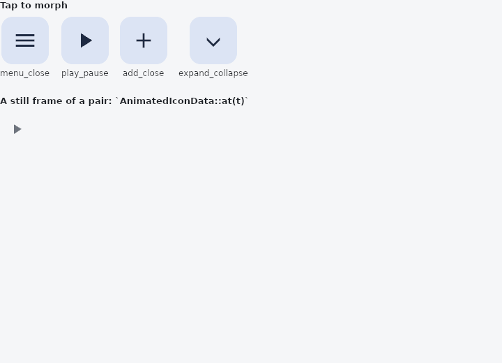
From frus-examples/widgets/src/features/animation/widgets/animated_icon.rs:
//! `Icon::animated` with `AnimatedIcons` — an icon that morphs between two marks: a menu
//! into a cross, play into pause.
//!
//! You say which end you want (`on`); the framework drives the morph there with the same
//! timing as the switches and drawers it usually sits beside.

use frus::{
    component, Align, AnimatedIcons, Column, Container, Icon, IconButton, InkWell, Text, Widget,
    Wrap,
};

use crate::common::shared::{section, sections};

pub fn example() -> Box<dyn Widget> {
    Box::new(component(|cx| {
        // One flag per bundled pair, kept together.
        let states = cx.use_state(|| [false; 4]);
        let flags = states.get();
        let scheme = &cx.theme().scheme;

        // `AnimatedIcons::all()` lists every bundled pair with its name.
        let tiles = AnimatedIcons::all().enumerate().fold(
            Wrap::new().gap(16.0).run_gap(16.0),
            |row, (index, (name, icon))| {
                let flip = states.clone();
                row.child(
                    Column::new()
                        .spacing(6.0)
                        .cross_axis_alignment(Align::Center)
                        .child(
                            InkWell::new()
                                .radius(16.0)
                                .on_click(move || flip.update(|flags| flags[index] = !flags[index]))
                                .child(
                                    Container::new()
                                        .padding(16.0)
                                        .radius(16.0)
                                        .color(scheme.secondary_container)
                                        .child(
                                            Icon::animated(icon, flags[index])
                                                .size(36.0)
                                                .color(scheme.on_secondary_container),
                                        ),
                                ),
                        )
                        .child(Text::new(name).size(12.0)),
                )
            },
        );

        // The usual home of one: a button whose mark follows what it controls.
        let playing = flags[1];
        let toggle = states.clone();
        let player = IconButton::new(AnimatedIcons::PLAY_PAUSE.at(if playing { 1.0 } else { 0.0 }))
            .label(if playing { "Pause" } else { "Play" })
            .on_press(move || toggle.update(|flags| flags[1] = !flags[1]));

        sections(vec![
            Box::new(section("Tap to morph", tiles)),
            Box::new(section(
                "A still frame of a pair: `AnimatedIconData::at(t)`",
                player,
            )),
        ])
    }))
}
Properties
| Type | Method | Argument | Effect |
|---|---|---|---|
Icon | .size() | size: f32 | Sets the size, that is, the square's side, in logical pixels. Outranks the theme. |
Icon | .color() | color: Color | Forces the colour; the theme's otherwise, and on_surface if it says nothing. |
Behaviour
Icon
A vector icon. Size and colour can both be customised; they default to 24 px and the theme's foreground colour (on_surface).
AnimatedIcons
The bundled pairs, as one constant each — the same shape of thing Icons is for the static set.
These are the ones this framework needs itself. An application that needs another authors it with AnimatedIconData::custom, which is the same door IconData::custom opens for a static mark.
Icons: crate::Icons
See also
- DecoratedBoxTransition & DefaultTextStyleTransition: a whole decoration or text style, part of the way from one to another.
- Curve: the shape of a motion, separate from its duration.
- Hero & page transitions: a shared element that flies between two pages during a transition.
- The guide: Animation
- API reference:
Icon - API reference:
AnimatedIcons
Source: crates/frus-widgets/src/icon.rs, crates/frus-widgets/src/icons/animated.rs @ e6fba33f5b42