AnimatedDefaultTextStyle
Purpose
The text style handed down to a subtree, moving to each new style.
Signature
pub struct AnimatedDefaultTextStyle<Msg = crate::callback::Callback> { .. }

impl AnimatedDefaultTextStyle {
    pub fn new(
        duration: f32,
        curve: Curve,
        style: TextStyle,
        child: impl Widget<Msg> + 'static,
    ) -> Self;
}
Example
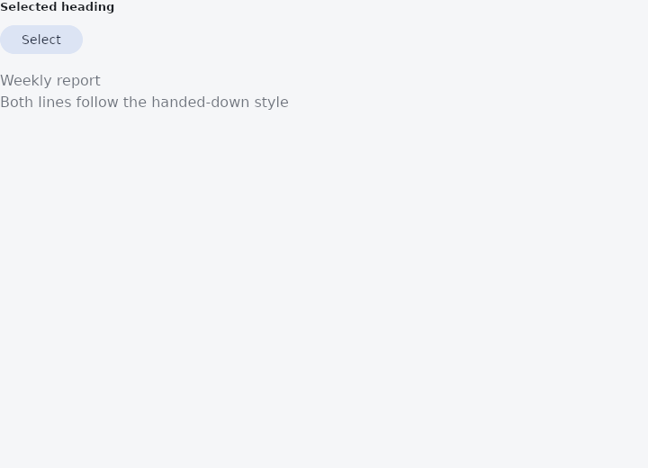
From frus-examples/widgets/src/features/animation/widgets/animated_text_style.rs:
//! `AnimatedDefaultTextStyle` — the text style handed down to a subtree, moving to each new
//! style: size, weight and colour change smoothly for every text inside that does not set
//! them itself.

use frus::{
    component, Align, AnimatedDefaultTextStyle, Button, Column, Component, Curve, FontWeight, Text,
    TextStyle, Variant, Widget,
};

use crate::common::shared::{section, sections};

pub fn example() -> Box<dyn Widget> {
    sections(vec![
        // A heading that grows when its section is selected. The texts inside name no size,
        // weight or colour of their own — a text that states its size keeps it.
        Box::new(section("Selected heading", heading())),
    ])
}

fn heading() -> Component {
    component(|cx| {
        let selected = cx.use_state(|| false);
        let on = selected.get();
        let scheme = &cx.theme().scheme;

        let style = if on {
            TextStyle::NONE
                .size(28.0)
                .weight(FontWeight::Bold)
                .color(scheme.primary)
        } else {
            TextStyle::NONE
                .size(16.0)
                .weight(FontWeight::Regular)
                .color(scheme.on_surface_variant)
        };

        let toggle = selected.clone();
        Box::new(
            Column::new()
                .spacing(16.0)
                .cross_axis_alignment(Align::Start)
                .child(
                    Button::new(if on { "Deselect" } else { "Select" })
                        .variant(Variant::Tonal)
                        .on_press(move || toggle.update(|on| *on = !*on)),
                )
                .child(AnimatedDefaultTextStyle::new(
                    0.3,
                    Curve::ease_in_out(),
                    style,
                    Column::new()
                        .spacing(4.0)
                        .cross_axis_alignment(Align::Start)
                        .child(Text::new("Weekly report"))
                        .child(Text::new("Both lines follow the handed-down style")),
                )),
        )
    })
}
Properties
| Method | Argument | Effect |
|---|---|---|
.align() | align: TextAlign | Where the lines sit inside their box. Not animated — it takes effect at once. |
.soft_wrap() | wrap: bool | Whether the text wraps at the width it is given. Not animated. |
.overflow() | overflow: TextOverflow | What becomes of text that does not fit. Not animated. |
.max_lines() | lines: usize | At most this many lines. Not animated. |
Behaviour
Hands a moving text style down to everything below it rather than restyling the subtree at once.
A heading that shrinks as a page scrolls, a label that goes from muted to emphatic when its row is selected, a caption thickening as it becomes the thing being edited: each is a run of words whose type changes, and each of them jumped before this.
use frus_core::{Curve, TextStyle};
use frus_widgets::{AnimatedDefaultTextStyle, Text};

let selected = true;
let _row: AnimatedDefaultTextStyle<()> = AnimatedDefaultTextStyle::new(
    0.2,
    Curve::ease_out(),
    TextStyle::NONE.size(if selected { 22.0 } else { 16.0 }),
    Text::new("Reminders"),
);
It reaches the subtree through the theme, the way DefaultTextStyle::around does: a Text resolves what the caller said ?? what the subtree hands down ?? what the framework ships, so this styles the words a caller passed in already assembled and never has to be threaded through them. A field the caller set on a particular text still wins — an inherited style is the answer to a question, not an instruction.
It is the only animated value in this framework that layout reads through the theme, which is why it is the only one whose consumer is the walk's theme swap rather than the node. That swap is made four times over a frame, and all four go through one function so they cannot answer differently.
What travels, what holds and what swaps at the halfway point within the type itself is TextStyle::lerp's business — in short, sizes travel, a field only one end states holds still, and faces swap in the middle.
Like AnimatedPositioned, and unlike the transparent Themed it is built on the same idea as, this is a node of its own. Two of these nested — an outer one moving the colour, an inner one the size, which is a thing the cascade positively invites — would otherwise fuse into one node and put two timelines on it.
See also
- AnimatedPositioned: a stack layer whose pins move: panels that slide in, cards that travel.
- AnimatedScale, AnimatedRotation & AnimatedSlide: grow, turn or shift a child to each new value without moving its neighbours.
- AnimatedFractionallySizedBox: a fraction of the room, moving to each new fraction.
- AnimatedSize: a box that follows its child's size over time instead of jumping.
- AnimatedSwitcher: the old child leaves as the new one arrives when the value changes.
- The guide: Animation
- API reference:
AnimatedDefaultTextStyle
Source: crates/frus-widgets/src/animated.rs @ e6fba33f5b42