AnimatedContainer
Purpose
A box whose colour, size, corners and opacity glide to each new value.
Signature
pub struct AnimatedContainer<Msg = crate::callback::Callback> { .. }

impl AnimatedContainer {
    pub fn new(duration: f32, curve: Curve) -> Self;
}
Example
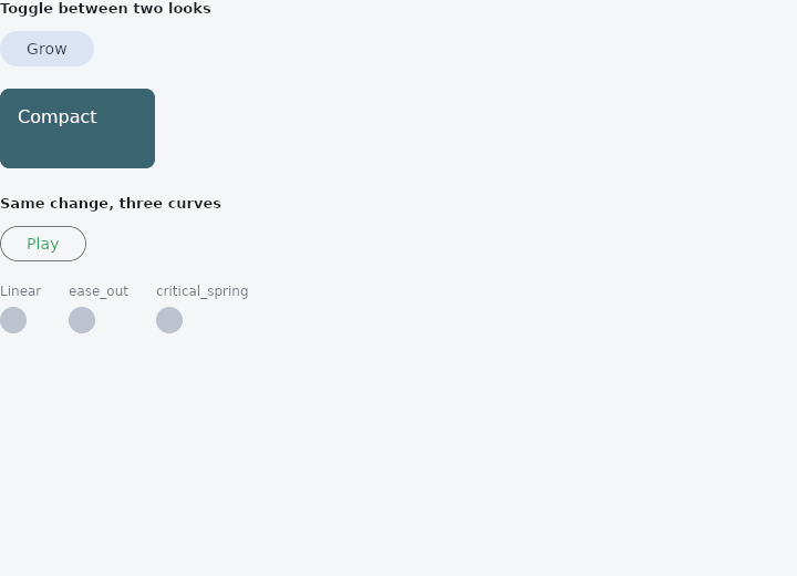
From frus-examples/widgets/src/features/animation/widgets/animated_container.rs:
//! `AnimatedContainer` — a box whose colour, size, corners and opacity glide to each new
//! value instead of jumping there.
//!
//! This is an **implicit** animation: you never start or stop anything. Build the box with
//! new targets and it travels to them over its duration, on its curve.

use frus::{
    component, Align, AnimatedContainer, Button, Column, Component, Curve, Row, Text, Variant,
    Widget, Wrap,
};

use crate::common::shared::{section, sections};

pub fn example() -> Box<dyn Widget> {
    sections(vec![
        // The everyday use: one flag in state, two looks for the box. Press the button and
        // the colour, the size and the corners all move together.
        Box::new(section("Toggle between two looks", two_looks())),
        // The same change on three curves: the duration is identical, only the *shape* of
        // the motion differs.
        Box::new(section("Same change, three curves", three_curves())),
    ])
}

fn two_looks() -> Component {
    component(|cx| {
        let expanded = cx.use_state(|| false);
        let on = expanded.get();
        let scheme = &cx.theme().scheme;

        // Every property set on an `AnimatedContainer` shares its duration (seconds) and its
        // curve.
        let card = AnimatedContainer::new(0.4, Curve::ease_in_out())
            .color(if on { scheme.primary } else { scheme.tertiary })
            .size(
                if on { 260.0 } else { 140.0 },
                if on { 120.0 } else { 72.0 },
            )
            .radius(if on { 32.0 } else { 8.0 })
            .padding(16.0)
            .child(
                Text::new(if on { "Expanded" } else { "Compact" }).color(if on {
                    scheme.on_primary
                } else {
                    scheme.on_tertiary
                }),
            );

        let toggle = expanded.clone();
        Box::new(
            Column::new()
                .spacing(16.0)
                .cross_axis_alignment(Align::Start)
                .child(
                    Button::new(if on { "Shrink" } else { "Grow" })
                        .variant(Variant::Tonal)
                        .on_press(move || toggle.update(|on| *on = !*on)),
                )
                .child(card),
        )
    })
}

fn three_curves() -> Component {
    component(|cx| {
        let moved = cx.use_state(|| false);
        let on = moved.get();
        let scheme = &cx.theme().scheme;

        let bar = |curve: Curve, name: &str| {
            Column::new()
                .spacing(6.0)
                .cross_axis_alignment(Align::Start)
                .child(Text::new(name).size(12.0).color(scheme.on_surface_variant))
                .child(
                    AnimatedContainer::new(0.8, curve)
                        .color(scheme.secondary)
                        .size(if on { 96.0 } else { 24.0 }, 24.0)
                        .radius(12.0)
                        // `opacity` animates too, on the same clock as the rest.
                        .opacity(if on { 1.0 } else { 0.5 }),
                )
        };

        let toggle = moved.clone();
        Box::new(
            Column::new()
                .spacing(16.0)
                .cross_axis_alignment(Align::Start)
                .child(
                    Row::new().child(
                        Button::new("Play")
                            .variant(Variant::Outlined)
                            .on_press(move || toggle.update(|on| *on = !*on)),
                    ),
                )
                .child(
                    Wrap::new()
                        .gap(24.0)
                        .run_gap(12.0)
                        .child(bar(Curve::Linear, "Linear"))
                        .child(bar(Curve::ease_out(), "ease_out"))
                        .child(bar(Curve::critical_spring(), "critical_spring")),
                ),
        )
    })
}
Properties
| Method | Argument | Effect |
|---|---|---|
.color() | color: Color | A background whose color animates toward color. |
.size() | width: f32, height: f32 | Animated width×height size (interpolated at layout time). |
.radius() | radius: impl Into<BorderRadius> | Animated corner radius (uniform via f32, or per corner via BorderRadius). |
.opacity() | opacity: f32 | Animated group opacity [0,1]. |
.padding() | padding: f32 | Inner padding (static). |
.child() | child: impl Widget<Msg> + 'static | The box's child. |
Behaviour
A box whose properties animate on every change: color, size, radius and opacity — all with the same (duration, curve). Builds a Container under the hood.
AnimatedContainer::new(0.3, Curve::ease_in_out())
    .color(theme.primary)
    .size(200.0, 100.0)
    .radius(12.0)
    .child(Text::new("hi"))
See also
- Opacity & AnimatedOpacity: see-through by a fixed amount, or fading to each new amount.
- AnimatedAlign: slides a child to a new anchor inside its box.
- AnimatedPadding: insets a child by an amount that moves to each new value.
- The guide: Animation
- API reference:
AnimatedContainer
Source: crates/frus-widgets/src/animated.rs @ e6fba33f5b42