AnimatedAlign
Purpose
Slides a child to a new anchor inside its box.
Signature
pub struct AnimatedAlign<Msg = crate::callback::Callback> { .. }

impl AnimatedAlign {
    pub fn new(
        alignment: impl Into<frus_core::AlignmentGeometry>,
        duration: f32,
        curve: Curve,
        child: impl Widget<Msg> + 'static,
    ) -> Self;
}
Example
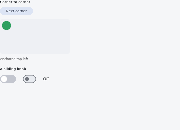
From frus-examples/widgets/src/features/animation/widgets/animated_align.rs:
//! `AnimatedAlign` — moves a child to a new anchor inside its box instead of letting it
//! jump: a badge changing corner, a thumb crossing a track.

use frus::{
    component, Align, Alignment, AnimatedAlign, Button, Column, Component, Container, Curve, Row,
    Switch, Text, Variant, Widget,
};

use crate::common::shared::{section, sections};

/// The four corners the dot visits, in order.
const CORNERS: [(Alignment, &str); 4] = [
    (Alignment::TOP_LEFT, "top left"),
    (Alignment::TOP_RIGHT, "top right"),
    (Alignment::BOTTOM_RIGHT, "bottom right"),
    (Alignment::BOTTOM_LEFT, "bottom left"),
];

pub fn example() -> Box<dyn Widget> {
    sections(vec![
        // The anchor is the animated quantity: change it and the child slides there.
        Box::new(section("Corner to corner", corners())),
        // The same idea, small: a home-made toggle whose knob glides across.
        Box::new(section("A sliding knob", knob())),
    ])
}

fn corners() -> Component {
    component(|cx| {
        let corner = cx.use_state(|| 0_usize);
        let (alignment, name) = CORNERS[corner.get()];
        let scheme = &cx.theme().scheme;

        let next = corner.clone();
        Box::new(
            Column::new()
                .spacing(12.0)
                .cross_axis_alignment(Align::Start)
                .child(
                    Button::new("Next corner")
                        .variant(Variant::Tonal)
                        .on_press(move || next.update(|i| *i = (*i + 1) % CORNERS.len())),
                )
                .child(
                    Container::new()
                        .width(280.0)
                        .height(140.0)
                        .padding(8.0)
                        .radius(12.0)
                        .color(scheme.surface_container_high)
                        .child(AnimatedAlign::new(
                            alignment,
                            0.5,
                            Curve::ease_in_out(),
                            Container::new()
                                .width(36.0)
                                .height(36.0)
                                .radius(18.0)
                                .color(scheme.primary),
                        )),
                )
                .child(Text::new(format!("Anchored {name}")).size(13.0)),
        )
    })
}

fn knob() -> Component {
    component(|cx| {
        let on = cx.use_state(|| false);
        let is_on = on.get();
        let scheme = &cx.theme().scheme;

        // A framework `Switch` alongside, driven by the same state, for comparison.
        let flip = on.clone();
        let track = Container::new()
            .width(64.0)
            .height(32.0)
            .padding(4.0)
            .radius(16.0)
            .color(if is_on {
                scheme.primary
            } else {
                scheme.outline_variant
            })
            .on_click(move || flip.update(|on| *on = !*on))
            .child(AnimatedAlign::new(
                if is_on {
                    Alignment::CENTER_RIGHT
                } else {
                    Alignment::CENTER_LEFT
                },
                0.15,
                Curve::ease_out(),
                Container::new()
                    .width(24.0)
                    .height(24.0)
                    .radius(12.0)
                    .color(scheme.surface),
            ));

        let set = on.clone();
        Box::new(
            Row::new()
                .spacing(24.0)
                .cross_axis_alignment(Align::Center)
                .child(track)
                .child(Switch::new(is_on).on_toggle(move |value| set.set(value)))
                .child(Text::new(if is_on { "On" } else { "Off" })),
        )
    })
}
Properties
| Method | Argument | Effect |
|---|---|---|
.width_factor() | factor: f32 | The box is factor times as wide as its child, rather than as wide as the room. See Aligned::width_factor. |
.height_factor() | factor: f32 | The box is factor times as tall as its child. See Aligned::height_factor. |
Behaviour
Slides its child to each new anchor instead of letting it jump across the box.
The anchor is where the child sits in the free space around it, so this is the widget for a thing that moves within something — a thumb crossing a track, a badge changing corner, a label that settles against the other edge when a panel opens.
use frus_core::{Alignment, Curve};
use frus_widgets::{AnimatedAlign, Container};

let on = true;
let _thumb: AnimatedAlign<()> = AnimatedAlign::new(
    if on { Alignment::CENTER_RIGHT } else { Alignment::CENTER_LEFT },
    0.15,
    Curve::ease_out(),
    Container::new().width(20.0).height(20.0),
);
The kind of anchor is kept the whole way: a directional one stays directional, so in a right-to-left script the whole movement mirrors rather than the two ends mirroring separately and the child crossing the box the wrong way.
Unlike a scale's pivot, an anchor is the quantity here — it says where the child is, not where the maths starts from — which is why this one animates and that one does not.
See also
- AnimatedContainer: a box whose colour, size, corners and opacity glide to each new value.
- Opacity & AnimatedOpacity: see-through by a fixed amount, or fading to each new amount.
- AnimatedPadding: insets a child by an amount that moves to each new value.
- AnimatedPositioned: a stack layer whose pins move: panels that slide in, cards that travel.
- AnimatedScale, AnimatedRotation & AnimatedSlide: grow, turn or shift a child to each new value without moving its neighbours.
- The guide: Animation
- API reference:
AnimatedAlign
Source: crates/frus-widgets/src/animated.rs @ e6fba33f5b42